Often we have the need to display multiple columns of data in a graph, and we want to introduce some separation into their placement in the graph. Or, we want to display a bar chart of multiple response variables, and place the values side-by-side, like in a grouped bar chart. For both of these use cases we can use the DISCRETEOFFSET feature in GTL (SAS 9.2) and SG Procedures (SAS 9.3).
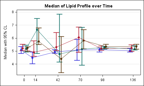
In this commonly used graph for Clinical Research, we want to plot the Median and 95% CL of the lipid values by visit and treatment. The visits are plotted on a discrete X axis.
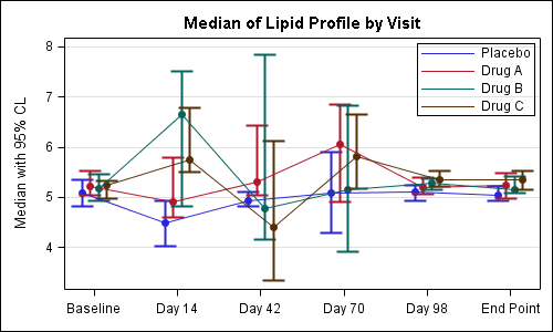
The data for this study is arranged in columns, with 3 columns of data for each treatment (Median, LCL and UCL). There is one observation for each visit. To create this plot we overlay four scatter plots and four seriesplots, one for each treatment
We use the scatter plots to display the mean, lcl and ucl values for each treatment. We use series plots to connect the values for each treatment. The key piece here is the use of the option DISCRETEOFFSET for each of the scatter and series plot statements. DISCRETEOFFSET shifts the plot by the specified fraction of the mid-point spacing. So, DISCRETEOFFSET=-0.15 shifts this plot by 15% to the left.
A snippet of the GTL code is shown below. The full code is included in this document: SAS Code For Lipid Graph
layout overlay / (other options); scatterplot x=day y=p_med / discreteoffset=-0.15 (other options); scatterplot x=day y=a_med / discreteoffset=-0.05 (other options); scatterplot x=day y=b_med / discreteoffset= 0.05 (other options); scatterplot x=day y=c_med / discreteoffset= 0.15 (other options); seriesplot x=day y=p_med / discreteoffset=-0.15 (other options); seriesplot x=day y=a_med / discreteoffset=-0.05 (other options); seriesplot x=day y=b_med / discreteoffset= 0.05 (other options); seriesplot x=day y=c_med / discreteoffset= 0.15 (other options); discretelegend 'ps' 'pa' 'pb' 'pc' / location=inside (other options); endlayout; |
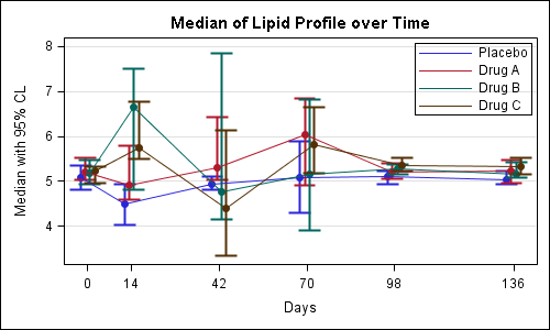
For the above graph, Peter has made a good observation that one could use a linear x axis to get the dates correctly scaled. Here is the result of Peter's code:

In the above graph the jittered values for each treatment on the x-axis may appear to be on different days. To reduce this impression one could cluster the observations more tightly, and display the exact tick values for each visit along with the axis label on the x-axis as shown below:
Here is a bar chart showing the mean city and highway milage for each type of car in the sashelp.cars data set.
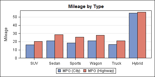
The data is organized in separate columns for the city and highway mileage values. We can create this graph by overlaying two BARCHART statements, one each for the city and highway milage with STAT=mean. Here we use the DISCRETEOFFSET and BARWIDTH options to place the bars side-by-side as shown in the code below. Note, here we have used DYNAMICS for the offset values so that we can use the same template again for the next example.
In this first graph, we have used DISCRETEOFFSET of 20% and BARWIDTH of 40% to get the above result.
proc template; define statgraph bar_offset; dynamic offset1 offset2; begingraph / designwidth=5in designheight=2.5in; entrytitle 'Mileage by Type'; layout overlay / yaxisopts=(griddisplay=on label='Mileage') xaxisopts=(display=(ticks tickvalues)); barchart x=type y=mpg_highway / discreteoffset=offset2 barwidth=0.4 fillattrs=graphdata2 name='high' stat=mean; barchart x=type y=mpg_city / discreteoffset=offset1 barwidth=0.4 fillattrs=graphdata1 name='city' stat=mean; discretelegend 'city' 'high'; endlayout; endgraph; end; run; ods listing; ods graphics / reset imagename='Bar_Offset_1'; proc sgrender data=sashelp.cars template=bar_offset; dynamic offset1='-0.2' offset2='0.2'; run; |
You can adjust the values used for DISCRETEOFFSET and BARWIDTH, to get different effects as shown below. Here we have reduced the DISCRETEOFFSET to 15% to create the overlapped effect. Note how the blue bars slightly overlap the red ones.
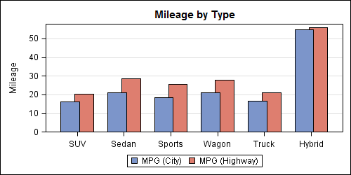
ods graphics / reset imagename='Bar_Offset_2'; proc sgrender data=sashelp.cars template=bar_offset; dynamic offset1='-0.15' offset2='0.15'; run; |


4 Comments
Neat!
These are nice graphs; but the first one has a problem - the gap between the times is the same, even though the number of days between times is not the same: Baseline to 14 days, then gaps of 28 days. Often in trials, followups are not equally spaced.
The following code fixes this (but I am not sure what is wrong with the continuouslegend - maybe Sanjay or another reader can fix it).
You are absolutely right that one can easily create a version of this graph using a linear X axis that can represent the scale for the visits, as you have shown.
Also, you don't actually have to jitter the data, you can use "scatterplot x=eval(day-2)".
One risk is that such a scaled x axis may suggest that the "jittered" values for each treatment are on different days, which is not true in this case. In such a case, it may be useful cluster the values more tightly and to show the actual visit dates on the x-axis, as shown in the updated post.
As for your usage of continuous legend, there are two problems. 1. There is no plot by name "lipid" in the graph that is referenced in the legend. 2. You will need to use some feature (like MarkerColorGradient) that uses a range of colors for this to be useful.
The intention of the article is to demonstrate the DISCRETEOFFSET feature, which can only be done on a discrete axis.
Thanks Sanjay; I didn't know about the eval() function being available inside scatterplot. I initially tried using something like scatterplot x = day + &a where I had macros for each level of jitter, but that didn't work.
Lots for me to learn about GTL; it's great stuff.