As we saw in Steve Morlidge's study of forecast quality in the supply chain (Part 1, Part 2), 52% of the forecasts in his sample were worse than a naive (random walk) forecast. This meant that over half the time, these companies would have been better off doing nothing and just using the naive model rather than using the forecast produced through their systems and forecasting process.
Of course, we don't know in advance whether the naive forecast will be more accurate, so this doesn't help with decision making in particular instances. But the findings provide further evidence that in the real-life practice of business forecasting, we are disturbingly mediocre.
In private correspondence with Steve last week, he brought out some important points that I failed to mention in my damnation of forecasting practice:
Very often what we find is that the non-value adding forecasts aren’t necessarily poor forecasts; in the conventional sense of the word at least…in fact they might have low MAPE. It is just that they are worse than the naïve…which is not the same.
As usual, it is obvious when you think about it…if you have a stable demand pattern it might be easy to construct a forecast with good MAPE numbers but it is actually very difficult to beat the naïve forecast because last period's actual is a good predictor. And if you manually intervene in the process in any way then you will almost certainly make things worse. Ironically it is the very messy forecast series which offer the greatest potential to add value through good forecasting.
Two conclusions to draw from this:
- Sometimes the naive model provides a perfectly appropriate forecast (so a naive forecast is not necessarily a "bad" forecast).
- A forecast that fails to beat a naive forecast is not necessarily a "bad" forecast.
Illustrate with a Comet Chart
By creating a "comet chart" (find instructions in The Accuracy vs. Volatility Scatterplot), you may be able to illustrate these observations with your own company data.

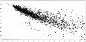
This comet chart displays Forecast Accuracy (here scaled 0-100%) on the vertical axis, and coefficient of variation (here truncated at 160%) on the horizontal axis, for the 5000 Item / DC combinations at a food manufacturer. The line represents the approximate accuracy of a very simple forecasting model (here a moving average) at each level of volatility.
As you would expect, forecast accuracy tends to be quite high when volatility of sales patterns is quite low, so even a very simple model (like a moving average or random walk) would perform well, and be difficult to beat. For more volatile sales patterns, there is more opportunity to "add value" to the forecast by judgmental overrides or more sophisticated models.
The comet chart is easy to construct and provides a new way to look at your company's forecasting challenge. Create yours today.
