Strengthen your programming skills with tips and techniques from the experts

SAS Tech Talk: What's new in the SAS programming language?

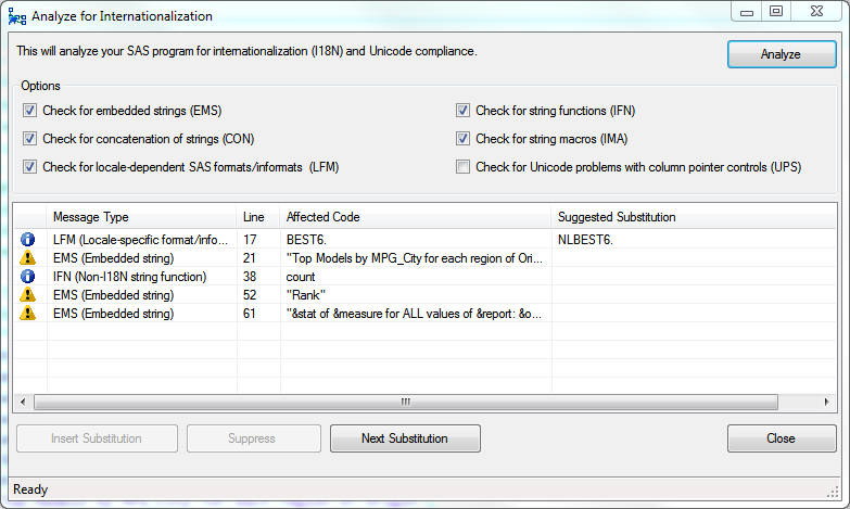
In SAS 9.4, the SAS programming language continues add new features by the truckload. I've already discussed PROC DELETE (which is actually an old feature, but like an 80s hit song it's now back with a better version). In this SAS Tech Talk video from SAS Global Forum 2013, I