Get the right information, with visual impact, to the people who need it
A neat new trick to trim your macro variables in 9.3

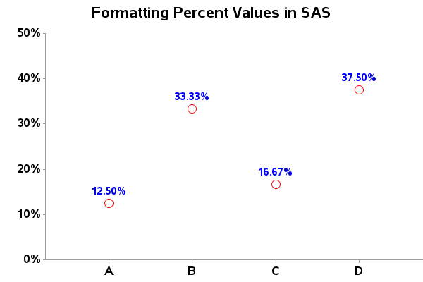
SAS macro variables are a great way to store a calculated value, so you can use it later in your code. They are not just limited to the data step -- you can also use macro variables in title statements, axis statements, etc. By default, the macro variable will be padded with