Get the right information, with visual impact, to the people who need it
Send your SAS graphs directly to Powerpoint!

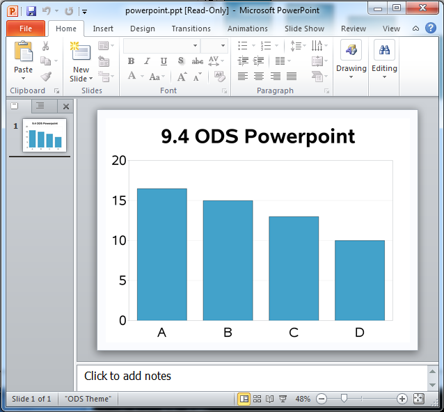
To say that I'm excited about the SAS 9.4 release is an understatement! For example, did you know that in SAS 9.4, you can write SAS/Graph output directly to a Powerpoint slide?!? This is definitely an item that was on my "wish list," and will no doubt make life a