Get the right information, with visual impact, to the people who need it
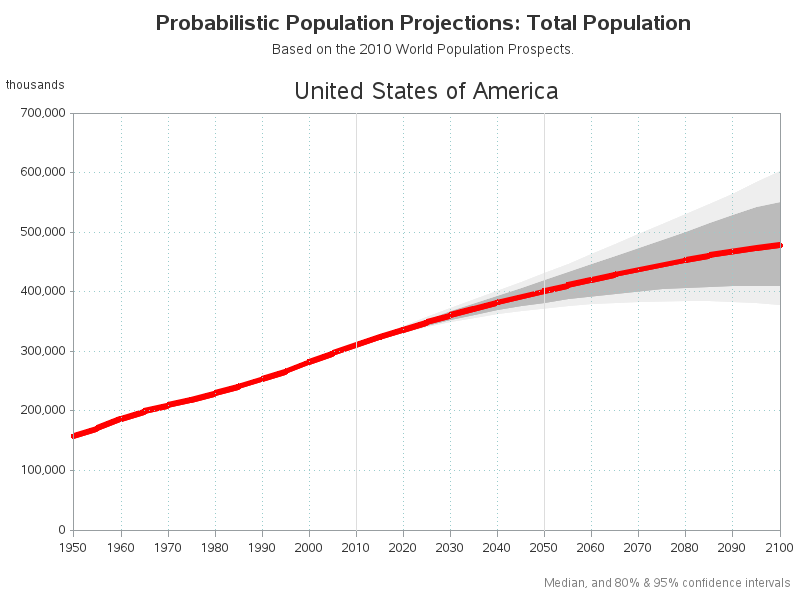
How to plot a forecast and confidence interval

The farther you try to forecast into the future, the less certain you are -- how can you represent that graphically? One way is to draw a shaded/colored "confidence interval" around your forecast line, but this is something a lot of SAS users have trouble with. That's why I decided to create