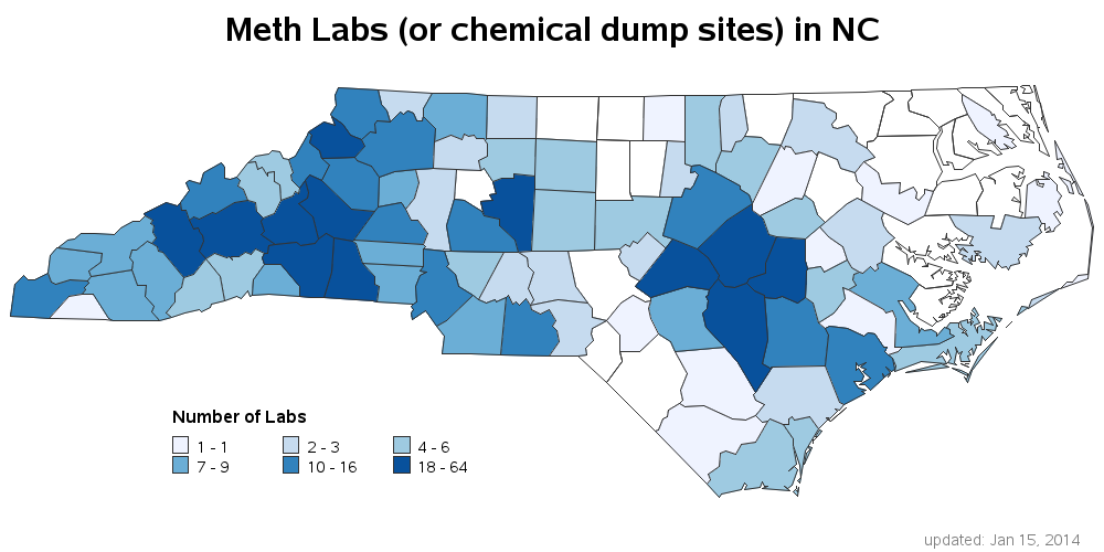
Get the right information, with visual impact, to the people who need it
Riddle: When is a bar chart really a pie chart?

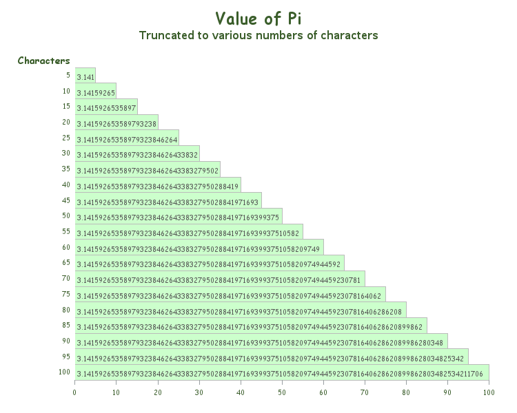
Did you know that this Friday is Pi Day? How are you planning to commemorate this special day? :) Next year's Pi Day might even be more special than usual, being that it will contain: March 14, 2015 - 9:26:53. And if you realize the coolness of that (3.141592653), you might be