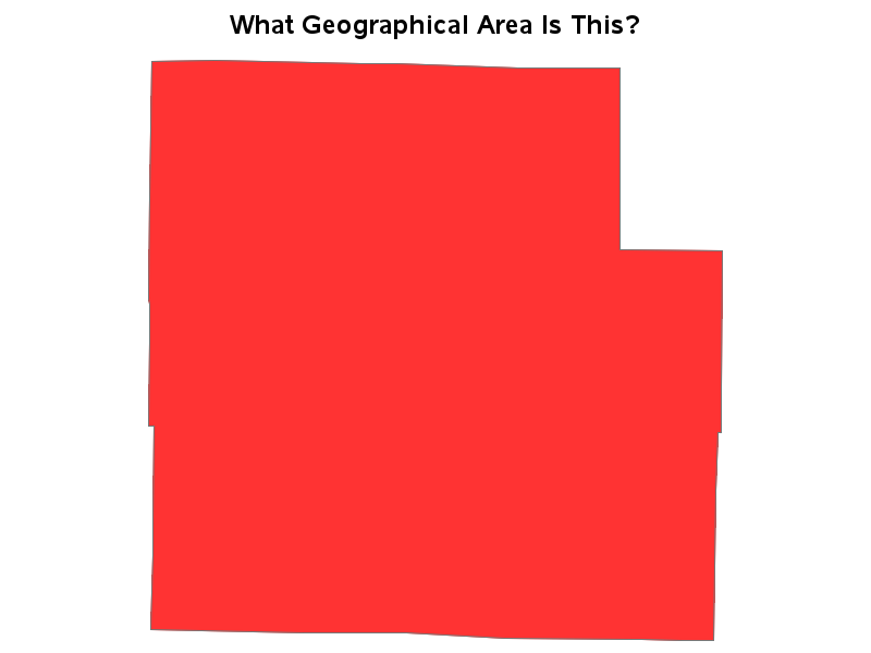
My blog posts focus on visual data analysis, and many of them use geographical maps. Therefore I hope you will have fun with a quick geography quiz, which I created using SAS/Graph ... And what, you might
I recently saw a cool graph showing the US import/export trade deficit. But after studying it a bit, I realized I was perceiving it wrong. Follow along in this blog, to find out what the problem was, and how I redesigned the graph to avoid it. I was looking through dadaviz.com
I saw the dress photo as blue & black. If you're a female, even if we perceived the exact same color, you might might not have said 'blue & black'. That's because women have a larger color vocabulary than men, and you might have elaborated on exactly which blue and