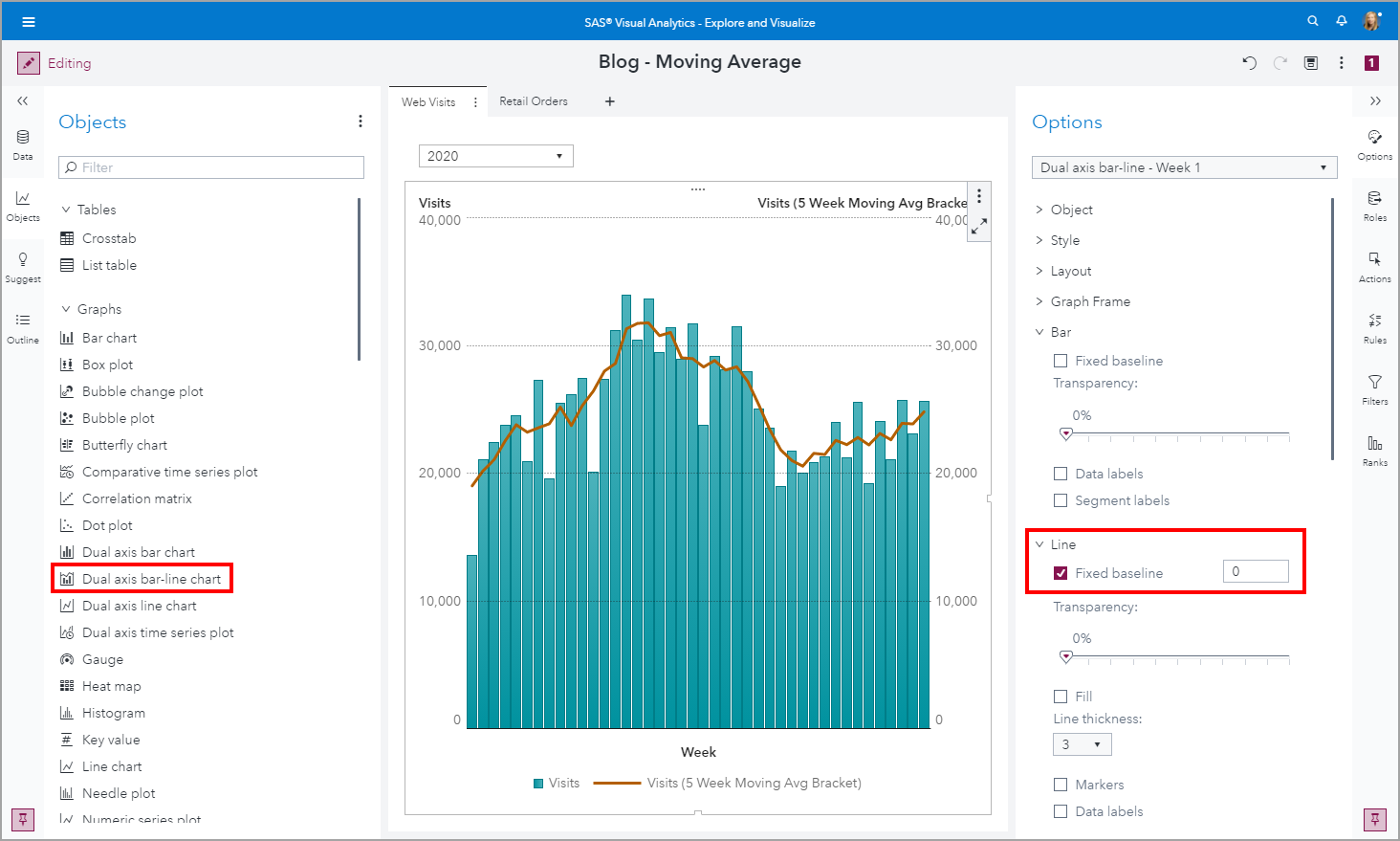
SAS Visual Analytics example: moving average

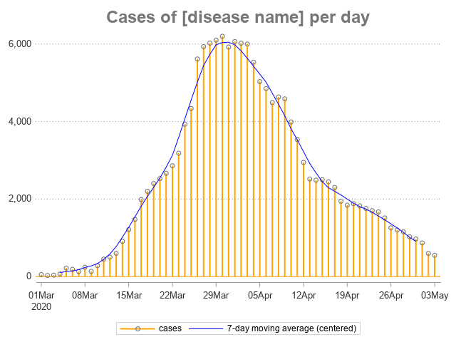
Data visualization has never been more widespread and consumed by a global audience as it has been this year with the Coronavirus pandemic. One visualization that is commonly used to display metrics of Coronavirus is a bar line chart where the bars display the actual values and the line is a moving average metric.