Common annotate pitfalls and how to avoid them

0

SAS/GRAPH® Annotate FacilityThe SAS/GRAPH® Annotate Facility is often viewed as a mysterious programming abyss that many SAS users do not wish to dive into, in part because of some not-so-obvious pitfalls that they might experience when using it. I view annotation as a frequently misunderstood and needlessly feared but powerful tool that enables me to draw anything—literally, anything—on my graphs.

I will not attempt to delve into a tutorial of the Annotate facility due to lack of time and space. But, I will point out a few of the more common pitfalls that I see with customers’ Annotate data sets and offer suggestions for how to avoid them.

Location, Location, Location…

An Annotate data set contains a set of variables that tells the Annotate facility what to draw and where to draw it. It has no intelligence of its own, and simply does what you tell it to do. One of the most common issues that I see is annotation that is not drawn in the expected location on a graph. For example, an annotated 45-degree line that you expect to be drawn inside the axis area might be drawn outside the axis area. The following code defines an Annotate data set that should draw a line from the lower left corner of the axis area (0,0 percent) to the upper right corner of the axis area (100,100 percent):

data myanno;                                                                                                                            
  length function color $8;                                                                                                                                                                                                                             
  function='move';                                                                                                                      
    x=0;  y=0;                                                                                                                          
    output;                                                                                                                             
  function='draw';                                                                                                                      
   x=100;  y=100;                                                                                                                       
   color='red';                                                                                                                         
   output;                                                                                                                              
run;                                                                                                                                    
 
proc gplot data=sashelp.cars;                                                                                                           
  plot mpg_highway*cylinders / vaxis=axis1 haxis=axis2 annotate=myanno;                                                                                         
  symbol1 interpol=none value=dot color=blue; 
  axis1 label=(angle=90);                                                                                                               
  axis2 offset=(2,2)pct;                                                                                                                                                                                                          
run;                                                                                                                                    
quit;


The following annotate errors are written to the SAS log when I run this code:

NOTE: ERROR DETECTED IN ANNOTATE= DATASET WORK.MYANNO.
NOTE: PROBLEM IN OBSERVATION     2 -
      A CALCULATED COORDINATE LIES OUTSIDE THE VISIBLE AREA           X
      A CALCULATED COORDINATE LIES OUTSIDE THE VISIBLE AREA           Y


Here is the resulting graph:

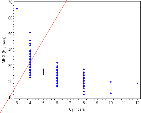
The annotated line is drawn outside the axis area. But why? I defined my X and Y coordinates for the MOVE and DRAW functions correctly, did I not?

The coordinates are defined correctly, but what I did not define is the coordinate system for the annotation. The coordinate system defines the drawing area in which the annotation is placed. These areas include the data (axis) area, the procedure output area, and the graphics output area. The XSYS and YSYS Annotate variables define the coordinate system for the X and Y coordinates, respectively. By default, a coordinate system of ‘4’ is defined for both XSYS and YSYS. A ‘4’ represents cells in the graphics output area.

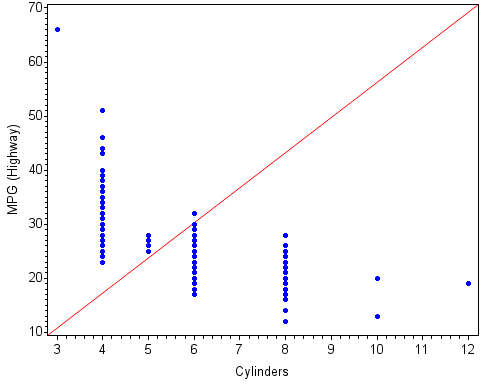
In order to draw the diagonal line inside the axis area when the X and Y coordinates are percentages, I define both the XSYS and YSYS variables as ‘1’, which is the percentage of the data area. When I include the correct coordinate system definition for the XSYS and YSYS variables in a RETAIN statement, the diagonal line is drawn correctly:

data myanno;                                                                                                                            
  length function color $8;                                                                                                             
  retain xsys ysys '1';                                                                                                                 
  function='move';                                                                                                                      
    x=0;  y=0;                                                                                                                          
    output;                                                                                                                             
  function='draw';                                                                                                                      
   x=100;  y=100;                                                                                                                       
   color='red';                                                                                                                         
   output;                                                                                                                              
run;                                                                                                                                    
 
proc gplot data=sashelp.cars;                                                                                                           
  plot mpg_highway*cylinders / vaxis=axis1 haxis=axis2 annotate=myanno;                                                                                         
  symbol1 interpol=none value=dot color=blue;
  axis1 label=(angle=90);                                                                                                               
  axis2 offset=(2,2)pct;                                                                                                                                                                                                           
run;                                                                                                                                    
quit;


Here is the graph containing the correct line:

Creating Multiple Graphs with an Annotate Data Set, BY-and-BY

The need to generate multiple graphs from one procedure using a BY statement is very common. However, using an Annotate data set with a BY statement can be a little tricky. Here are the general rules for using an Annotate data set with a SAS/GRAPH procedure that creates multiple graphs with a BY statement:

  1. Make sure that the Annotate data set and the input data set for the procedure include the same BY variables. The BY variables must also be the same data type in both data sets.
  2. Both the Annotate data set and the input data set must be sorted by the BY variables.
  3. Include the ANNOTATE= (or ANNO=) option in the action statement of the SAS/GRAPH procedure.

The goal of the following program is to create two graphs using a BY statement in which the annotation is specific to each graph. The Annotate data set draws the maximum MPG_Highway value at the maximum point for each X value.

/* Compute the maximum MPG_Highway values */                                                                                            
proc sort data=sashelp.cars(where=(origin in('USA' 'Europe'))) out=cars;                                                                
  by origin cylinders;                                                                                                                  
run;                                                                                                                                    
 
proc means data=cars noprint;                                                                                                           
  by origin cylinders;                                                                                                                  
  var mpg_highway;                                                                                                                      
  output out=meansout max=max;                                                                                                          
run;                                                                                                                                    
 
data myanno;                                                                                                                            
  length function color text $8;                                                                                                        
  retain xsys ysys '2' color 'black' position '2' size 1.5;                                                                             
  set meansout;                                                                                                                         
 
  function='label';                                                                                                                     
    x=cylinders;  y=max;                                                                                                                
    text=strip(max);                                                                                                                    
    output;                                                                                                                             
run;                                                                                                                                    
 
proc gplot data=cars annotate=myanno;                                                                                                   
  by origin;                                                                                                                            
  plot mpg_highway*cylinders / vaxis=axis1 haxis=axis2;                                                                                 
  symbol1 interpol=none value=dot color=blue;                                                                                           
  axis1 label=(angle=90);                                                                                                               
  axis2 offset=(2,2)pct;                                                                                                                
run;                                                                                                                                    
quit;


Here are the resulting graphs:

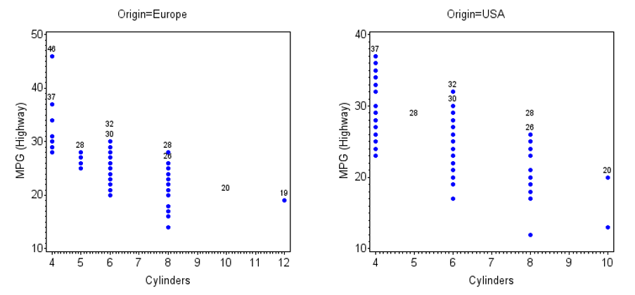
There are two issues here. First, there should be only one maximum value displayed for each X value. There are duplicate values of the annotated text on each graph. Second, the following messages are written to the SAS log:

NOTE: ERROR DETECTED IN ANNOTATE= DATASET WORK.MYANNO.
NOTE: PROBLEM IN OBSERVATION     1 -
      DATA SYSTEM REQUESTED, BUT VALUE IS NOT ON GRAPH    'Y'
NOTE: PROBLEM IN OBSERVATION     5 -
      DATA SYSTEM REQUESTED, BUT VALUE IS NOT ON GRAPH    'X'
NOTE: The above message was for the following BY group:
      Origin=USA


These notes tell me that either the X or the Y coordinate in two of the observations in the Annotate data set do not exist on one of the graphs. This issue occurs because the Annotate coordinates for each of the BY values are different for each graph. The axis ranges are different on the two graphs. So, when all of the annotation, instead of the annotation for only each BY value, is drawn on each graph, some of the Annotate coordinates cannot be found on the graph.

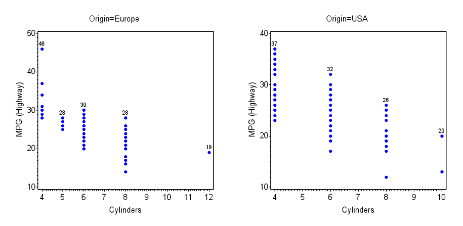
Both of these issues occur because the ANNOTATE=Myanno option is in the PROC GPLOT statement instead of in the action (PLOT) statement. Moving the ANNOTATE=Myanno option to the PLOT statement generates the expected output:

proc gplot data=cars;                                                                                                                   
  by origin;                                                                                                                            
  plot mpg_highway*cylinders / vaxis=axis1 haxis=axis2 annotate=myanno;                                                                 
  symbol1 interpol=none value=dot color=blue;                                                                                           
  axis1 label=(angle=90);                                                                                                               
  axis2 offset=(2,2)pct;                                                                                                                
run;                                                                                                                                    
quit;


Off the Grid

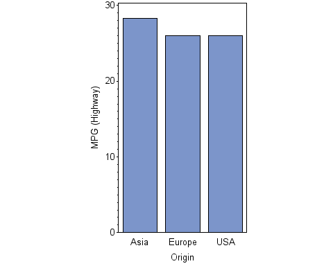
Another common issue with using an Annotate data set is when a coordinate in the Annotate data set lies outside the range of an axis on the graph. For example, I will chart the mean MPG_Highway values with the GCHART procedure and draw a symbol at the maximum value for each country of origin using an Annotate data set:

proc sort data=sashelp.cars out=cars;                                                                                                   
  by origin;                                                                                                                            
run;                                                                                                                                    
 
/* Compute the mean and the max */                                                                                                      
proc means data=cars noprint;                                                                                                           
  by origin;                                                                                                                            
  var mpg_highway;                                                                                                                      
  output out=meansout mean=mean max=max;                                                                                                
run;                                                                                                                                    
 
data myanno;                                                                                                                            
  length function color $8 text $14;                                                                                                    
  retain xsys ysys '2' color 'red' position '2' size 2;                                                                                 
  set meansout;                                                                                                                         
 
  function='symbol';                                                                                                                    
    midpoint=origin;  y=max;                                                                                                            
    text='diamondfilled';                                                                                                               
    output;                                                                                                                             
run;                                                                                                                                    
 
proc gchart data=meansout;                                                                                                              
  vbar origin / sumvar=mean annotate=myanno raxis=axis1;                                                                                
  axis1 label=(angle=90);                                                                                                               
run;                                                                                                                                    
quit;


When I run this program, the following graph is produced, excluding the annotated symbols:

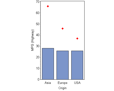
The following annotate error messages are written to the SAS log:

NOTE: ERROR DETECTED IN ANNOTATE= DATASET WORK.MYANNO.
NOTE: PROBLEM IN OBSERVATION     1 -
      DATA SYSTEM REQUESTED, BUT VALUE IS NOT ON GRAPH    'RESPONSE'
NOTE: PROBLEM IN OBSERVATION     2 -
      DATA SYSTEM REQUESTED, BUT VALUE IS NOT ON GRAPH    'RESPONSE'
NOTE: PROBLEM IN OBSERVATION     3 -
      DATA SYSTEM REQUESTED, BUT VALUE IS NOT ON GRAPH    'RESPONSE'


These messages tell me that multiple response values (Y coordinates) in the Annotate data set lie outside the range of the Y axis. The procedure does not automatically extend the Y-axis range to accommodate the annotation, so I need to do this by including the ORDER= option in the AXIS1 statement:

proc gchart data=meansout;                                                                                                              
  vbar origin / sumvar=mean annotate=myanno raxis=axis1;                                                                                
  axis1 label=(angle=90) order=(0 to 70 by 10);                                                                                         
run;                                                                                                                                    
quit;


The correct graph is now generated:

Annotation is a useful tool that enables you to draw features on a graph that the graphics procedure might not have the capability to draw. Using an Annotate data set is easier once you understand what the SAS log messages are telling you and can take steps to avoid common issues. Don’t be afraid to dive in!

Happy drawing!

Share

About Author

Sue Morrison

Sue Morrison is a Senior Technical Support Analyst at SAS Institute Inc., in Cary, NC, where she supports SAS/GRAPH procedures and ODS Graphics. She has been a SAS user since 1982 and in SAS Technical Support for more than 20 years. Sue is a SAS® Certified Base Programmer for SAS® 9.

Leave A Reply

This site uses Akismet to reduce spam. Learn how your comment data is processed.

Back to Top