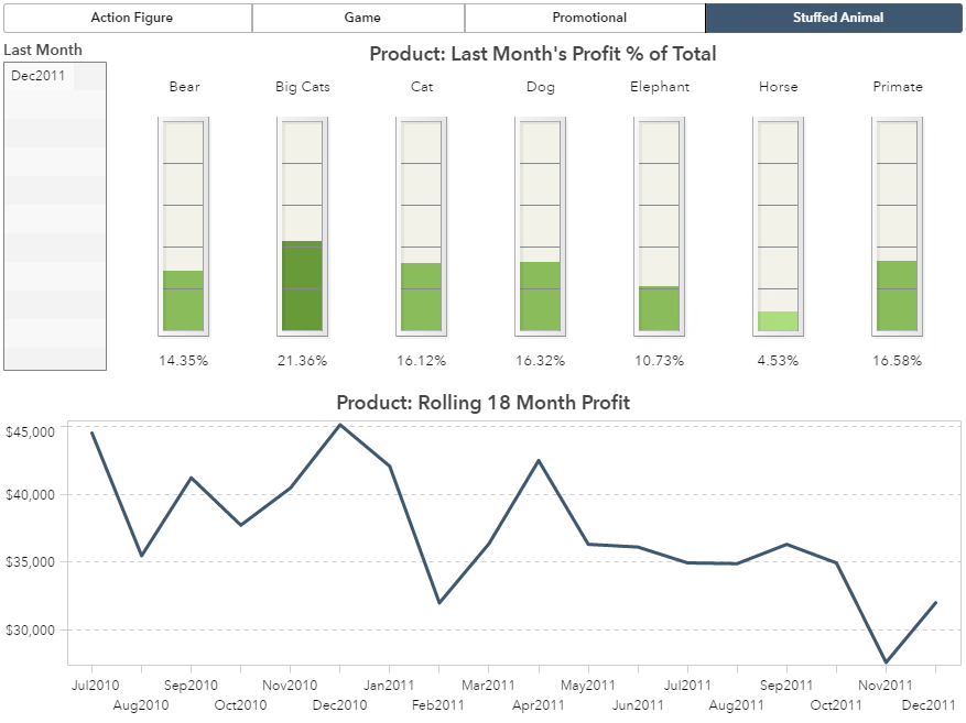
Requirements that are the most easily described can often be the most difficult to implement. I’m referring to requests like:
- Display a gauge with the most recently collected metric.
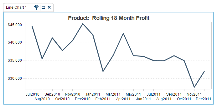
- Plot a 18 month rolling window of profit.
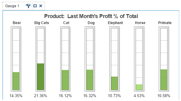
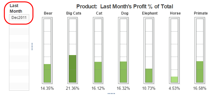
- Display last month’s products percent of total metrics for visual comparison.
Okay, so these are pretty specific requests, which I built a report to answer, but none the less, requirements like these do exist.
So, how do you implement these requests? Use rank! You might be wondering how this is possible since the rank feature requires a numeric value and these requirements are based on dates. Solution: use the TreatAs function. Let’s break it down step by step.
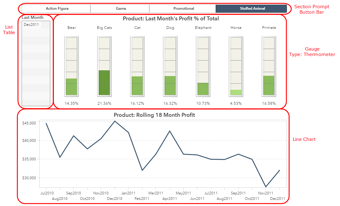
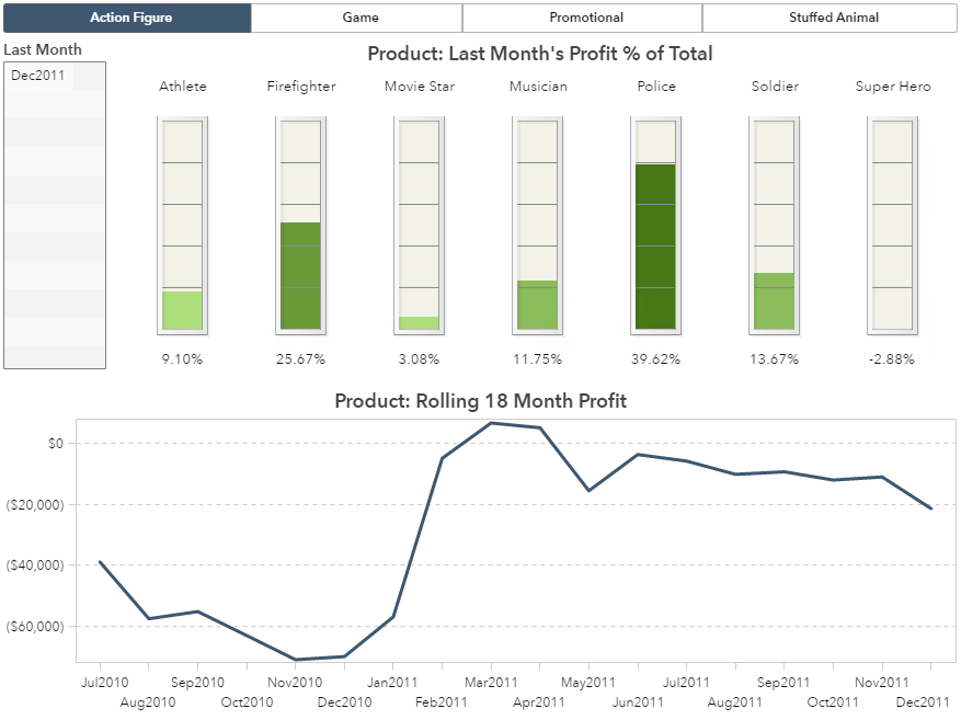
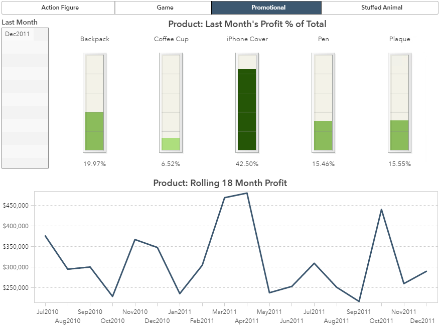
But first, here is a breakdown of the report objects used in this report. Notice that this report contains a section prompt via a button bar which prompts the user to select a Product Line. This section prompt filters all of the other objects by that Product Line value.
Step 1: Use TreatAs to create a metric from your date category
I am assuming that your data source has a date category. This will work with a date or date by month or date by year formatted data item. So long as the data item is recognized as a date then this technique will work.
This example will use the Date by Month data item. We will use the TreatAs function to create a metric, or in other words, a numeric representation of the date. That’s the great thing about dates in SAS, they simply represent the number of days before or after January 1, 1960. So the most recent the date, the larger the number, which we can then use rank to order.
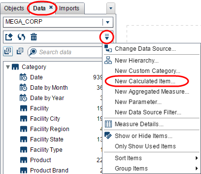
From the Data tab, use the drop-down menu and select New Calculated Item….
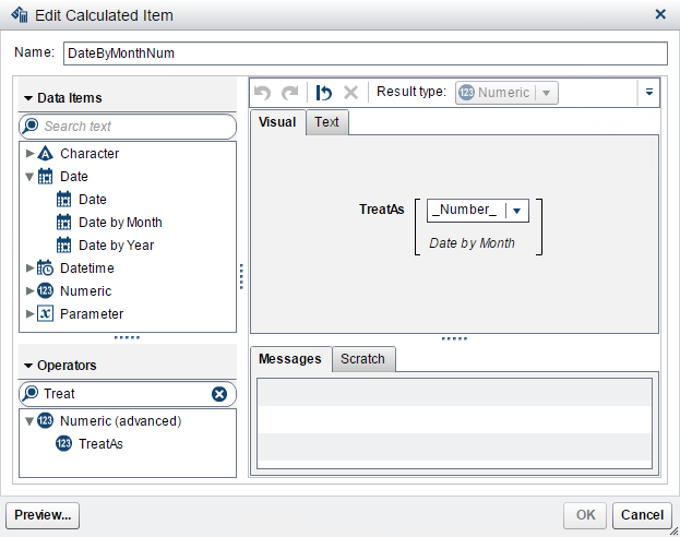
Give your new calculated data item a name.
The result type will be numeric.
Under Operators, use the search window to find the TreatAs function; then drag that onto the visual pane. For the drop-down option, select _Number_.
Finally, drag the date data item onto the visual pane. In this example, we are using Date by Month
Step 2: Change the aggregation on your new measure to be non-additive
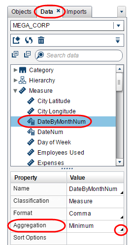
Next, we need to make sure this new metric that represents the Date by Month date is non-additive. We will not get the proper result if this new metric takes the sum or average when displayed on a visualization. To do this, navigate to the Data tab and click on the name of the new metric you created. In my example, I created a new metric named DateByMonthNum.
Toward the bottom of the Data tab are the data properties. Under the Aggregation property use the drop-down menu and select one of the non-additive metrics such as: Minimum, Median, or Maximum.
Step 3: Verify that your new measure returns the correct results
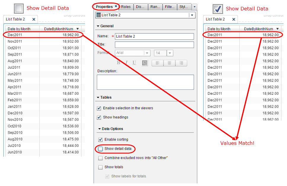
Now we can verify that when we rank our new measure, we get the expected results. To do this, I used a list table and added both the date data item Date by Month and the new metric data item DateByMonthNum. Here we can see that when I sort the metric data item by descending I get the expected results where each Date by Month value gives me a different DateByMonthNum value. I can also see that the more recent Date by Month value pairs to a larger DateByMonthNum value.
To be sure that you properly assigned a non-additive aggregation type, you can use the Show detail data property from the Properties tab. At the detail level you should see the same value pairs for the date and metric data items. Once you de-select Show detail data you should see the exact same value pairs. If you do, then you have correctly assigned your non-additive aggregation type.
Step 4: Use Rank to meet report requirements
Now that we have our metric properly created, we can use the Rank feature to display the last month’s metrics or a rolling window.
Last Month’s Metrics
In this visualization I used the Gauge Object.
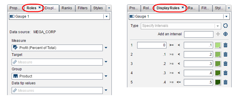
On the Roles tab, I assigned Profit to the Measure role and Product to the Group role. I then created a five interval Display Rule between 0% and 50% at 10% intervals where anything over 50% is grouped together under the darkest green rule.
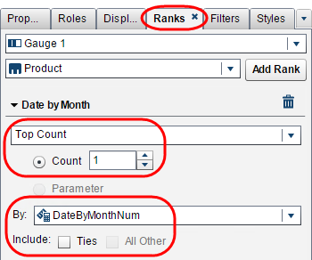
Now we must filter this visualization to display only the last month’s profit metrics; we do this by using the Rank feature. From the Ranks tab, you must first select the category data item you wish to subset by the rank. In our example, we want to display the last month’s metrics, so we will want to add a rank for the Date by Month data item. Once selected, click the button Add Rank.
Next we will need to select the metric we want to rank by. Next to the By drop-down; select our newly created metric DateByMonthNum. Then we will want to select the type of rank and how many to return. In this example, we will return the Top Count, i.e. the greatest value. And for the Count we want to return 1.
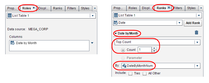
To help with the titling of the report, I added the exact same rank to a List Table object to display the data’s last month and to help report users know which month they are looking at.
Rolling 18 Month Window
The next visualization I created was a Line Chart Object plotting a rolling window of 18 month profit.
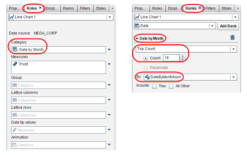
On the Roles tab, I selected Date by Month as the Category and Profit as the Measure.
On the Ranks tab, I selected the same values as I did for the list table and gauge objects, except I selected a Count of 18 to return the top 18 values of Date by Month ranked on our newly created metric DateByMonthNum. The rank will return the top 18 highest values for DatebyMonthNum which pair to the most recent 18 values for Date by Month giving us a rolling 18 month window.
Other Applications
In this example I used Rank at the month level but you could use this technique at the day level, quarter level, essentially for any supported date interval.
Assuming you have the proper data collected, you could also use Rank for the standard use of ranking the top X performing products, sales representatives or investment funds. You could also use rank to identify your bottom performing manufacturing equipment, car mileage, or school ratings.
