I was answering questions about SAS in a forum the other day, and it struck me how much easier it is to help folks if they can provide a snippet of data to go along with their program when asking others to help troubleshoot. This makes it easy to run
Uncategorized
Our colleagues at the SAS office in Korea recently had the opportunity to interview two customers from KT, one of the biggest telecommunications companies in Korea, about getting SAS certified. Sung-chul Hwang and Gyu-seob Lee both have four SAS certifications – Base Programmer, Advanced Programmer, Statistical Business Analyst and Predictive
We recently had a flooding event at Jordan Lake where the water rose almost 20 feet above normal. This blog details that flooding event in both photos and graphs. If you're intrigued by weather, boats, or lakes then this blog's for you! In NC's Research Triangle Park area, there are basically two
Have you ever found a graph of some interesting information, but the graph was difficult to understand (or even misleading). I strive to fix those graphs - this time it's a graph of US immigration data... I found the following immigration graph on the flowingdata website - it's a screen-capture of
When I am discussing my new Explaining Analytics course with analytic professionals, I frequently hear, “I have a co-worker that needs the class.” That comment is much more frequent than – “Hey I need that class.” The truth of the matter is we all need to continue to improve –
With the upcoming appointment of a new Supreme Court Justice, I wondered just how liberal and conservative previous justices have been. I found some data, and tried my hand at creating a graph to help visualize it... In my quest for data, I came upon an article on the NYTimes
When I was a kid, I remember being fascinated by the first moon landing. I probably won't ever get to explore the moon in person, but perhaps creating an interactive moon map is the next best thing! Before we get started, I wanted to share a couple of photos my co-worker
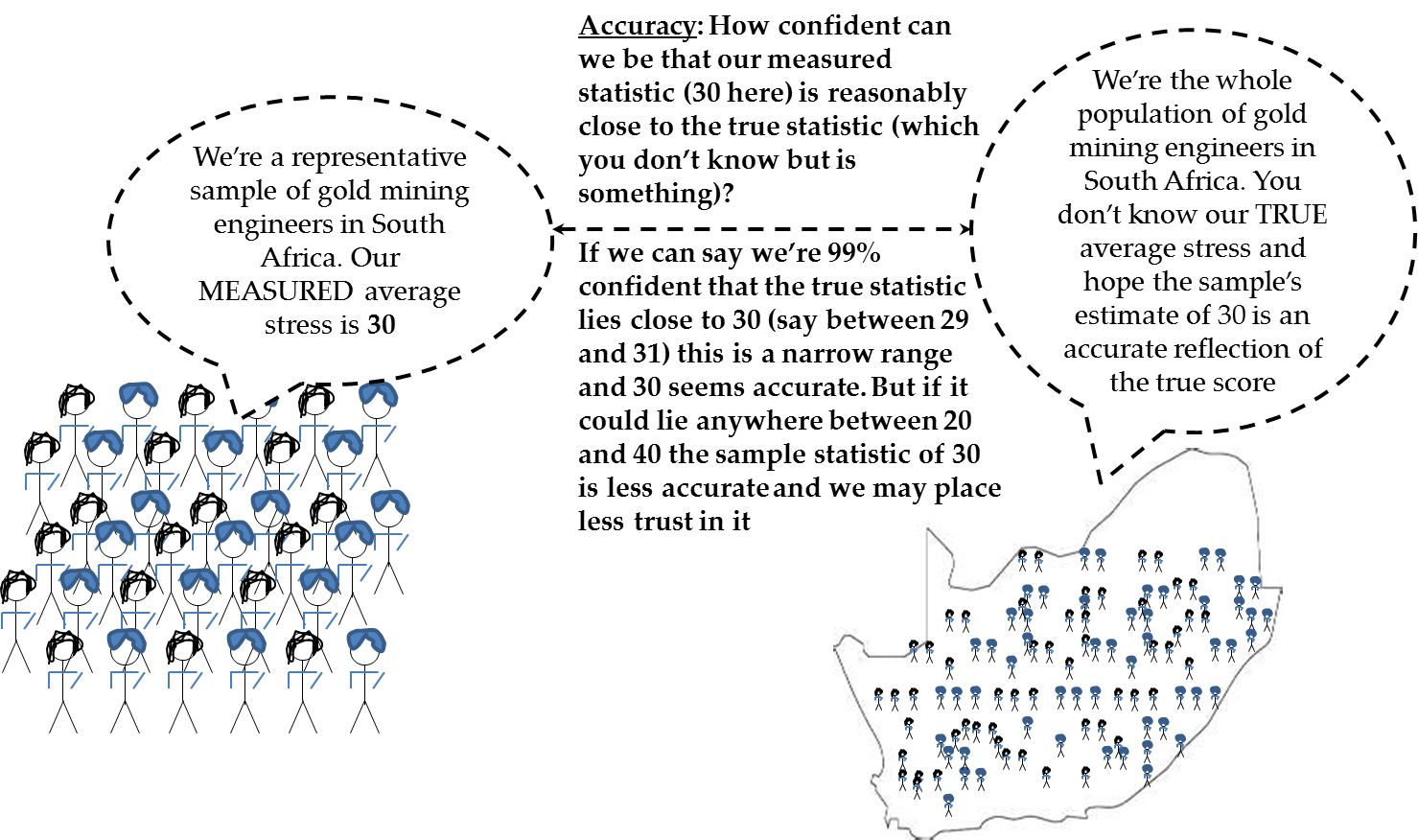
In “Explaining statistical methods to the terrified & disinterested: A focus on metaphors”, I discuss the usefulness of metaphors for explaining abstract statistical concepts to non-technical readers. This is an approach taken in my new SAS Press book, Business Statistics Made Easy in SAS®, since many readers of this level
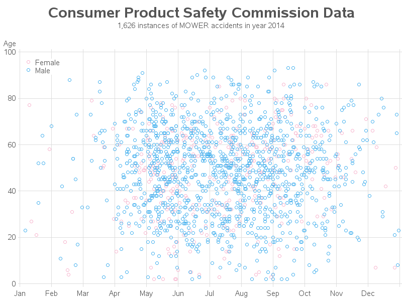
If you're a worrier, you know there's a chance you could get bitten by a shark, or hit by a piece of falling satellite debris - these events are both possible, but not probable. Getting injured by a lawn mower, on the other hand, is something that could easily happen. With
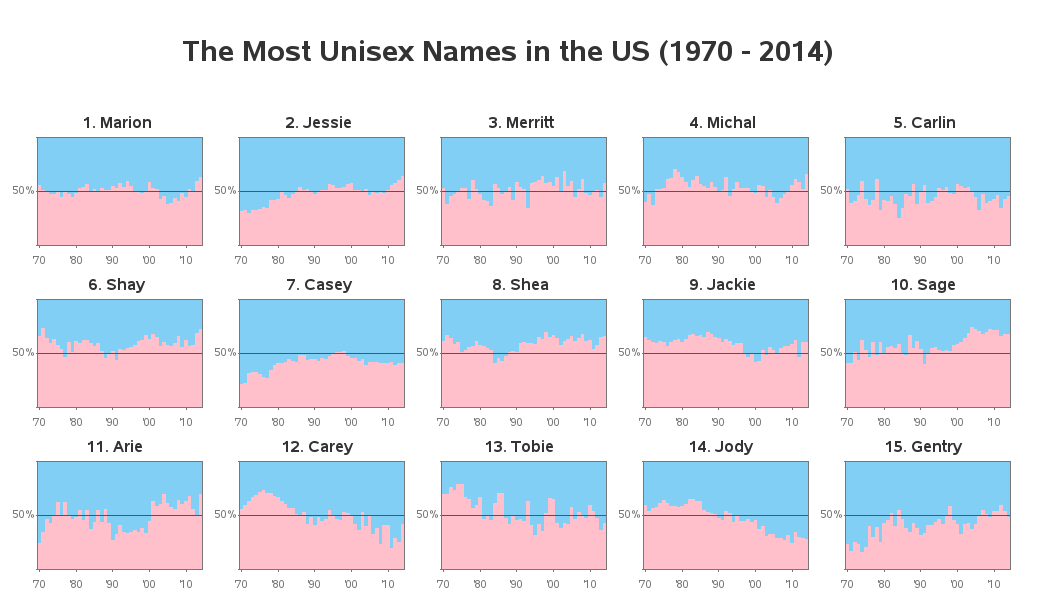
With many names, it's difficult to know whether the person is male or female. Let's use the power of analytics to determine which names are the most unisex, based on the number of boys and girls with those names. But, before we get started, here's a picture of my friend