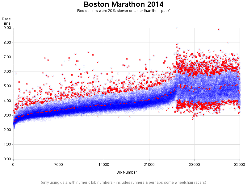
With more and more data available these days, and computers that can analyze that data, it's becoming feasible to look for fraud in events such as the Boston Marathon. So put on your detective hat, and follow along as I show you how to use SAS to be a data sleuth!
Author
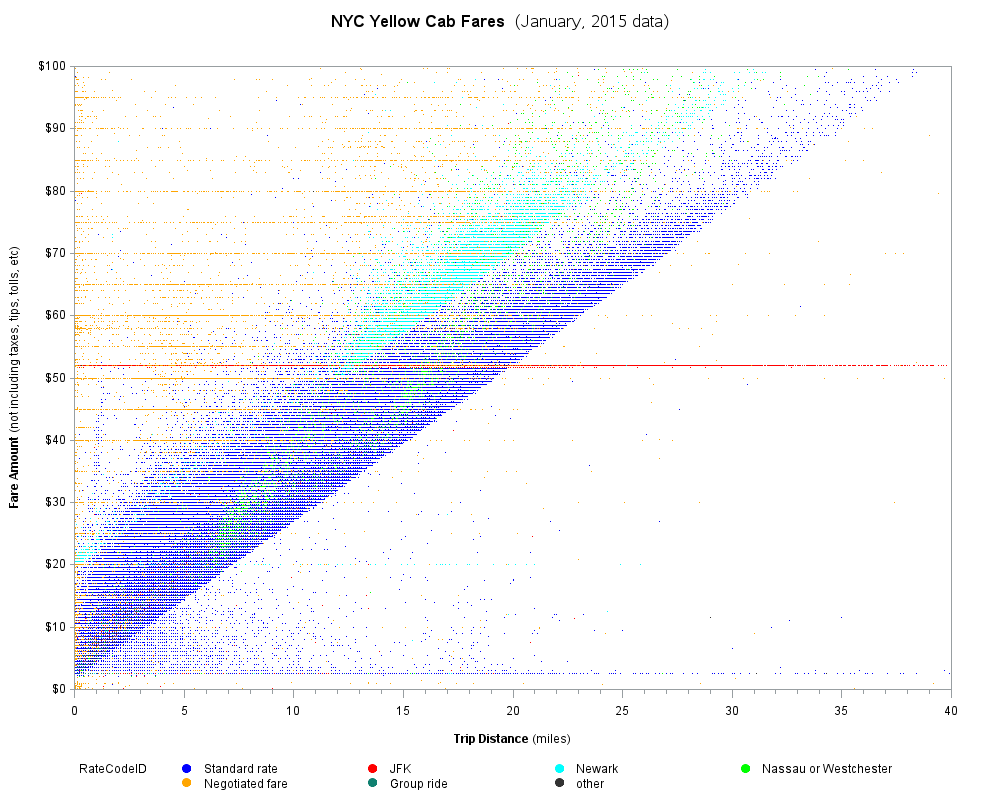
Are you afraid that if you take a ride in a taxi, you might get "taken for a ride"? If trying to figure out the reasonable price of a taxi is a bit voodoo/black-box to you, here is a SAS data analysis of over 12 million NYC Yellow Cab rides, that
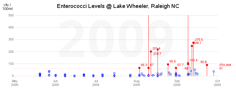
Just like my hero Mike Rowe on the Dirty Jobs TV show, I'm finally diving into an area involving water quality ... and poop! Let's take a graphical look at just how clean (or dirty) the water is, at the lake where my Raleigh Dragon Boat Club practices... Before we get
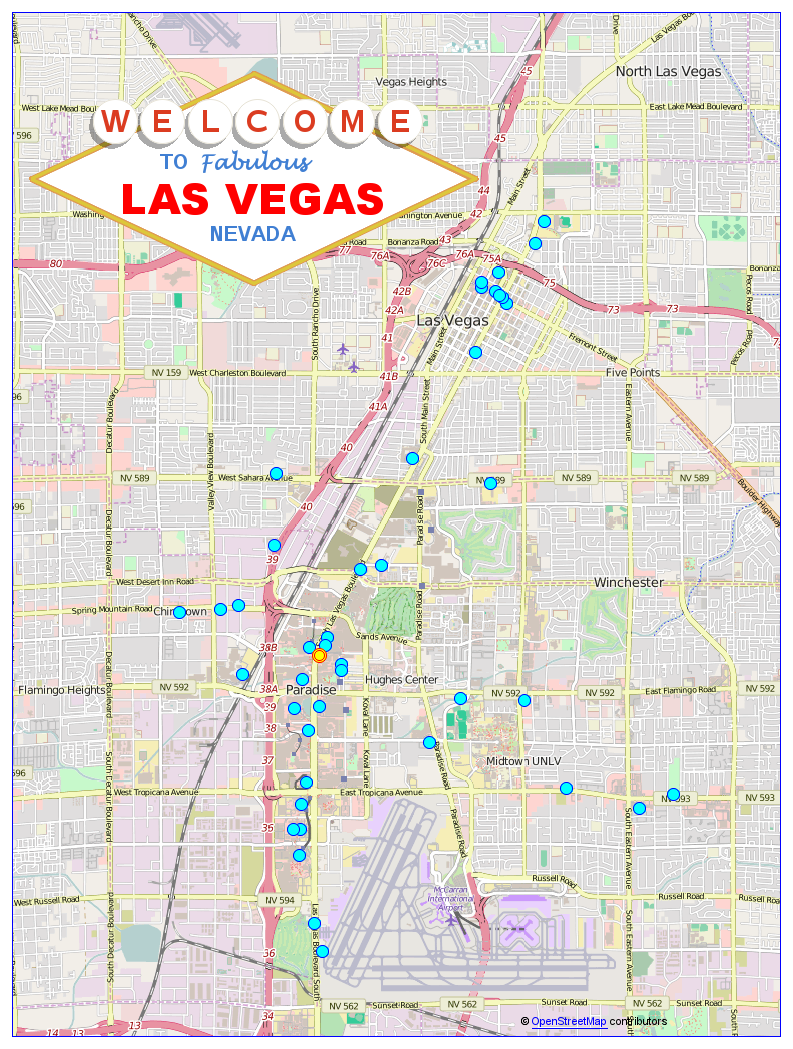
While you're at SAS Global Forum (or any conference) in Las Vegas, you might have a bit of spare time to do some sightseeing. Therefore I've put together a list & map of interesting things you might want to experience! Below is a snapshot of my map - click it
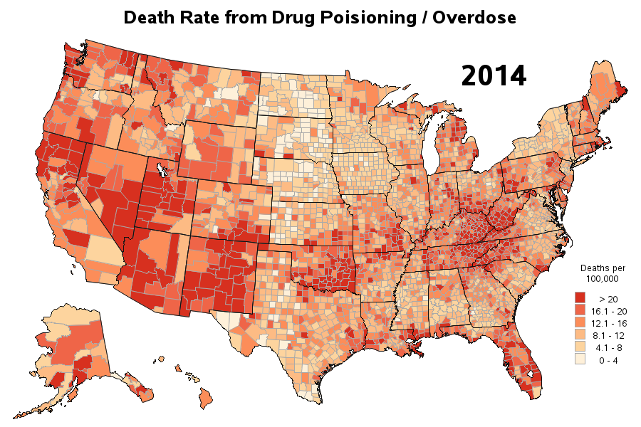
Lately I've seen several articles about drug overdose deaths being on the increase. But I didn't really like the graphs in those articles, so I tried to create some better ones using SAS ... For example, here's a map from the National Center for Health Statistics website (see the 3rd dashboard/tab
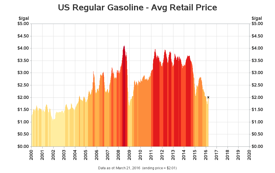
Gasoline prices are a lot lower than they've been the past few years, but the price fluctuates so much that it's difficult to tell whether you're getting a good deal. Perhaps these SAS graphs & maps will help you get a handle on it, so you'll know a good deal
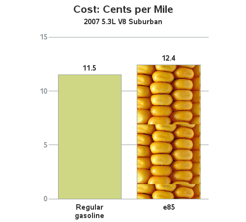
I recently bought a vehicle that has FlexFuel capability and can use E85 (mostly ethanol) fuel. But can you guess whether it is more economical for me to use E85, or regular gasoline? Read the SAS analysis below to see if you guessed right! I've been the happy owner of
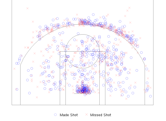
People have always been fascinated by sports statistics, and with the recent popularity of fantasy sports there is an increased demand for custom analyses of the sports data. With those folks in mind, I have created a simple example that SAS programmers can use as a starting point for analyzing NBA
We recently had a flooding event at Jordan Lake where the water rose almost 20 feet above normal. This blog details that flooding event in both photos and graphs. If you're intrigued by weather, boats, or lakes then this blog's for you! In NC's Research Triangle Park area, there are basically two
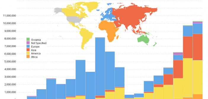
Have you ever found a graph of some interesting information, but the graph was difficult to understand (or even misleading). I strive to fix those graphs - this time it's a graph of US immigration data... I found the following immigration graph on the flowingdata website - it's a screen-capture of