According to a recent Bloomberg article, this year the United States passed Hong Kong and Singapore to become the country with the world's most competitive economy! They say, "The U.S. dethroned Hong Kong to retake first place among the world's most competitive economies, thanks to faster economic growth and a supportive atmosphere for scientific and technological innovation." This seems like a great topic for some graphs!
But before we get started, here's a picture my friend Eva made while visiting Sydney, Australia, showiung the Opera House and the Business District. Australia looks pretty prosperous here, but I wonder how well they do when it comes to competitiveness? Hopefully you'll be able to answer that question when we're done!

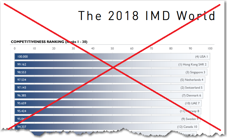
And now, let's dive into the data! The Bloomberg article I first saw contained a table of the 63 countries in the study, sorted by their competitiveness rank. Here's a screen-capture of the top of their table - it's a simple table, but a bit difficult to read, with so much spacing between the rank number and the country name:

They credited the study to the Switzerland-based IMD World Competitiveness Center. I did a few quick web searches, and soon found their page for the study, and a link to a bar chart of the results (it was actually split into 2 bar charts, on two pages of a pdf document). The bar chart gave me a better feel for how the actual scores differed, rather than just the ranks. Here's a screen-capture of the top part of the first bar chart:
But, being a Graph Guy, I had a few complaints about the bar chart.
- Their bar chart was too busy.
- What meaning did the gradient shading have? (none that I can tell)
- Showing the rank on the bar seems a little redundant.
- Showing the previous year's rank in ()'s could confuse people.
- The large and small parts of the title need to be read together to make sense, therefore why split them into two visually different pieces that make them look like they don't go together?
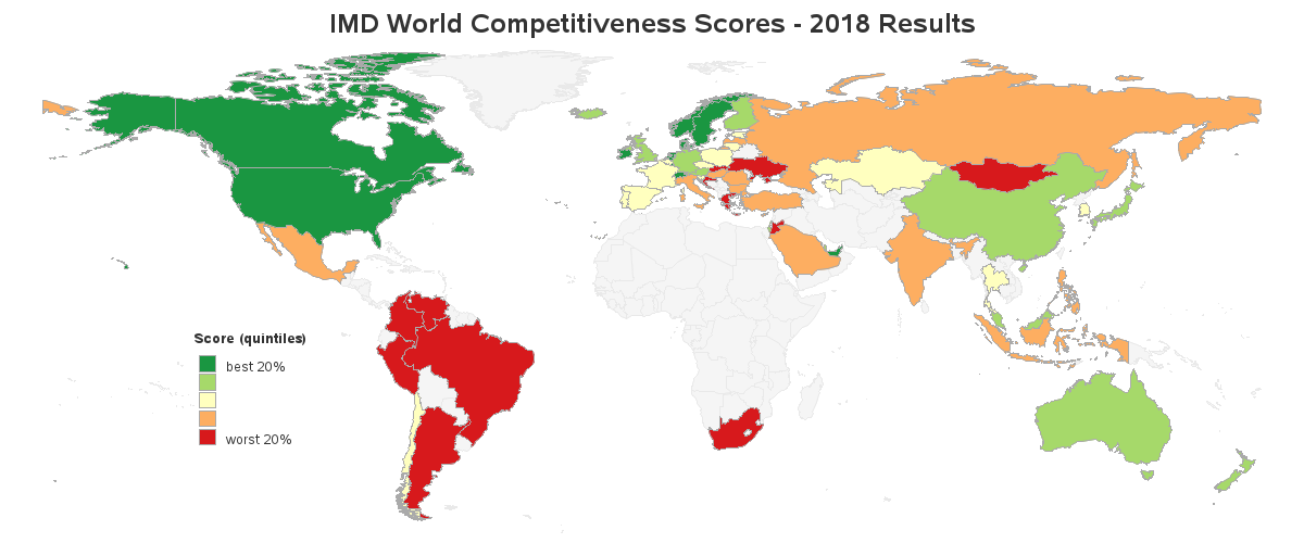
Therefore I decided to create my own visualization(s) of the data, using SAS Software. I first created a map, and colored the countries based on their competitiveness scores. This lets you quickly see if there are certain geographical areas with good, or bad, scores. It appears as though South America tends to have lower scores, and most of Africa doesn't have scores at all. I think the map helps give the user an overall feel for the data. Click the image below to see the full-size interactive version, with mouse-over text.
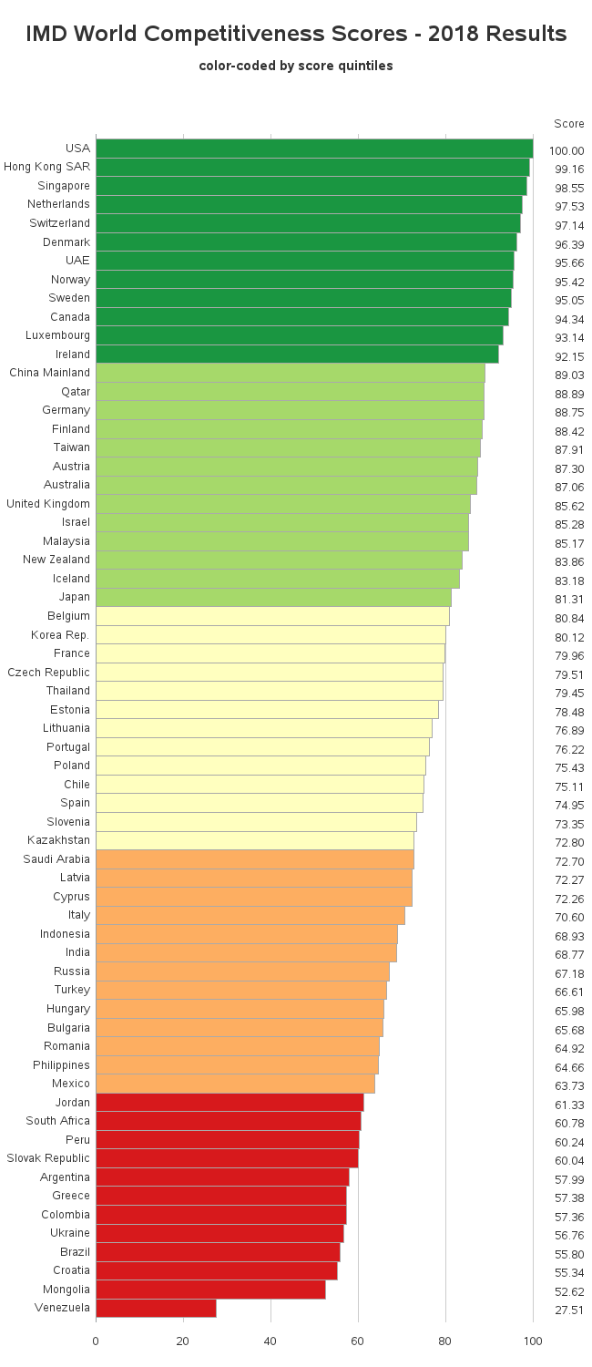
Next I created a bar chart. I tried to keep it very simple, and just focus on one thing - the competitiveness scores. I color-coded the bar chart the same as the map, so users could more easily relate between the two. Click the image below to see the interactive version, with mouse-over text.
Do these graphs give you good insight into the data? How did your country do? Do you have any suggestions for enhancements or additional graphs? Do you agree with the study results, or are there important factors they might be leaving out? Oh - and how competitive is Australia (remember the photo from earlier)? Feel free to leave a comment!

3 Comments
I realize that there is no perfect choice of projection when creating a two-dimensional map of areas that are really laid out on a sphere, but this projection might be my least favored. That stretching of upper Canada, of Russia, and of Kazakhstan is very strange. China and the USA are distorted as well. Korea ends up as East Asia rather than SouthEast Asia. Also, on the HTML-deployed map, the areas available for mouseover access are probably artificially compressed for some countries that are diminished by the expansion of the huge ones, and that makes it more difficult to identify them and get their data.
Mouseover text on the HTML-enabled map is no help when the country area is very small, such as the case here for, e.g., Hong Kong and Singapore—for which the data (but NOT the location) happens to be easy to find because they are at the top of ranked bar chart. I have long wondered whether it would be possible to “annotate” a blinking bright symbol over countries that are tiny. Since the signal would be off part of the time, the presence and size of surrounding countries would not be overlaid. When HTML-deployed, I’d want such an enhanced map to still support mouseover text for all areas, including the ones with the blinking signal annotation.
Yes - you can have an HTML mouse-over for a map with a blinking marker (via animated gif). When you create the animation, just make sure the final frame has the marker, and the html mouse-over for that final frame will stay up during the whole animation (iirc).
Luxembourg is a surprise!