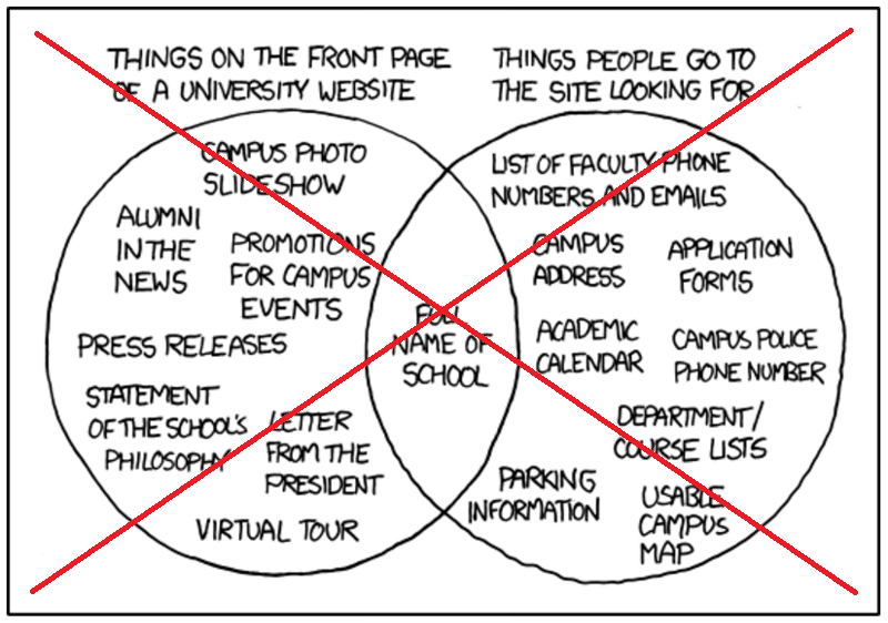
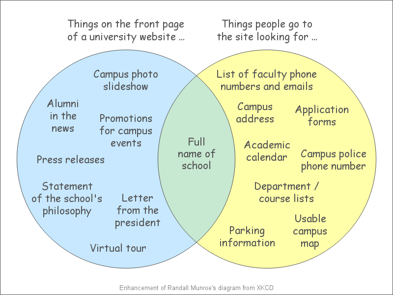
What information should you make easily available from the top page of your website? This Venn diagram might help you decide!
Have you ever gone to a website to try to find some information, and had a (expletive) difficult time trying to find that info? I think there is often a disconnect between people designing websites and the people using them - designers seem to be mainly concerned with having a certain look and using the latest technology to display a slideshow, whereas users just want to be able to find the information quickly and easily.
I found the following graphic that demonstrates this pretty well. It was designed by Randall Munroe, and his site describes itself as "A webcomic of romance, sarcasm, math, and language." I assume that being a webcomic is the reason he uses all upper case letters, but with this amount of text, I think that makes it a bit difficult to read. Also, those not familiar with Venn diagrams might not get what it's saying.
So I decided to create my own version using SAS, and make it a bit more professional, easier to read, and more intuitive. I used annotate to draw the circles, and filled them with transparent blue and yellow, so that the combined area in the middle is green (I think just about everyone will understand that green is the combination of blue and yellow, which will make the Venn diagram concept more obvious). And I used mixed case text, so it is easier to read. Since there is no built-in SAS procedure to create this plot, I hard-coded the x/y positions for each piece of text, and then annotated the text on top of the colored circles.
I think the finished graph look pretty nice!
What are some examples of good, and bad, websites you've tried to find information on? Feel free to share in a comment!


3 Comments
Are these good colors for people that are color blind?
I don't think the colors really matter in this particular graph.
But, to answer your question - I ran the graph through a webpage/filter to see what it would look like to a colorblind person, and the colors seem to be pretty easily distinguishable. I'm not sure if the URL will work in a blog comment, but here is the URL I used (in case it does work)...
http://colorfilter.wickline.org/?a=1;r=www.makeuseof.com/tag/3-easytouse-online-colorblindness-simulators;l=0;j=1;u=blogs.sas.com/content/sastraining/files/2016/07/college_website_venn.png;t=p