A recent news report shows an unexpected spike in traffic fatalities here in the US in 2015. This got me wondering what the data shows ... for the past 100 years or so...
Driving was a lot more dangerous in the early days. If you were in a wreck, you were likely to suffer terrible cuts as you flew through the windshield - or at the very least smash your head into the metal dash, or have a broken wooden steering wheel impale your chest. And of course with no seat belts, you might go flying out of the vehicle altogether!
My buddy Jerry had a hot rod 1920-something T-bucket. It recently had a mechanical problem and took him off-roading. Luckily he wasn't hurt, and he even let me sit in the wrecked car to make this staged photo:
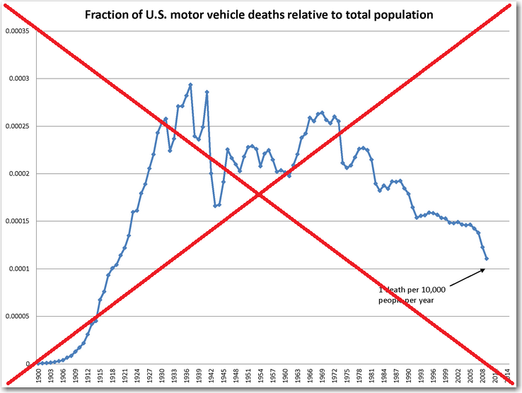
With today's safer cars, I assumed the data would show a decrease in fatalities (but I wasn't 100% sure). I found some data on Wikipedia, and they even had a graph:
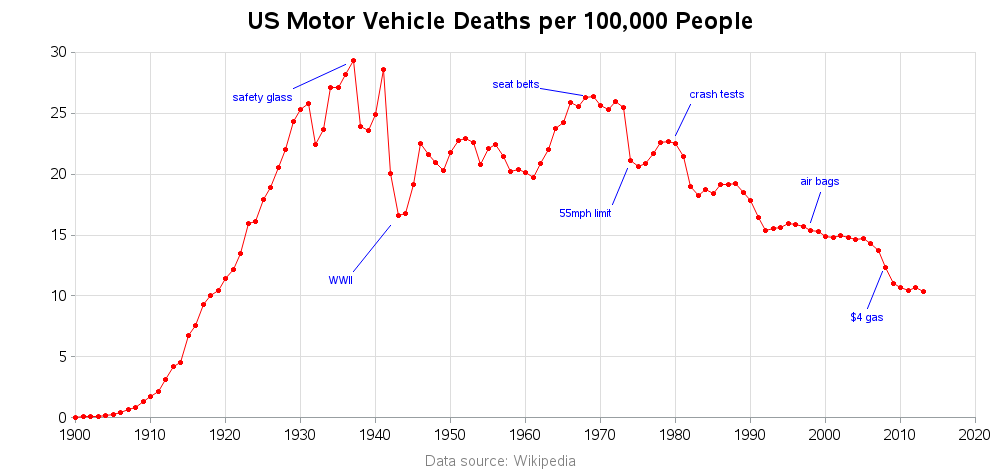
The graph seemed to show about what I expected, but upon closer inspection I found the y-axis confusing. Rather than plotting the "fraction of deaths, relative to total population," why not plot the number of deaths per 100,000 people?!?
So that's what I did in my plot. And I also labeled several events that might help explain some of the trends in the data. I think these simple improvements make the graph much more useful.
The Wikipedia data only went through year 2013, but I'm wondering why the number of fatalities in 2015 are spiking (as described in the article linked above)? One theory is that it is mainly due to distracted drivers using smartphones. Or perhaps as the price of gas has gone down, people are driving more?
What's your theory, and your prediction for the next few years?


2 Comments
Was that 100,000 people or 100,000 legal drivers?
The way the Wikipedia page labeled their table, it was "fatalities per 100,000 population".