Most powerful stories begin with people.
For IOM Uganda, that means individuals and communities uprooted by disasters and climate-driven migration. Their work sits at the intersection of uncertainty, where movement, risk and response are constantly shifting, often without a clear picture of what’s happening in real time.
When SAS Data for Good volunteers joined the effort, the goal wasn’t just to analyze data. It was to make data accessible, insightful and deeply human.
Working without a clear picture
Climate events displace thousands of Ugandans each year. Yet for many years, quality data on disasters and mobility was simply unavailable.
The challenge has always been with the data. How many people have been affected? How many people have responded? Wabwire Vincent, IOM Uganda
Without this information, even basic questions were difficult to answer. Migration data was scarce, fragmented and often not digitized, making it hard to inform national-level policy and interventions.
That meant decisions – where to send resources, how to prepare, what risks were emerging – were often made with limited visibility.
Making the data usable: Data loading, cleaning and integration
The project focused on improving data quality, harmonizing sources and enabling analysis of both disaster events and mobility patterns over time. Some variables that initially seemed useful turned out to add more noise than value, including indicators with too little variation or too many gaps.
Stripping that away made it easier to focus on what mattered.
On the one hand, IOM Uganda brought deep knowledge of migration, policy, and the realities communities face. Along the way, the team identified variables that looked promising but delivered little analytical value. These included indicators with too many zeros or insufficient variation, such as certain high-temperature thresholds, tropical night counts and infrastructure damage categories.
On the other hand, SAS teams worked to structure and make that information usable. Removing the noise was essential to ensure the signal, the real story in the data, could shine.
Seeing patterns that weren’t visible before
What emerged was a clearer way to see what had been happening over time.
The interactive dashboard brings together climate patterns, disaster severity, displacement movements, vulnerable regions and trends over time in one place. The dashboard was transformed into a set of web-based experiences, providing IOM Uganda with the insights it needed. Instead of pulling from separate reports, teams can now explore how events connect and evolve.
Opening a browser becomes a way to trace movement – where people go after disasters, which regions are repeatedly affected and how patterns shift from year to year.
For the first time, those connections are easier to follow.
Decisions, not just dashboards
That visibility starts to change how decisions are made.
Understanding which regions face recurring climate stress, how displacement evolves after events and where vulnerabilities are emerging makes it easier to act with more precision.
Food distribution, shelter decisions and resource allocation are no longer based on partial views. They’re informed by patterns that can be seen, compared and understood. It helps prevent suffering before it occurs.
For IOM Uganda, it also changes how movement is interpreted. With clearer insight into hotspot protection, IOM can better identify where people are moving, what risks they face and where interventions will make the most difference.
Predictive modeling for a safer future
The collaboration didn’t stop there.
Using long-term climate projections, land-use data and displacement trends from 2014 to 2024, the team began exploring how to anticipate what might come next.
Technology helps us to store our data and to predict future events. It’s a key tool for storing data and can also be used for forecasting, predicting future events and assessing vulnerability. Wabwire Vincent
The IOM Uganda team sees technology as essential for forecasting and preparedness in a changing climate. In other words, better data and better technology don’t just improve dashboards. They can help save time and, ultimately, lives.
Protecting the people behind the data
This kind of data comes with responsibility.
Migration and displacement data are sensitive. Not all of it is digital and not all stakeholders are comfortable sharing it. Communities need to know their data is used responsibly.
Digitalization and this technology are important for us. It will help us identify risks earlier… and deploy resources faster to affected people… to ensure that those affected by a crisis are attended to much more quickly. Hussein Bisharo Ali
Building the system requires not just technical work, but trust across ministries, agencies and communities.
Ethical considerations weren’t separate from the work. They shaped it: fairness, privacy, data protection and responsible use all became part of how the project moved forward.
-
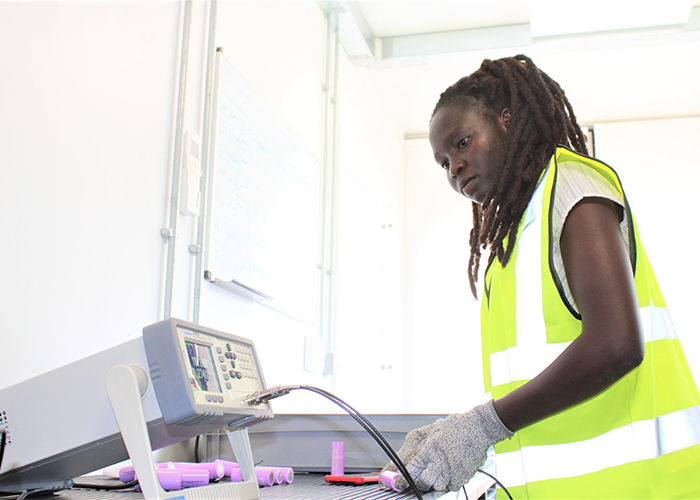
- Twenty-one-year-old Reida Moses Kiden, a technician working in the Batlab, testing battery cells for assembly. (Courtesy: IOM Uganda)
-
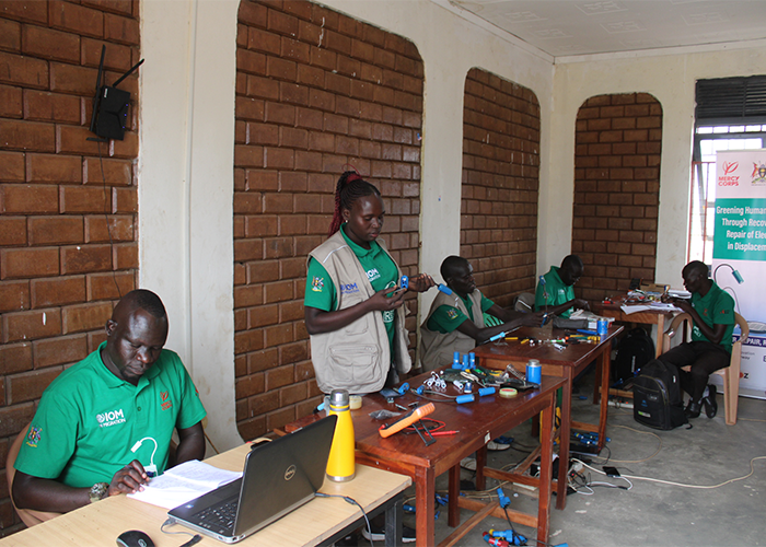
- Project technicians handling SunBell repairs at the Mercy Corps Innovation Centre, the project’s main repair centre located in Bidibidi Zone 4 Annex. (Courtesy: IOM Uganda)
-
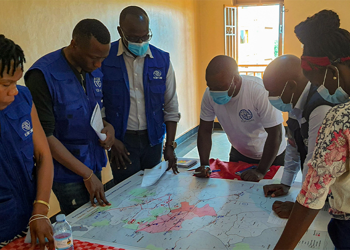
- IOM members conducting the Population Mobility Mapping (PMM) to collect preliminary information on migration routes and available social services. (Courtesy: IOM Uganda)
What this work makes possible
This story isn’t just about Uganda. It’s about what happens when passionate humanitarians and curious data scientists come together.
It proves that:
- Data can protect lives.
- Visualization can bring clarity to crises.
- Technology can amplify human compassion.
And for communities facing climate-driven risks, being seen more clearly means being supported more effectively.
A future powered by curiosity and collaboration
IOM Uganda continues to build on the data they’ve worked hard to collect, with analysis that now extends beyond individual projects.
For SAS Data for Good, the work reflects a broader idea: that data becomes most meaningful when it’s used in context, alongside people who understand the realities behind it.
Together, the partnership shows what’s possible when humanitarian experience and analytical curiosity come together.
Not a perfect system. Not a finished solution.
But a clearer way forward.