Communications

Data Visualization | Learn SAS | Programming Tips
Sanjay Matange 0
Spark table

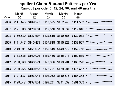
In the previous post, I discussed creating a 2D grid of spark lines by Year and Claim Type.  This graph was presented in the SESUG conference held last week on SAS campus in the paper ""Methods for creating Sparklines using SAS" by Rick Andrews.  This grid of sparklines was actually the
Data Visualization | Learn SAS | Programming Tips
Sanjay Matange 0
Long category values

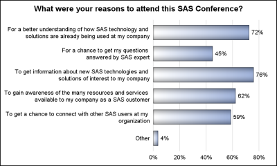
The South East SAS Users Group meeting wound up yesterday.  The 25th anniversary conference was held on SAS Campus and it provided a great opportunity to meet with many enthusiastic SAS users and attend many informative presentations.  More on this in a follow-up article. During one of these presentations, Mary

Data Visualization | Learn SAS | Programming Tips
Sanjay Matange 0
Legend items

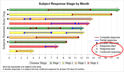
Plot statements included in the graph definition can contribute to the legend(s).  This can happen automatically, or can be customized using the KEYLEGEND statement.  For plot statements that are classified by a group variable, all of the unique group values are displayed in the legend, along with their graphical representation

1 72 73 74 75 76 83