Find out how analytics, from data mining to cognitive computing, is changing the way we do business
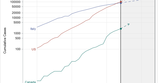
Estimates of doubling time for exponential growth

During an epidemic, such as the coronavirus pandemic of 2020, the media often shows graphs of the cumulative numbers of confirmed cases for different countries. Often these graphs use a logarithmic scale for the vertical axis. In these graphs, a straight line indicates that new cases are increasing at an