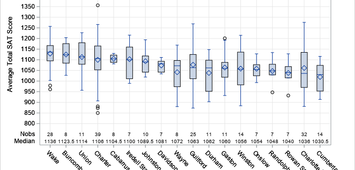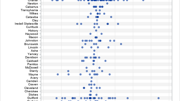
Years ago, I wrote an article about how to create a Top 10 table and bar chart. The program can be trivially modified to create a "Top N" table and plot, such as Top 5, Top 20, or even Top 100. Not long after the article was written, the developer
Tag: Data Analysis
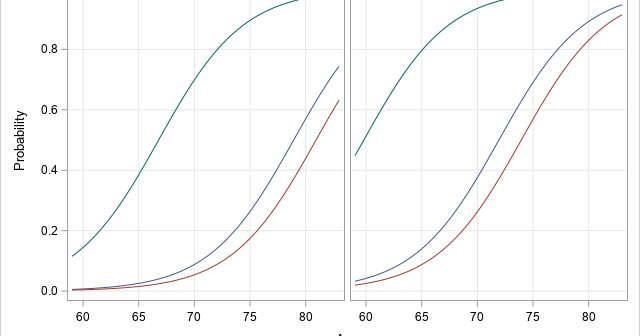
A previous article showed how to use a calibration plot to visualize the goodness-of-fit for a logistic regression model. It is common to overlay a scatter plot of the binary response on a predicted probability plot (below, left) and on a calibration plot (below, right): The SAS program that creates
In my article about how to construct calibration plots for logistic regression models in SAS, I mentioned that there are several popular variations of the calibration plot. The previous article showed how to construct a loess-based calibration curve. Austin and Steyerberg (2013) recommend the loess-based curve on the basis of
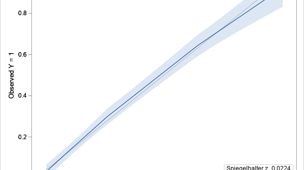
A logistic regression model is a way to predict the probability of a binary response based on values of explanatory variables. It is important to be able to assess the accuracy of a predictive model. This article shows how to construct a calibration plot in SAS. A calibration plot is
Order matters. When you create a graph that has a categorical axis (such as a bar chart), it is important to consider the order in which the categories appear. Most software defaults to alphabetical order, which typically gives no insight into how the categories relate to each other. Alphabetical order
Some say that opposites attract. Others say that birds of a feather flock together. Which is it? Phillip N. Cohen, a professor of sociology at the University of Maryland, recently posted an interesting visualization that indicates that married couples who are college graduates tend to be birds of a feather.
SAS programmers on SAS discussion forums sometimes ask how to run thousands of regressions of the form Y = B0 + B1*X_i, where i=1,2,.... A similar question asks how to solve thousands of regressions of the form Y_i = B0 + B1*X for thousands of response variables. I have previously
You've probably heard about the "80-20 Rule," which describes many natural and manmade phenomena. This rule is sometimes called the "Pareto Principle" because it was discovered by Vilfredo Pareto (1848–1923) who used it to describe the unequal distribution of wealth. Specifically, in his study, 80% of the wealth was held
Correlation is a statistic that measures how closely two variables are related to each other. The most popular definition of correlation is the Pearson product-moment correlation, which is a measurement of the linear relationship between two variables. Many textbooks stress the linear nature of the Pearson correlation and emphasize that
One of my favorite magazines, Significance, printed an intriguing image of a symmetric matrix that shows repetition in a song's lyrics. The image was created by Colin Morris, who has created many similar images. When I saw these images, I knew that I wanted to duplicate the analysis in SAS!