Last week Warren Kuhfeld wrote about a graph called the "lines plot" that is produced by SAS/STAT procedures in SAS 9.4M5. (Notice that the "lines plot" has an 's'; it is not a line plot!) The lines plot is produced as part of an analysis that performs multiple comparisons of
Tag: Data Analysis
Correlations between variables are typically displayed in a matrix. Because the correlation matrix is determined by the order of the variables, it is difficult to find the largest and smallest correlations, which is why analysts sometimes use colors to visualize the correlation matrix. Another visualization option is the pairwise correlation
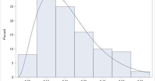
If you perform a weighted statistical analysis, it can be useful to produce a statistical graph that also incorporates the weights. This article shows how to construct and interpret a weighted histogram in SAS. How to construct a weighted histogram Before constructing a weighted histogram, let's review the construction of
How can you specify weights for a statistical analysis? Hmmm, that's a "weighty" question! Many people on discussion forums ask "What is a weight variable?" and "How do you choose a weight for each observation?" This article gives a brief overview of weight variables in statistics and includes examples of
Pearson's correlation measures the linear association between two variables. Because the correlation is bounded between [-1, 1], the sampling distribution for highly correlated variables is highly skewed. Even for bivariate normal data, the skewness makes it challenging to estimate confidence intervals for the correlation, to run one-sample hypothesis tests ("Is
If you use SAS regression procedures, you are probably familiar with the "stars and bars" notation, which enables you to construct interaction effects in regression models. Although you can construct many regression models by using that classical notation, a friend recently reminded me that the EFFECT statement in SAS provides
Correlation is a fundamental statistical concept that measures the linear association between two variables. There are multiple ways to think about correlation: geometrically, algebraically, with matrices, with vectors, with regression, and more. To paraphrase the great songwriter Paul Simon, there must be 50 ways to view your correlation! But don't
A previous article discussed the mathematical properties of the singular value decomposition (SVD) and showed how to use the SVD subroutine in SAS/IML software. This article uses the SVD to construct a low-rank approximation to an image. Applications include image compression and denoising an image. Construct a grayscale image The
Visualizing the correlations between variables often provides insight into the relationships between variables. I've previously written about how to use a heat map to visualize a correlation matrix in SAS/IML, and Chris Hemedinger showed how to use Base SAS to visualize correlations between variables. Recently a SAS programmer asked how
When someone refers to the correlation between two variables, they are probably referring to the Pearson correlation, which is the standard statistic that is taught in elementary statistics courses. Elementary courses do not usually mention that there are other measures of correlation. Why would anyone want a different estimate of