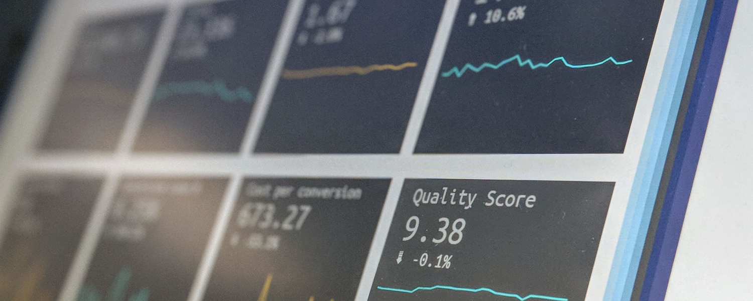
"Senior managers adore their dashboards. Are they really capable of understanding what they indicate? I have my doubts!" And so do many dashboard developers. Had they not, though, invested a huge amount of workdays for creating very sophisticated tools a few years ago? You remember? In those days business intelligence was all about dashboards. Everyone wanted a dashboard to display information about their business. As analytics improved, dashboards got more detailed and the visual display got better, allowing better drill-down into detail. They also started to draw on real-time information. Somewhere along the line, however, quite a lot of people seemed to forget that it isn’t really about the dashboard itself. It’s actually about how you use it.
It’s a mistake to believe that dashboards themselves deliver business value. All they do is provide information. They might give you an overview, insight, perspectives and even food for thought – but first of all, they require a lot of effort to get them right. It's a huge effort to create them and make them look good, and then you also have to build trust in them. And to do that, you need to be able to explain what they really mean, in a way that people will understand, so that they will be prepared to use the information to drive business decisions. Dashboards are hard work.

What counts is what’s measured
Remember Peter Drucker? “If you can't measure it, you can't improve it.” Sometimes this is quoted as “you can't manage what you can't measure,” or even “what counts is what’s measured.” Measurement is crucial to performance. With the rise of big data, however, it turned out that we could measure pretty much everything. Sometimes we could do it even without realising (remember those examples of measuring success by analysing the lift (elevator) logs to show when people were entering and leaving the office?). But did all this analysis mean we were managing better?
Management means taking decisions. If you believe in fact-based management, you know that you need to collect data, and then aggregate it. So that’s what we created dashboards to do: collect all the machine-made data, in all its huge volume, and then boil it down to something that we could actually understand. We automated the data collection process – but we couldn’t automate the decisions. All we could do was make them easier for managers.
The main feature of a dashboard is – or should be – that it can drill down to the level of detail that enables managers to act. In other words, it is there to support managerial decisions. For example, you cannot act on the overall growth figure for one region. You need to drill down to see what’s happening at the level of individual sales teams. What this means in practice, however, is that the dashboard itself is worthless. If it shows high-level information, it does not support managerial decisions.
Squaring the circle
There are two strategies to solve this, and both of them take us beyond the standard dashboard software that most people will recognise. They are:
- A weak solution. Take dashboards to the next level. Instead of focusing on more accurate numbers for every detail, change the output to show an interpretation of the data. In other words, the dashboard starts to tell you what is happening and the likely impact. We might even get to the point where an AI-based algorithm can propose a strategy by looking at historical data: “A similar situation in another region two years ago was solved by increasing marketing spending by 20%.”
- A strong solution. Move towards automated decisions. In the past, we have automated data collection and analysis. It is coming to the time when we need to enable our IT systems to start to make autonomous decisions. In other words, we must move from intelligent dashboards to intelligent decisioning systems.
