I promised in my previous post on automated segment comparisons that I would reveal more about how SAS measures differences between segment profiles. To recap, we wanted to have a method that would determine:
- If two segments are different in a meaningful way.

- By how much?
- What descriptive attributes best characterize this difference?

The segment comparison feature in SAS Customer Intelligence 360 uses sophisticated techniques to presents the marketer with easy-to-understand summaries. For example, the degree of difference is converted into a descriptive text label – very different, somewhat difference and not different. Being able to see at a glance which attributes most distinguish a segment leads to actions – such as targeting or testing ideas.
Read on to discover how we did this. I apologise in advance if there is some math in the post, and it is not necessary to understand the concepts. I just wanted to whet the appetites of anyone who might be interested in more of the details.
And whichever method I chose, I wanted the methodology to relate in a simple way to what a marketer would see if they visualized the segment profiles side by side. If you read the previous blog post, you will remember I chose the “Earth Mover Distance” to compare numerical attributes across segment profiles.
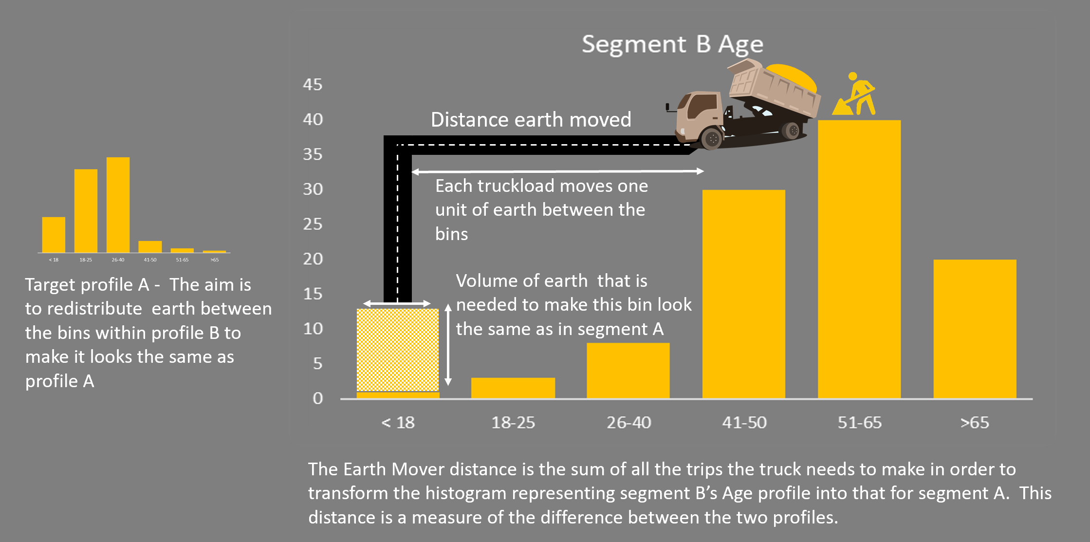
The figure above gives a qualitative explanation of how the Earth Mover Distance is calculated. The previous post did not address how the calculation works, neither did it address how to measure differences for categorical variables.
What about categorical attributes?
The earth mover approach will not work here because, for example, asking how far the distance between marital statuses single or divorced does not make sense. For categorical attributes, I turn to a more familiar measure of similarity, the chi-squared test, which has the advantage that you can express it as a formula. This formula is given below for those who are interested. What it means in practice is that the more the counts between the same bins in the two profiles differ, the greater the ‘distance’. For example, if segment A has 25 percent in the 26-40 age bracket and segment B has 50 percent then this distance will be greater than if both had 25 percent.
If you are interested, the distance formula for a specific categorical attribute, with N bins is:
 SegA represents the size of a given bin of the segment A profile expressed as a percentage. The sum is over all the N bins of the attribute.
Earth mover approach
Returning to numerical attributes and the dump truck diagram, the task at hand is to figure out how much work it takes (how far you must drive) to transform the pile of dirt representing segment B’s profile into that for segment A. But, if you think about it, it’s not a simple problem and that there are infinite ways you can do this. Each of these would have a different cost or distance associated with them.
So how can a calculation with many possible answers be useful as a comparative measure?
As the truck driver, you’d probably want to complete this task in as short a time as possible (assuming you are paid by the job rather than by the hour!). In other words, find the solution that minimizes the distance measure. This is an optimization problem, and is an area where SAS has class-leading technology. Of course, you do not want to expose the marketer to operations research theory, so you have hidden the details behind business functionality. Here I will reveal some of the details, so you can get a glimpse of how the problem is solved in practice.
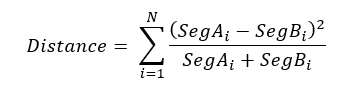
You see how this works in the diagram above. This shows two segment comparisons for age (a binned numeric, so we can still construct a ‘distance’ based on bin boundaries or bin averages). Visually one would see that the differences are greater in the comparison on the right than the one on the left. In both cases 25 percent of the volume needs to be moved to make the profiles identical. But that earth must be moved further in the right-hand comparison than in the left.
In principle, the dirt can move from any bin to any other bin, and the cost of moving the dirt considers the distance that it moves. For example, if you have to move 25 units of dirt from the > 65 bin to the 18-25 bin, then it has the same cost as moving the dirt from > 65 to the 51-65 bin first, then to the 41-50 bin, from there to the 26-40 bin and finally to the 18-35 bin.
One of the segment distributions stays fixed, and that distribution represents the demand at each bin (or vertex, if you want to think of it as a graph). The other segment distribution represents the supply at each bin. There’s an arc between every pair of bins, and each arc has a cost of moving 1 unit of dirt across that arc –the cost represents the distance between the bins.
This is a flow optimization problem, and you can solve it by minimising the cost flow using SAS Proc OPTMODEL. Put simply, you figure out the overall route corresponding to the lowest cost way to move the earth. The total length of this route is the Earth Mover Distance.
Like-for-like comparison
Now you have an objective measure of difference for each attribute. Well, you actually have two measures, one for numeric and one for categorical classes of attribute. And neither are comparable within a class or between classes. This is obviously a challenge because comparing between classes and variables is exactly what you need to do.
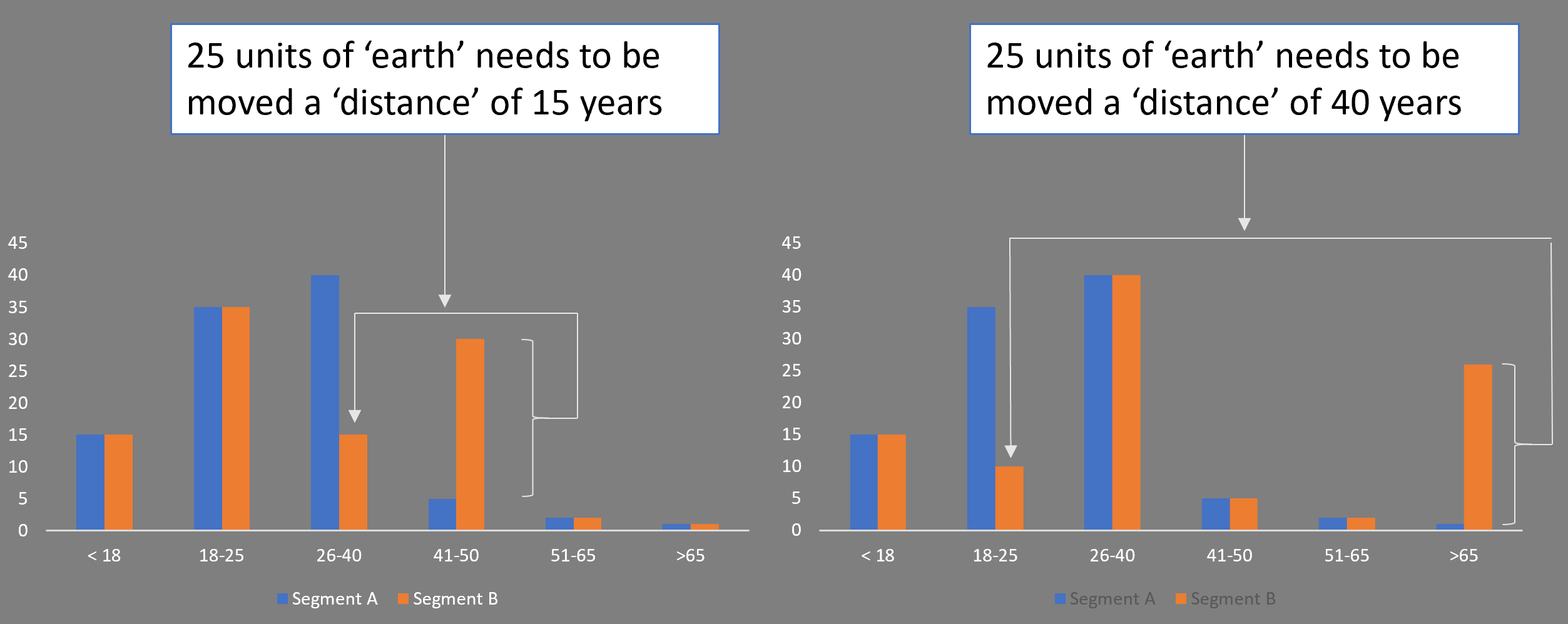
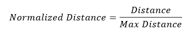
The answer is to construct a normalized scale, so they are based on a common measure, which we do in the following way. For each pair of profiles, A and B, that you are comparing, you consider a hypothetical profile that is as different as possible to B, work out the Earth Mover Distance or chi-squared distance, as appropriate, and use the result to normalize the measured A, B comparison. Thus, the distance is always a number between 0 (identical) and 1 (extreme difference).
This is repeated for each profiling attribute common to the two segments being compared and the overall result is combined to come up with a simple-to-understand textual label indicating the degree of difference.
The question is what exactly is the worst case (most different) profile? For simplicity, I used the entire population concentrated in the smallest bin or category of the original. In the following diagram, I am comparing segments A and B using a numeric profile attribute. The Earth Mover Distance that makes segment B look most like A is then normalized by taking the hypothetical distribution (blue) and working out the Earth Mover Distance that transforms this to A.
Categorical attributes proceed in a similar way, except that the smallest category by population could be anywhere in the bar chart. In this case the worst case (most different) hypothetical profile to segment B would be that which has all its population in the bin with the smallest percentage. Again, the formula below is given for completeness, the diagram above explains the concepts behind the argument.
This hypothetical maximum distance is given by:
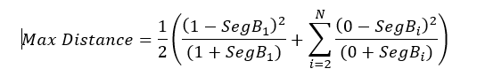 In the above calculation, bin 1 has the smallest population (which is assumed to have a 100 percent population for the worst-case calculation). The normalized distance becomes:
Putting it all together
Now you can compare differences between segment profiles for all attributes, regardless of type. You have a number for each attribute in the profile comparison. Summing these numbers gives an idea of the overall degree of difference. Sorting by these numbers shows which attributes contribute most to the difference.