 When it comes to the SAS web experience on sas.com, support.sas.com (and more), we have a vision and mission to create experiences that connect people to the things that matter – quickly, easily and enjoyably. You could say that we’re a user-task-focused bunch of web people here, and so whether you’re a web visitor to SAS researching a solution area or evaluating a product, looking for how-to content or applying for a job, our goal is to make sure you complete that task easily.
Using tools like SAS Customer Intelligence 360 helps us do this by allowing us to take the guesswork out creating the most optimized web experiences possible through it's A/B, multi-arm bandit, and multivariate testing capabilities.
A/B testing? Yes, I know. In a world where AI, machine learning, omnichannel marketing and analytics and more is all the rage – and for good reason – don’t lose sight of the power and impact of good old fashioned a/b and multivariate testing.
The power of small in a big customer journey
If you think of your website as a product, and think of that product as being comprised of dozens, maybe hundreds of small interactions that users engage with – imagery, video, buttons, content, forms, etc. – then the ability to refine and improve those small interactions for users can have big impact and investment return for the product as a whole. Herein lies the beauty of web testing – the ability (really art and science) of taking these small interactions and testing them to refine and improve the user experience.
So what does this look like in real life, and how to do it with SAS Customer Intelligence 360?
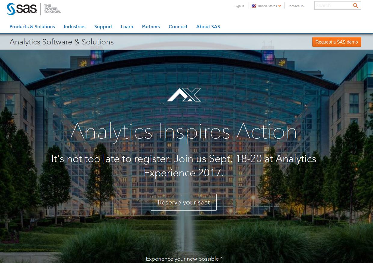
On the top right corner of the sas.com homepage we have a small “sticky” orange call-to-action button for requesting a SAS demo. We like to test this button.
A button test? Yes, I know – it doesn’t get much smaller than this, which is why I affectionately refer to this particular button as “the little button that could.” It’s small but mighty, and by the end of this year, this little button will have helped to generate several hundred demo and pricing requests for sales. That’s good for SAS, but better for our site visitors because we’re helping to easily connect them with a high-value task they’re looking to accomplish during their customer journey.
How do we know this button is mighty? We’ve tested a ton of variations with this little guy measuring CTR and CVR. It started off as a “Contact Us” button, and went through a/b test variations as “Connect with SAS” “How to Buy” “Request Pricing” as we came to realize what users were actually contacting us for. So here we are today with our control as “Request a SAS Demo>"
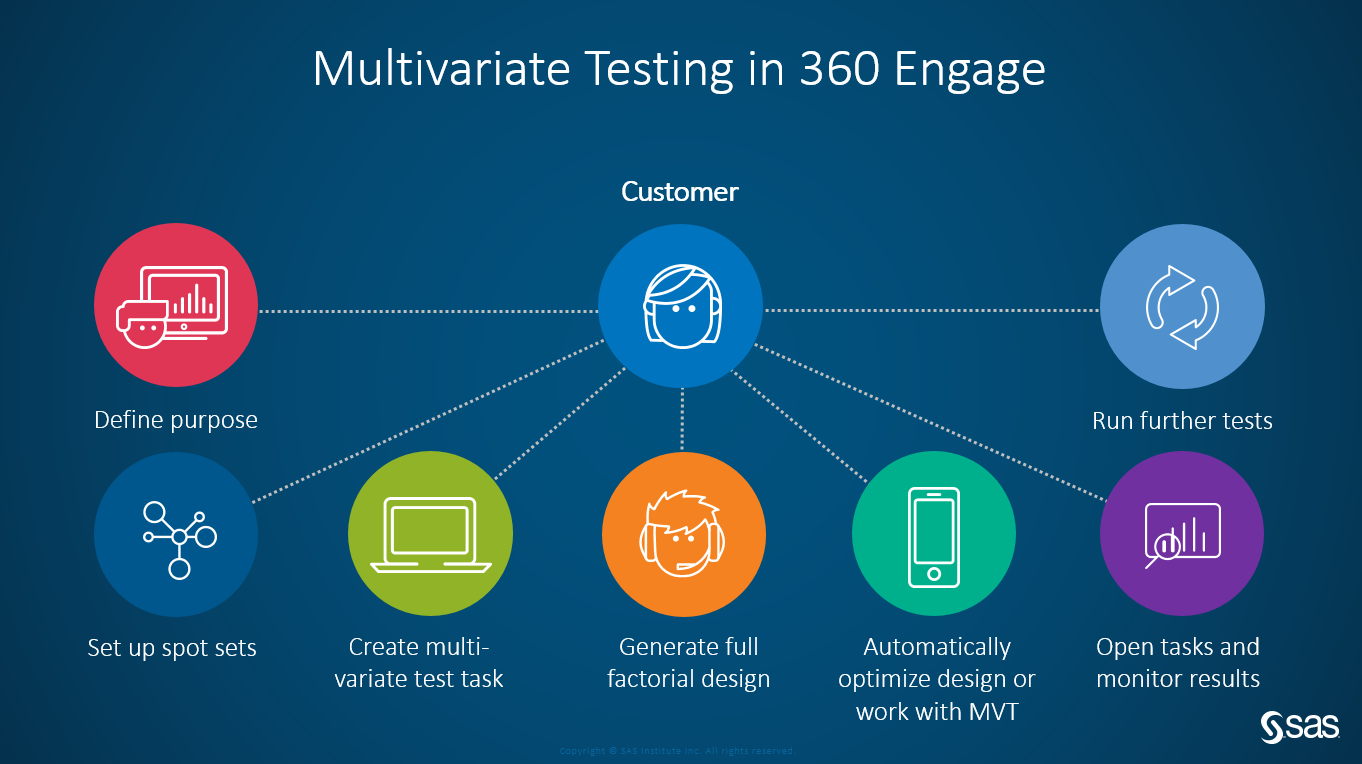
Setting up a simple a/b test like this literally takes no longer than five minutes in SAS Customer Intelligence 360. Here's how:
- First, you set up a spot. A spot is the place or element on a designated web page that we'll test. For this test, the spot we set up is on the sas.com homepage and is the top-right CTA orange button.
- Next, you build your message or creative.
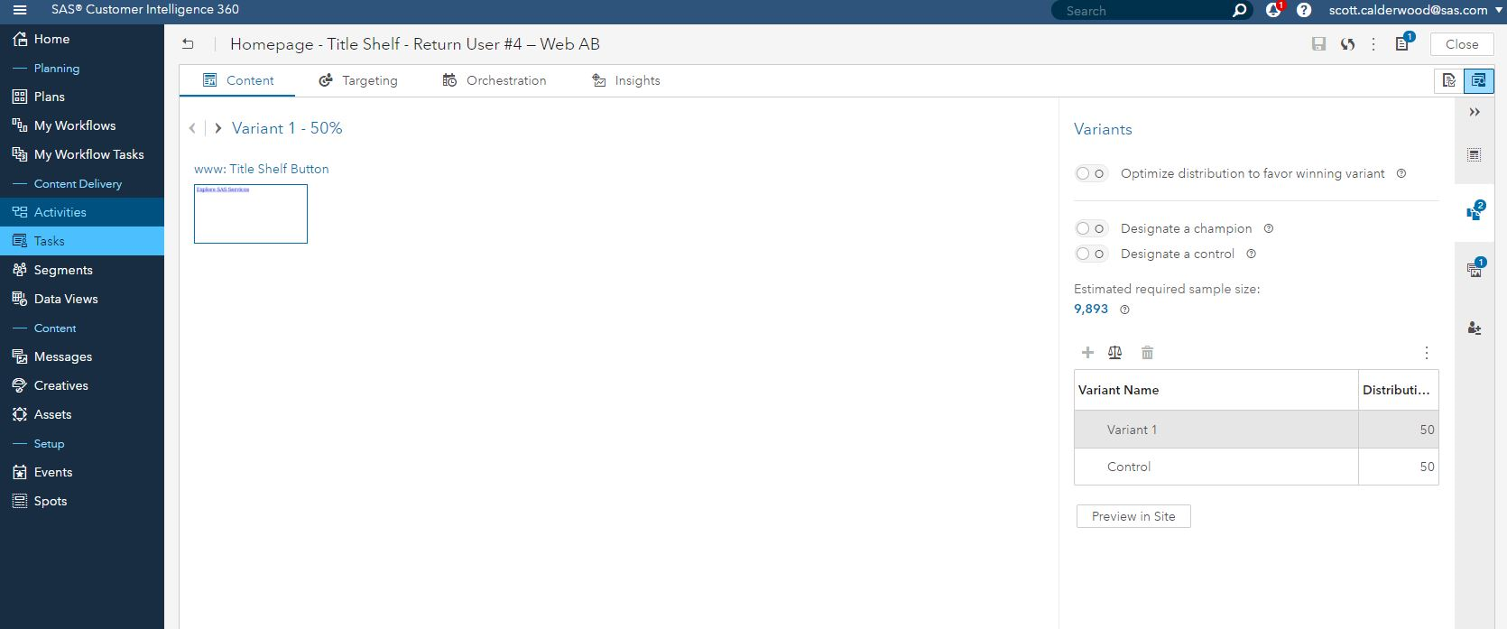
- Finally, you create your task. This is where we set the rules for our a/b test.
Easy breezy. Activate it, let it run, get statistical significance, declare a winner, optimize, rinse and repeat.
Now, add segmentation targeting to the mix
So now let’s take our testing a step further. We’ve tested our button to where we have a strong control, but what if we now refine our testing and run a test targeted to a particular segment, such as a “return user” segment to our website - and test button variations of Request a SAS Demo vs. Explore SAS Services.
Why do this? The hypothesis is that for new users to our site, requesting a SAS demo is a top task, and our control button is helping users accomplish that. For repeat visitors, who know more about SAS, our solutions and products – maybe they are deeper in the customer journey and doing more repeat research and validation on www.sas.com. If so, what might be more appropriate content for that audience? Maybe it’s our services content. SAS has great services available to SAS users - such as Training, Certification, Consulting, Technical Support, and more. Would this content be more relevant for a return user on the website that's possibly deeper in the research and evaluate phase, or maybe already a customer? Let's find out.
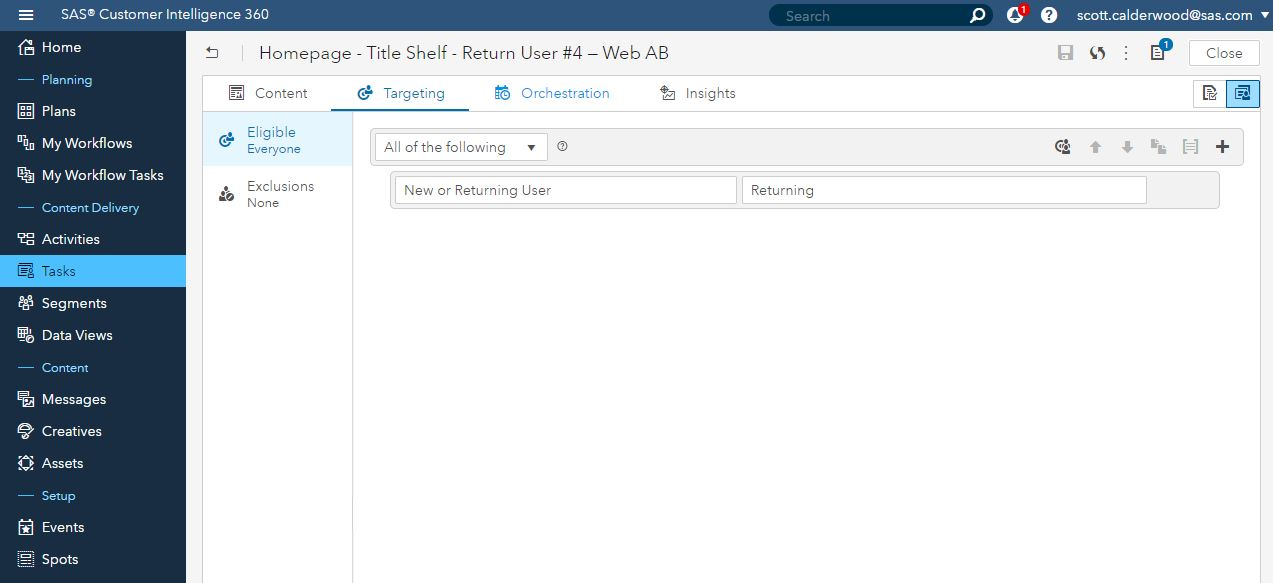
Setting up this segmentation a/b test is just like I noted above – you create a spot, build the creative, and set up your task. After you have set up the task, you have the option to select a “Target” as part of this task, and for this test, we select "New or Return User" as the criteria from the drop down, and then "Returning" as the value. Then just activate and see what optimization goodness takes place.
So, how did our test perform?
I'll share results and what we learn from this test in the upcoming weeks. Regardless of the results though, it's not really about what variation wins, but rather it's about what we learn from simply trying to improve the user experience that allows us to continue to design and build good, effective, optimized user experiences. Tools like SAS Customer Intelligence 360 and its web testing and targeting capabilities allow us to do that faster and more efficiently than ever.


1 Comment
How many variants in a multi-v test is there a capability to test on?