How often does a graph change the world? In 1854, Doctor John Snow produced a map to plotter cholera cases by drawing on a London map a bar for each reported death. Until then, it was believed that cholera was spread by miasma in the air, however, transmission method has not been confirmed and the sudden outbreak of cholera in London’s Soho was a big mystery. So Snow did something data journalists often do now: he mapped the cases. It was then that it became apparent that the cases were clustered around the pump in Broad (now Broadwick) street.

This graph is one of the examples that changed how we see data visualizations. But how, we perceive the power within the data today and how we make reality visible through data visualization?
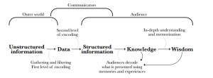
“In the early 1970s, years before access to the Internet was universal, Richard Saul Wurman, predicted that the oncoming information explosion would require the intervention of a new breed of professionals trained in organizing data and making sense out of it. According to Wurman, the biggest challenge our species was about to face was to learn how to navigate the upcoming tsunami of bits that was cresting the horizon” (Cairo, 2013). In this context, data visualization provides a mean of navigating to large amounts of data. The below model explains what visualization and graphs are about.

Unstructured information means reality, the world out there is organized in bits spinning around and coming to us in all the possible ways. Data are the records of this information that are encoded to structured information. This is the level that data visualization comes into the picture to enable the data communicators to give shape to data so that relevant patterns will become visible to the information consumers. Information consumption from structured information can lead to higher knowledge on the part of the audience. The role of the data visualization expert in this phase is to anticipate this process and generate order before people’s brains try to do it on their own. Finally, wisdom is reached when we combine a deep understanding of the acquired knowledge, we blend new information with prior experience.
The way the human brain perceives knowledge makes the use of charts and graphs into visualizing large amounts of complex data easier than poring over spreadsheets or reports. Thus, the first and the main goal of data visualization tools is to be the tool for your brains to perceive what lies beyond their natural reach.
Cairo, A. (2013) ‘The functional art: an introduction to information graphics and visualization’. New Rider, 15.
