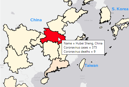
I recently read an interesting article in The Economist, where they describe "The Big Mac index." This is an index they invented as a lighthearted guide to compare currencies in different countries. In their article they create a multi-panel display (similar to a dashboard) where they compare the index for several countries using
Author
Are you an NFL fan, or curious about analyzing social media data? -- Well, in either case, this blog's for you! I recently read a fascinating Facebook article that included a U.S. county map showing which NFL (U.S. football) team had the most 'likes' in each county (based on ~35 million
I haven't seen an official definition of 'infographic' that I really like ... but in my mind it's something 1/2 way between data visualization & artwork. It borrows elements from graphs & dashboards, and combines that with an artistic poster. If you perform a Google image search on infographic you'll see
A big part of "winning" these days (be it sports or a business) is performing analytics better than your competition. This is demonstrated in awe-inspiring fashion in the book (and movie) "Moneyball." And on that topic, I'd like to show you a few ways SAS can be used to analyze sports data
I've heard many customers ask "Can SAS do/use/handle census block maps?" My answer was "of course!" ... but I never really had any examples to show/prove that. Well, now I do! :) First, you need to locate & download the shape files for the census blocks you're interested in plotting. For
It's said that the only things you can't avoid are Death and Taxes ... Well, in this blog, I'm going to avoid the "Death" one (for now), and just show you some graphs on taxes in the U.S., since the deadline for paying 2012 taxes is quickly approaching! :-) I created these
I'm sure that most of you have seen the really cool interactive Baby Name Voyager, right? If not, go have a look and try it out (be sure to plug in your name, and the names in your family, and so on). Here's a screen-capture: That's a pretty cool application! ...
What are the odds of winning the lottery? This seems like a simple question (and yes, there is a simple answer), but there are a few technical details to work out first... Which lottery? Let's say the Powerball Lottery. When? The number of balls used in the Powerball lottery has
I like to think that I have a graph for all occasions - Chinese New Year is no exception! ... The exact date of the Chinese New Year varies from year to year, because it's based on the lunar (moon) cycles. I thought it would be useful to create a
We had some fierce wind storms all across the United States yesterday, which even spawned some tornadoes! It looks like we weathered the storm OK here in Cary (but I still need to run out to the lake and make sure my pontoon/houseboat is still there, agh!). Anyway ... as with other
SAS macro variables are a great way to store a calculated value, so you can use it later in your code. They are not just limited to the data step -- you can also use macro variables in title statements, axis statements, etc. By default, the macro variable will be padded with
Being that 2013 is the International Year of Statistics, I wanted to make sure everyone knows how to handle my favorite statistic - percent (%) - in SAS! I often see data in spreadsheets/csv/etc that purport to represent "percents"... but you have to be a bit careful when working with
In the spirit of the new year – the International Year of Statistics – I thought I’d share some different ways to use statistics. Can statistics help you in your everyday life? Certainly! And here's an example to prove it... Let's say you have a dresser drawer full of white socks.
'Twas the week before Christmas, and all through the world ... dot-matrix printers were humming as Santa's naughty/nice list was unfurled... Can you imagine what it must have been like years ago when Santa had to maintain his naughty/nice list by hand, with a feather quill pen?!? Or even these
While I'm waiting for the next "data intense" event to show up in the news (so I can blog some SAS graphs about it), I thought I'd share a few fun SAS graphs in the spirit of the holiday season! Please don't hold me to too high of graphical "best practices"
Have you heard the expression "Talk Turkey"? Well then, what better (tongue-in-cheek) thing to do around the Thanksgiving holiday, than talk some turkey using SAS Graphs! ;) I don't usually decorate my graphs with images and pictures (they typically make the graph more difficult to read), but when it comes
In the U.S. we have a presidential election every 4 years - and as luck would have it, 2012 is an election year! I see a lot of election maps & graphs in the news, and I'm always subconsciously critiquing them in my mind and thinking to myself, "How would I graph this
“Frankenstorm” is what the U.S. National Weather Service is calling the combination of Hurricane Sandy, an early winter storm heading east, and a blast of arctic air from the North. SAS headquarters is located in the middle of the U.S. east coast ... and we barely missed being the bulls-eye for this
If you're like me, you hate all those pop-ups you get suggesting (or sometimes forcing) that you install an upgrade such as Windows, Java, browsers, phone apps, etc, etc. And quite often they don't convince you why you'd want to upgrade (will life be better?) ... they just tell you to
You've all heard about the recent meningitis outbreak, right? Being a data-guy and a map-guy, I went looking for maps related to the outbreak. I found the following map on the Centers for Disease Control (CDC) website. It shows the states that received the recalled drug used in epidurals (for back
SAS/GRAPH gives you the ability to customize your graphs (or even create totally new types of custom graphs) ... and it is my firm belief that it gives you a competitive advantage by allowing you to "make sense" of your data in ways your competitors can't. Most of the examples in
By now, most of you probably already know how to add drill downs and hover text to your SAS graphs. But did you know you can add pop-up images and graphs? Here are a couple of examples ... In this first example, when you hover your mouse over each state, you
Avast Mateys! Did you know that International Talk Like a Pirate Day is coming up?!? (September 19) Here's the official website, if you'd like more info. And what better way to get into the spirit of things than to use SAS/GRAPH to plot some real pirate data - Arrrr!!! Here's
A while back, I had seen the following map on the CEOs for Cities website. It seemed like an interesting topic and an interesting map, but I just couldn't grok what their map was saying ... So I decided to download the data and create my own map with SAS. I
Have you ever tried to put something on the Web, and then it looks different for other people (or maybe doesn't work at all)? ... And you eventually found that it was because they were using a different browser? That's one of the reasons I like traditional SAS/Graph output -- it's simple
Facebook has millions of users, and therefore when people share an interesting graph on Facebook it can "go viral" and millions of people might see it. Some of the graphs are obviously a bit biased - especially ones that are trying to sway your opinion one way or another on a topic
Do you use SAS for analytics and Microsoft Excel for graphs? Why not use SAS for your graphs too?!? Then you could completely automate the entire process in one SAS program, with no manual steps! A lot of people use Excel to create their graphs because "it's what they know." What if somebody
Everyone in the world has their attention turned towards the Olympics this week, so what better topic to tie in to a SAS/GRAPH blog than that?!?! I had seen a graph on the guardian website that I thought was interesting, so I decided to try to create my own (slightly different)
Hopefully you know that a gif animation can be used for more than just showing a cartoon animal doing cute tricks! Being a savvy data-meister, I'm sure you are also aware that you can use gif animations to see how data changes over time. But perhaps you didn't know you could
When working with "big data" you usually have too many points to view in a plot, and end up subsetting or summarizing the data. But now, in SAS 9.3, you have an alternative! For example, the following scatter plot of 10,000+ points is just a visual "blob": But using a new