When you work with big data, you often deal with both a large number of observations and a large number of features. When the number of features is large, they can be highly correlated, resulting in significant amount of redundancy in the data. Principal component analysis can be a very effective method in your toolbox in a situation like this.
Consider a facial recognition example, in which you train algorithms on images of faces. If training is on 16x16 grayscale images, you will have 256 features, where each feature corresponds to the intensity of each pixel. Because the values of adjacent pixels in an image are highly correlated, most of the row features are redundant. This redundancy is undesirable, because it can significantly reduce the efficiency of most machine learning algorithms. Feature extraction methods such as principal component analysis (PCA) and autoencoder networks enable you to approximate the row image by using a much lower-dimensional space, often with very little error.
PCA is an algorithm that transforms a set of possibly-correlated variables into a set of uncorrelated linear combinations of those variables; these combinations are called principal components. PCA finds these new features in such a way that most of the variance of the data is retained in the generated low-dimensional representation. Even though PCA is one of the simplest feature extraction methods (compared to other methods such as kernel PCA, autoencoder networks, independent component analysis, and latent Dirichlet allocation), it can be very efficient in reducing dimensionality of correlated high-dimensional data.
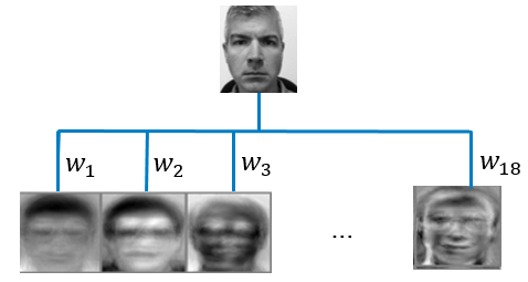
For the facial recognition problem described above, suppose you reduce the dimension to 18 principal components while retaining 99% of the variation in the data. Each principal component corresponds to an “eigenface” as shown in Figure 1 which is a highly representative mixture of all the faces in the training data. Using the 18 representative faces generated by principal components, you can represent each image in your training set by an 18-dimensional vector of weights (\(w_{1}\),...,\(w_{18}\)) that tells you how to combine the 18 eigenfaces, instead of using the original 256-dimensional vector of raw pixel intensities.
Now suppose you have a new image, and you wonder if this image belongs to a person in your training set. You simply need to calculate the Euclidian distance between this new image’s weight vector (\(w_{1}\),...,\(w_{18}\)) and the weight vectors of the images in your training set. If the smallest Euclidian distance is less than some predetermined threshold value, voilà – facial recognition! Tag this new image as the corresponding face in your training data; otherwise tag it as an unrecognized face. If you want to learn more about face recognition, see this famous paper, Face Recognition Using Eigenfaces, for your enjoyment.
Labeling and suggesting tags in images are common uses of reduced dimensional data. Similarly this approach could be used for analyzing audio data for speech recognition or in text mining for web search or spam detection. Perhaps a more common application of dimension reduction is in predictive modeling. You can feed your reduced-dimensional data into a supervised learning algorithm, such as a regression, to generate predictions more efficiently (and sometimes even more accurately).
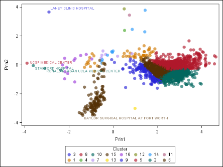
Another major use of dimension reduction is to visualize your high-dimensional data, which you might not be able to otherwise visualize. It’s easy to see one, two, or three dimensions. But how would you make a four-dimensional graph? What about a 1000-dimensional graph? Visualization is a great way to understand your data, and it can also help you check the results of your analysis. Consider the chart in Figure 2. A higher-dimensional data set, which describes hospitals in the United States, was clustered and projected onto two dimensions. You can see that the clusters are grouped nicely, for the most part. If you are familiar with the US health-care system, you can also see that the outliers in the data make sense, because they are some of the best-regarded hospitals in the US! (Of course, just because an analysis makes sense to you does not guarantee that it is mathematically correct. However, some agreement between human and machine is usually a good thing.)
If these examples have caught your interest and you know want more information about PCA, tune into my webcast, Principal Component Analysis for Machine Learning, where I discuss PCA in greater detail, including the math behind it, and how to implement it using SAS®. If you are a SAS® Enterprise MinerTM user, you can even try the hospital example for yourself with the code we’ve placed in one of our GitHub repos.


2 Comments
Pingback: Which machine learning algorithm should I use? - The SAS Data Science Blog
I always was concerned in this topic and still am, regards for posting.