Find out which state you'll live in, if the US state borders are redrawn so we have 50 states with equal population! (Don't worry! - This is just a fun/hypothetical "what if" blog!)
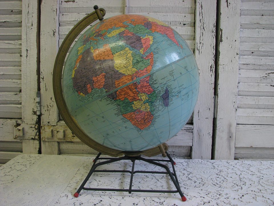
To get you in the mood for this topic, here's a picture of one of the many vintage globes my good friend (and antique dealer) Reggie has in his personal collection. I always like looking at old globes to see if I can find borders & country names that have changed, and then try to guess the age of the globe based on that information. ... Which brings us to the topic at hand - changing the borders and names of the 50 US states!
For those of you not familiar with the US, it is divided into 50 states (represented by the 50 stars on our flag), and the population of some states is huge (such as California, with 38 million people), while the population of other states is small (such as Wyoming, with 600,000 people). This population disparity makes it a bit awkward when trying to determine how much influence each state has in the US government, etc.
I recently saw a map Neil Freeman created, that proposed dividing the US into 50 new states with an equal population in each area. Being a "map guy" myself, this caught my attention. I read the details in his article, and I liked the factors that he had used in coming up with the new groupings - "The map began with an algorithm that grouped counties based on proximity, urban area, and commuting patterns. The algorithm was seeded with the fifty largest cities. After that, manual changes took into account compact shapes, equal populations, metro areas divided by state lines, and drainage basins."
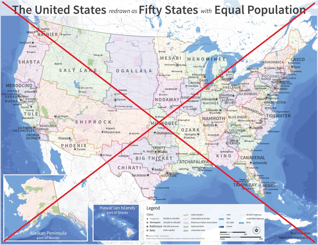
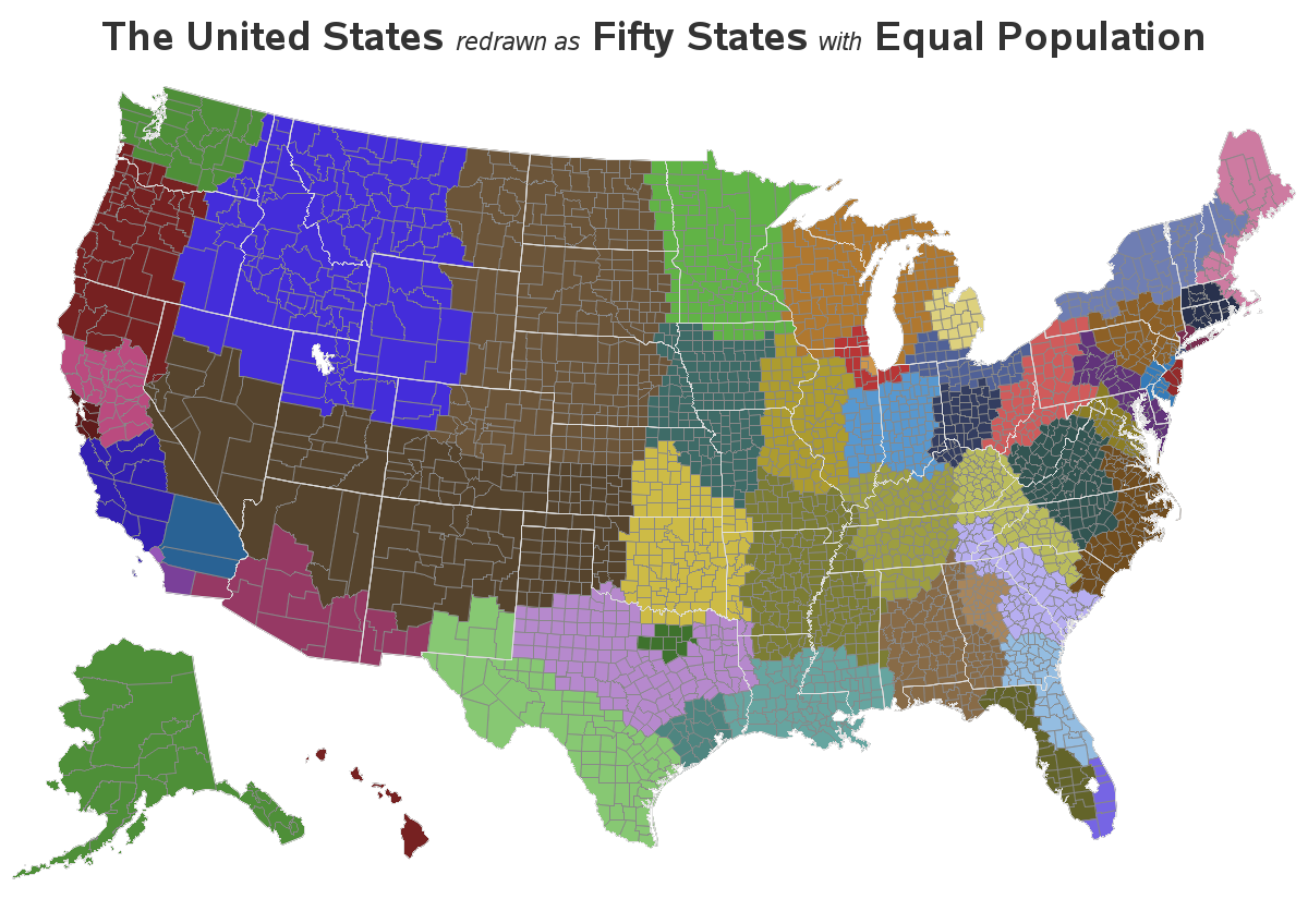
But, in scrutinizing his map, I found that I couldn't easily determine which of the current states & counties were included in the new proposed states. Therefore I created my own version of the map with SAS, which could easily answer those questions!
In my SAS version, I use the counties as my basic building blocks, and I add html hover-text so you can hover over any county and see the current state & county, and the proposed new state name. I also annotate the state borders (in white) so you can easily see how the current state borders compare to the new state borders. Therefore, while Neil's map makes a better static poster (which was his goal, by the way), the SAS map provides more analytic capabilities and insight. ... And having both maps gives you the best of both worlds!
Here is my SAS map. Click the static thumbnail below, to see the full-size interactive map with html hover-text.
If this change were to happen, what new state would your current residence be in, and what new state would you prefer to live in (and why)?
