If you consider yourself as a visualization expert, you strive to create graphs that set you apart from the data analysts and statisticians. Graphs that merely plot the data in a clear/concise manner aren't enough for you. You want your graphs to also be intuitive, easy to read, and provide extra insight - graphs that go to 11! My friend Beth, who is into roller derby and therefore knows a thing or two about going to 11, helped me with this photo to get you into the right mindset for today's blog post ...

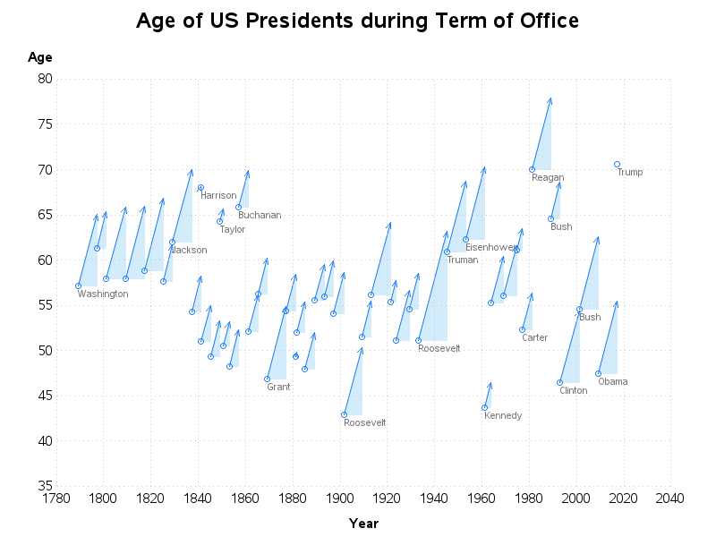
Rick Wicklin recently wrote a post showing how to plot the ages of the presidents during their terms in office. It was a clear & concise graph that showed the start & end age of each president during their stay in the White House.
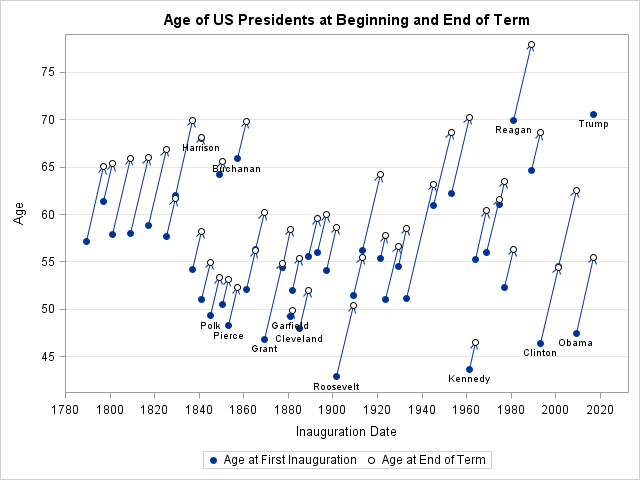
At the end of Rick's blog post, he asked "Do you think you can create a better graph that shows the ages of US presidents?" Can a graph guy turn down an invitation like that?!? ... Let's turn this graph up to 11!
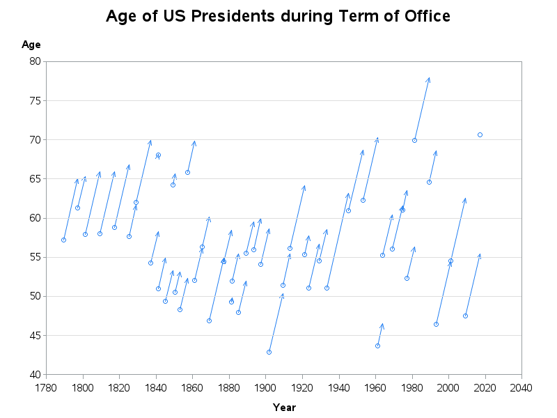
I start by creating a simple graph very similar to Rick's, with only a few small changes. I only place a marker at the beginning of the arrow, so there isn't as much a problem with visual (and mouse-over text) overlap. I place the y-axis label 'Age' in the normal/horizontal orientation so it will be easier to read. I label the x-axis 'Year' instead of 'Inauguration Date' (since both the inauguration date *and* the end-of-term date are both being plotted along that axis). And since I'm not using two markers, I leave off the marker legend.
I think these change produce a nice clean graph, and a good starting point for my enhancements.
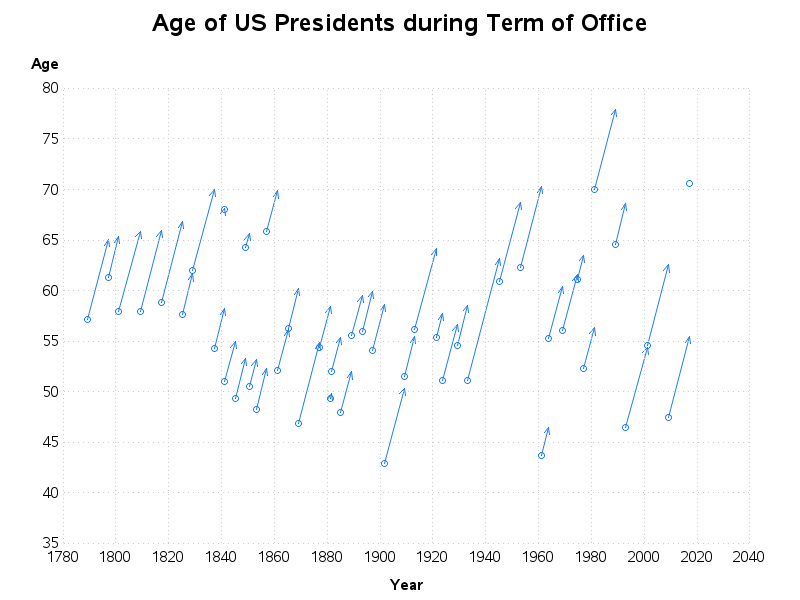
Rather than just the reference lines extending from the left axis, I added reference lines from both axes, so you can easily follow back from the markers to both the age and the year. And with reference lines from both directions, there wasn't really a need for axes or tick marks - therefore I got rid of them. I extend the y-axis down to 35 instead of just 40 (since 35 is the minimum possible age of a president). Now the markers & arrows stand out much more prominently than the reference lines and axes.
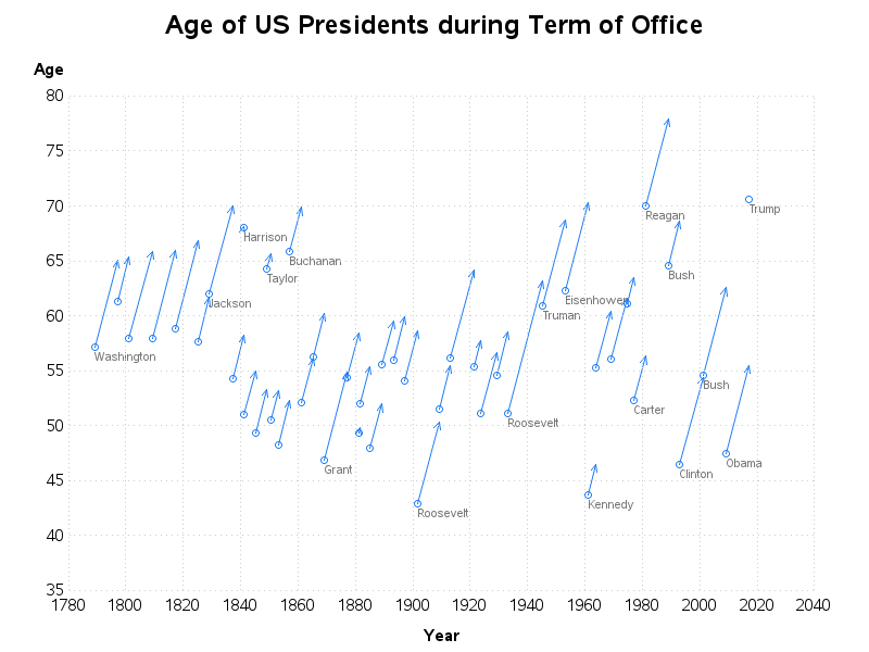
Next I worked on the labeling. Rick used automated labels for all the presidents who were <=50 or >=65. The data points in this graph are a bit crowded, therefore if you use automated labels, you either have to allow collisions or allow the software to decide which labels to leave out or move. Either of those automated solutions can produce non-optimal labels, therefore I decided to annotate my labels manually, and selected exactly which labels I did (and didn't) want. I tried to label the presidents that were interesting and/or ones that had plenty of room for labels. Note that in the interactive html version of my output, I also have html mouse-over text for all the markers, so you can also see the names for the presidents that aren't labeled.
At this point had a "pretty nice" graph ... but it still didn't quite "go to 11." Therefore I decided to make the 'area under the arrow' stand out a bit more, by drawing a triangular polygon there. I think having the visual area makes it a lot easier to visually compare the presidents. The triangular area also provides more area for the mouse-over text and drill downs, making the graph easier to interact with.(Click the image below, to see the interactive version with html mouse-over text.)
Some people might ask - "what makes your graph better?" I guess I would have to answer "These go to 11." :-)

5 Comments
Hi,
I have a requirement of changing length of multiple variables in one go in a sas dataset. I know this can be done by using 'RENAME' statement but I have to do this for over 70 variables. Is there a way to get this done in a much simpler way?
This would probably be a good question to post to the Base SAS Programming communities page: https://communities.sas.com/t5/Base-SAS-Programming/bd-p/programming
Dr. Allison
I really liked your paper on Teacher's salary graphs. I think you might find interesting my web site on which I delve at length on another aspect of Teacher's pay. I would like to correspond. If you agree and find my paper complements your approach please send me your email.
hbreaux1@verizon.net
My websit. . http://www.complexpolitics.wordpress.com
http://www.complexpolitics.wordpress.com
I guess if you use colors to indicate party you can claim you went to 12 :)
I considered that ... but with this chart spanning the entire history of all the US presidents, what the parties have represented has changed a bit over the years (therefore color-coding by party might be a bit misleading). :)