In a previous blog I suggested that many readers in many applied areas are reading statistics texts under duress for a course or project, and are in truth somewhere between disinterested and terrified. In my new SAS Press book Business Statistics Made Easy in SAS® I make use of various intuitive explanatory techniques, including:
- Metaphors
- Pictures & diagrams
- Organizational cases / vignettes
- Storytelling
In this blog, I explore the use of pictures & diagrams in more detail.
A picture tells a thousand words
In Business Statistics Made Easy in SAS® a key philosophy was to use explanatory diagrams and pictures wherever possible. Feedback from students consistently supports this technique. The following are some common types.
Flowcharts of technique steps
From experience teaching MBA and other classes, flowcharts of an overall technique decision process are ‘teaching gold.’ These are used in many statistical texts, yet I believe they are still not used enough.
See the figure below for an example from Business Statistics Made Easy in SAS®, in which I summarize steps for linear regression. Without the flowchart, the detailed 50+ page chapter would be far harder to assimilate, organize, and remember.
Explanatory pictures of specific concepts
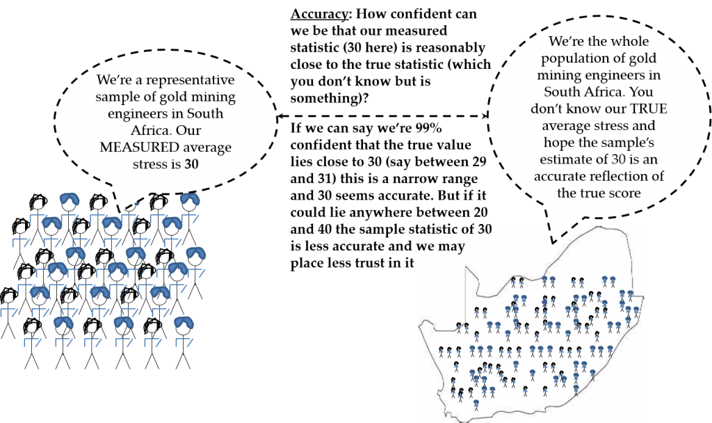
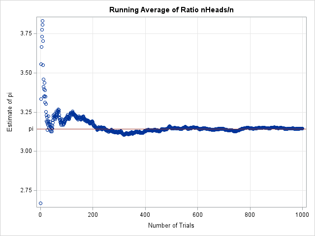
When using specific illustrations, the occasional pictorial illustration can really help. See <Fig 2> for an illustration from Business Statistics Made Easy in SAS®. I find that pictures that tell a story are often effective. I’ll have more on storytelling in a later blog.
SAS code, output, etc.
Here I favor annotating screenshots from SAS with helpful, short explanations in text, using arrows and the like to point out the key areas of interest in the screenshot. See below for an example from Business Statistics Made Easy in SAS®, in which I explain the tTest.
Are my pictures useful?
How about this for a radical test of the usefulness of your figures: could you use only the pictures in a series of projection slides and still be able to talk around the entire chapter / section / concept?


5 Comments
On the webpage
http://blogs.sas.com/content/sastraining/2016/02/18/explaining-statistical-methods-to-the-terrified-disinterested/?EMAIL=ian.shannon%40environment.nsw.gov.au&appid=49701
There is a slipup in the wording of the explaination.
If we can say we are 99% confident that the true statistic lies close to 30 ...
In this case (and a few other places as well) the words should have been "true value" not "true statistic".
A statistic is a calculation from a sample and (of course) will vary with different samples being taken. The true value is stuck on one value.
The distinction is important especially if the aim to to get new people to get into statistics!
Ian
Thanks Ian. True enough. I guess here you can read this as the true value for the statistic.
Thanks, Ian. I had the same thought. The "true value" should be called the "population value" or the "population parameter."
Thanks both - indeed. I have altered the figure to make it clearer
Gregory,
Thanks for changing, however I did say (and a few other places as well). Just above in the section starting Accuracy: you also use true statistic. I really like Rick's suggestion of using true population value.
Ian