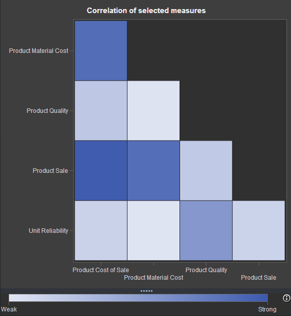
If you've watched any of the demos for SAS Visual Analytics (or even tried it yourself!), you have probably seen this nifty exploration of multiple measures. It's a way to look at how multiple measures are correlated with one another, using a diagonal heat map chart. The "stronger" the color
Tag: business analytics
How to build a correlations matrix heat map with SAS
How to get the statistics you need from SAS Enterprise Guide
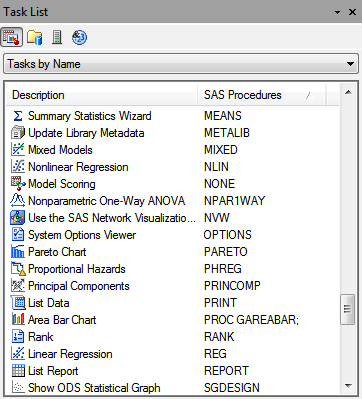
If you need to calculate the mean, sum, standard deviation, or frequency count for a variable, you'll find it pretty easy to accomplish in SAS Enterprise Guide. The corresponding tasks in the menus have names like "Summary Statistics" or "One-way Frequencies". Obvious, right? Often, researchers or students have a quest
Smart Cats with blogs on stats
Let's face it: ever since cats learned how to access the Internet, they've managed to besmirch their prestigious status as the "smarter-if-a-bit-aloof" pet. They've starred in many demeaning YouTube videos, bringing shame to their species for the sake of some cheap laughs. But I'm here to tell you: there are