I presented a paper at PharmaSUG this year along with my coauthor, Mary Beth Herring of Rho, Inc. Multipage Adverse Event Reports Using PROC SGPLOT All readers of Graphically Speaking know that PROC SGPLOT and the rest of ODS Graphics make great graphs. But did you know that you can make a graph extend across multiple pages? The goal here is to display adverse events (AEs) within body systems among subjects in a clinical trial. There are hundreds of AEs, so reports must span multiple pages if they are sent to destinations such as RTF or Printer. Making a multipage graph poses no problem for ODS Graphics---you simply use a BY variable to create page breaks. Most of the work involves deciding where to break pages and properly labeling continuations of body systems.
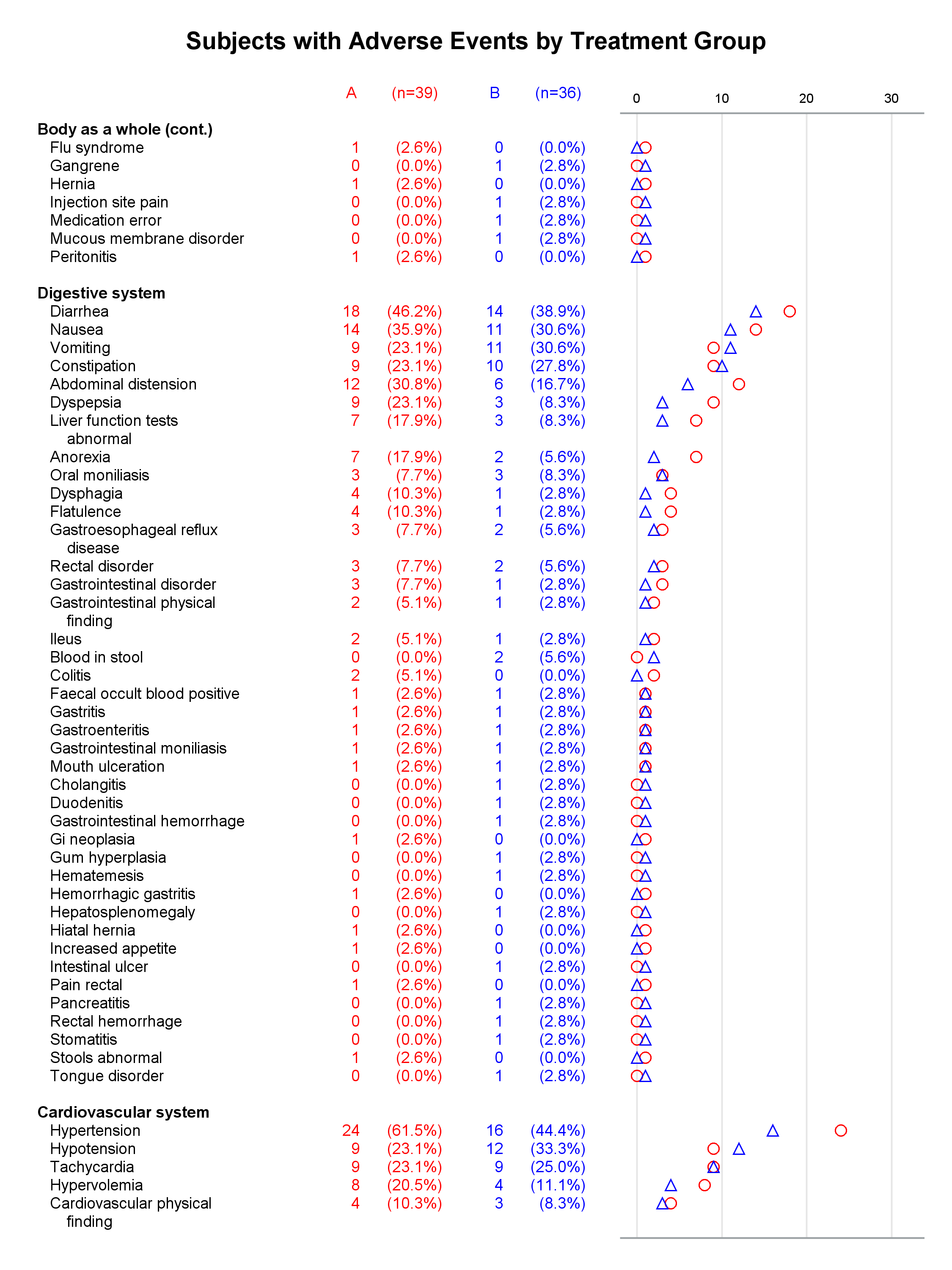
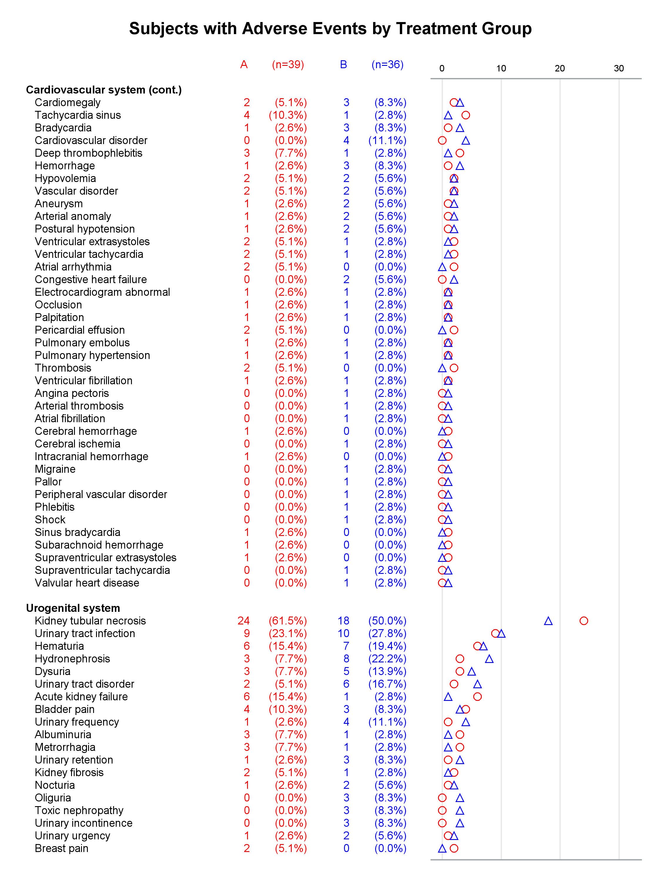
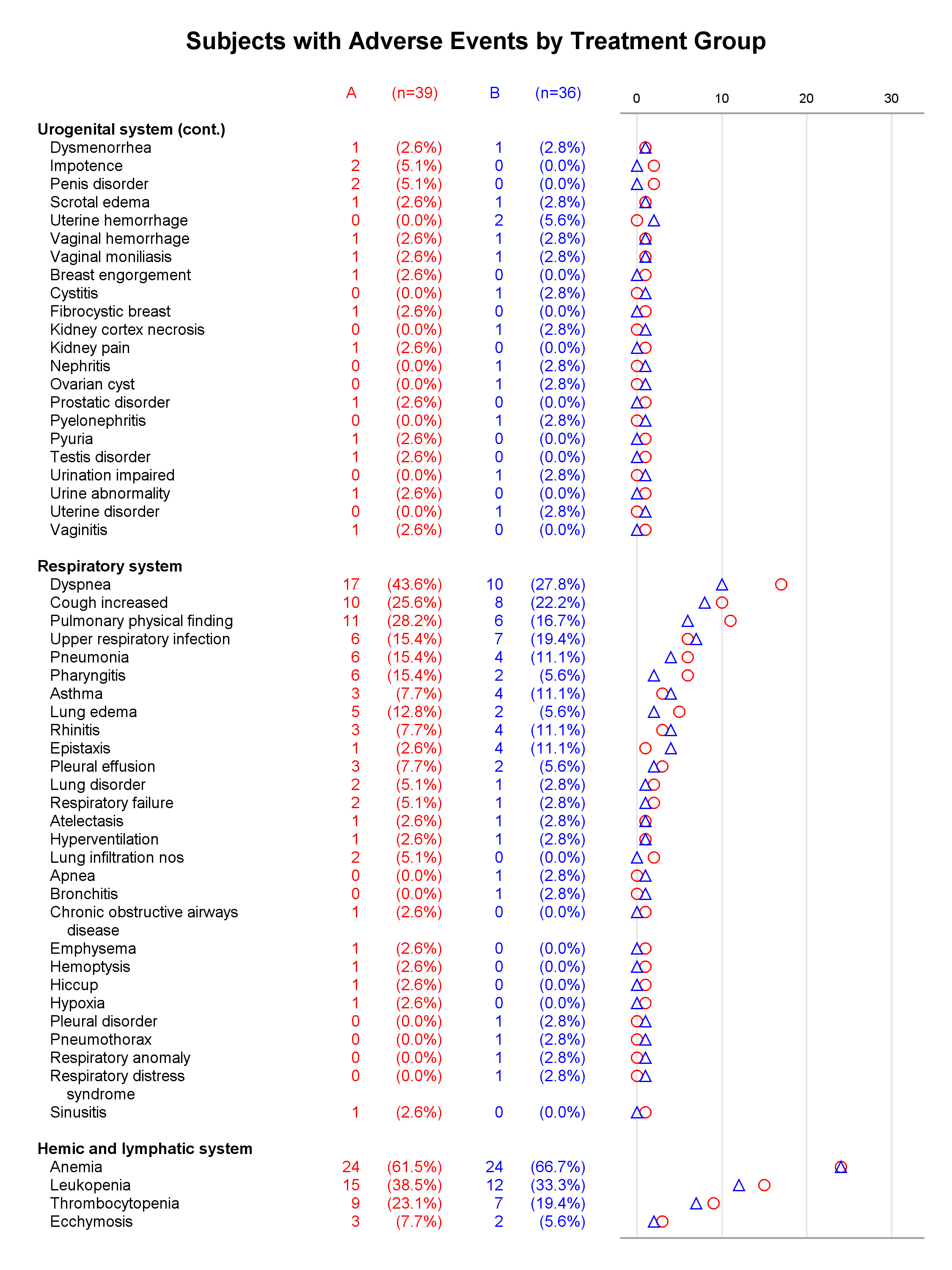
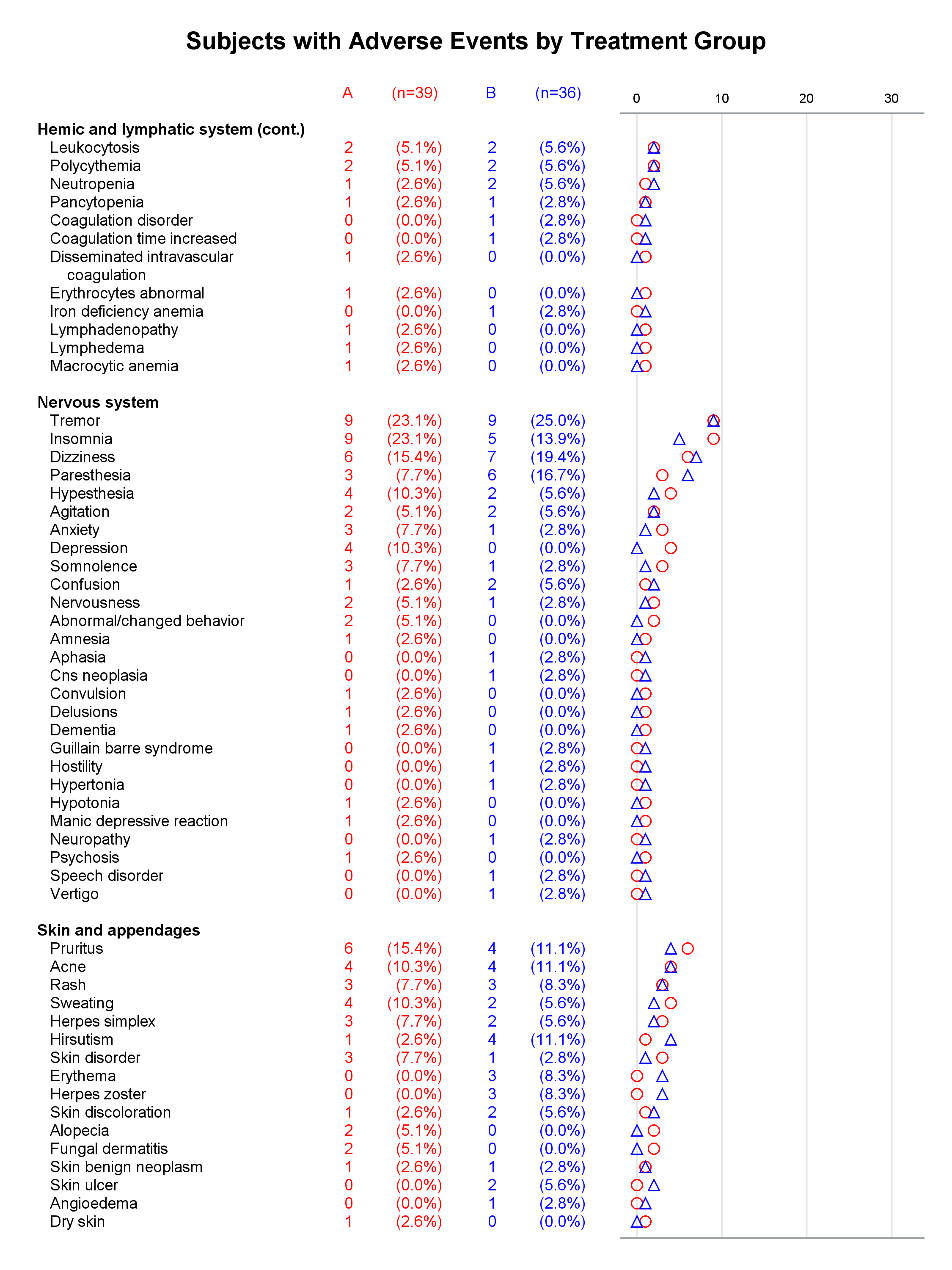
Each graph is composed of Y-axis tables and scatter plots. Scroll to the bottom to see examples. Body systems and AEs are displayed in an axis table along with AE frequencies and percentages for each of two groups. The frequencies are also displayed in scatter plots, which enable researchers to easily spot trends and differences between the treatments. AEs and body systems might be long, so the code supports split characters, which enable you to split text across two lines. Data preparation is a multistep process. While enterprising programmers could perhaps do all of this in fewer steps, the code is simpler to write if you break the problem down into manageable steps. This example also uses an attribute map to display body systems in a bold font while AEs are displayed in a normal font. One version of the report uses PROC SGPLOT and displays reference lines between body systems. Another version uses PROC SGPLOT to write a template, a DATA step to modify that template to ensure uniform scatter plot width across pages, and PROC SGRENDER to make the plot. This post also illustrates using nonbreaking spaces to indent lines in the axis table. Most of the details match the PharmaSUG paper. However, here I approach one aspect differently. Sanjay showed me how to use threshold options rather than scaled Y coordinates. Both approaches work, but the threshold options are easier. I changed the code in a few other places too. These changes just make the code a little easier to understand. Much more detail about most other aspects of the coding for this report is provided in the paper.
In the first lines, you set some macro variables. The reports display at most 62 lines in a page. The code will go to a new page rather than starting a new body system at the bottom of a page, so the actual number of lines in a page can vary. The code adds a split character (a tilde) between words when there is a word break after column 20. You could instead add split characters on an ad hoc basis (say, only in specific AEs). When you do not use reference lines between body systems, you can control the width of each graph component by specifying column widths. Here the AE and body system column uses 34% of the space, the group A frequency uses 5%, the group A percentage uses 11%, the group B frequency uses 5%, the group B percentage uses 11%, and the scatter plot uses 34%. You might want different widths depending on how long your AEs are and how aggressively you split them. PROC SGPLOT automatically picks a column width for each page. The PROC SGPLOT results (not shown) look great, but by optionally editing the graph template that it writes, you can explicitly set the column widths and make them consistent across pages.
%let maxperpage = 62; /* Maximum rows per page in a table */ %let s = 20; /* Split once between words after specified column */ %let cw = 0.34 0.05 0.11 0.05 0.11 0.34; /* column weights (proportions) */ %let file = ae6; |
The first DATA step provides the treatment group for each subject.
data adsl; /* Subject-level data used to get ns */ input trtp $ @@; datalines; A A B B B A B B A B A A B B B B B A A B A B B A B A B B A A A A A B B A A A A B A B A B A A A A A A B B B B B A B A B A A B A A A B A A B A B B A B B ; |
The second DATA step reads the body systems, the preferred terms for AEs, counts, and percentages. These data are preprocessed for display in a paper or blog. For an actual analysis, you would need to use procedures such as PROC FREQ to compute counts and percentages and a procedure such as PROC SORT to display the AEs by descending maximum AE frequencies within each body system.
This step counts the number of subjects in each of the two groups.
proc freq data=adsl noprint; /* Get ns for both groups */ tables trtp / out=trt; run; |
This step stores the frequencies in two macro variables (&na and &nb). These macro variables later provide headers for the two percentage columns.
data _null_; /* Store ns in macro variables */
   set trt;
   call symputx(cats('n', trtp), cats('(n=', count, ')'));
run; |
This step stores in a macro variable the maximum frequency across both groups. Axes must be the same across each page, and this is achieved by specifying MAX=&X2MAX in the X2AXIS statement.
%let x2max = 0; /* Maximum count for X2 axis */
data _null_;
   set ae;
   call symputx('x2max', max(input(symget('x2max'), best16.), acount, bcount));
run; |
The attribute map displays the body systems (designated by Value='Head') using a bold font. The Value variable is also used throughout the data processing to differentiate observation types, although only one type is mentioned in the attribute map. The default font is used when data values do not match attribute map values. 'Head' indicates a header (body system) and later the only line of a one-line header, 'Head1' indicates the first line of a two-line header, 'Head2' indicates the second line of a two-line header, 'Irow' (indented row) indicates an AE and later the only line of a one-line AE, 'Irow1' indicates the first line of a two-line AE, 'Irow2' indicates the second line of a two-line AE, 'Blank' indicates a blank line between body systems, and 'Pad' indicates blank padding on the last page. These values are all arbitrary as long as observations consistently have Value ='Head' in the data set and the attribute map.
data attrmap; /* Attribute maps to make bold body system headers */ retain ID 'aemap' Value 'Head' TextWeight 'Bold'; run; |
This step inserts split characters beyond column 20. You could instead insert split characters in an ad hoc manner.
data plot0(drop=i); /* Add split characters */ set ae; i = find(trim(aebodsys), ' ', &s+1); if i then substr(aebodsys, i, 1) = '~'; i = find(trim(aedecod), ' ', &s+1); if i then substr(aedecod, i, 1) = '~'; run; |
This step starts rearranging the data for display. The first axis table displays the variable Rowlab, which contains the body systems, AEs, and blank lines. For each line that is read, one to three lines are written, which populate this and the other variables. Conditionally, a blank line is output before a new body system line, and a body system line is output for a new body system. Unconditionally, each AE is output. Nonbreaking spaces ('A0'x) provide indentation.
data plot1(drop=aedecod); /* Add section headers and spaces between sections */
   set plot0;
   by sort_bodysys;
   length RowLab $ 80;
   if first.sort_bodysys then do;
      value  = 'Blank';
      call missing(rowlab, acount, bcount, ap, bp);
      if _n_ ne 1 then output;
      value  = 'Head';
      rowlab = aebodsys;          /* Section header                        */
      output;
      set ae point=_n_;           /* Retrieve data after setting up header */
   end;
   value  = 'IRow';
   rowlab = 'A0A0A0'x || aedecod;/* Indent using 3 NBSPs                   */
   output;
run; |
This step processes split characters. When a split character is encountered, two lines are output in place of the original one. This step temporarily stores two-line headers, which are used to create continuation headers in the next step.
data plot2(drop=t1 t2); /* Handle split characters */
   set plot1;
   by sort_bodysys;
   length head1 head2 $ 80;
   retain head1 head2 ' ';
   if first.sort_bodysys then do; head1 = ' '; head2 = ' '; end;
   i = index(rowlab, '~'); /* split at column i */
   if i then do;
      t1 = substr(rowlab, 1, i - 1); /* segement 1 */
      t2 = substr(rowlab, i + 1);    /* segement 2 */
      if value =: 'Head' then do; head1 = t1; head2 = t2; end; /* store headers */
      substr(value, 5, 1) = '1'; /* set up first piece */
      rowlab = t1;
      output;
      substr(value, 5, 1) = '2'; /* set up second piece */
      rowlab = 'A0A0'x || t2;
      if value =: 'IRow' then do;
         call missing(acount, bcount, ap, bp);
         rowlab = 'A0A0A0A0A0'x || rowlab;
      end;
   end;
   output;
run; |
This step adds a nondisplayed BY variable to make the different pages. The number of lines in each page is not constant to ensure nice header positions. The BY variable is BG, and the number of observations in the BY group is nInGrp. Continuation headers are added when a page breaks in the middle of a body system. Pages never break in the middle of a split line; nor do they break immediately after displaying a new body system. This step also adds blank lines to fill out the last page.
data plot3(drop=sort_bodysys head1 head2 aebodsys ningrp i);
   set plot2 nobs=nobs;    by sort_bodysys;
   ningrp + 1; /* Number of lines in this BY group so far */

   * Start a new page rather than a new group near the page bottom;
   if ningrp ge &maxperpage - 5 and value eq 'Blank' then do;
      bg + 1; ningrp = 0; return;
   end;
   output;

   * Start a new page and potentially continue the group;
   if ningrp ge &maxperpage - 1 and value in ('IRow', 'IRow2') then do;
      bg + 1; ningrp = 0;

      * If a group gets continued, add new header line(s) for the new page;
      if not last.sort_bodysys then do;
         call missing(acount, bcount, ap, bp);
         value = 'Head';
         if head1 eq ' ' then do; /* one header line  */
            rowlab = catx(' ', aebodsys, '(cont.)');         ningrp + 1; output;
         end;
         else do;                 /* two header lines */
            rowlab = head1;                                  ningrp + 2; output;
            rowlab = 'A0A0'x || catx(' ', head2, '(cont.)');             output;
         end;
      end;
   end;

   if _n_ eq nobs and ningrp then do; /* Add blank lines to end of last page */
      value = 'Pad';
      call missing(rowlab, acount, bcount, ap, bp);
      do i = ningrp + 1 to &maxperpage;    output;    end;
   end;
run; |
This step removes superfluous blank lines and removes numerals from the Value variable. This step also creates the Y axis variable ObsID, which is the row number. Null ('00'x) labels suppress axis table column headers. Macro variables provide some of the other headers. The variable Ref contains the coordinates for reference lines.
data plot4; /* Don't begin or end the page with a blank line */
   set plot3; by bg;
   if first.bg then obsid = 0;
   if not ((first.bg or last.bg) and value eq 'Blank') then do;
      value = compress(value, '12');      /* No longer need numeral split flags */
      ref   = ifn(value eq 'Blank', obsid, .); /* reference lines */
      output;
      obsid + 1;
      end;
   label rowlab = '00'x acount = "A" ap="&na" bcount = "B" bp="&nb";
run; |
This step writes a graph template by using the TMPLOUT= option in PROC SGPLOT. The Y-axis variable is a row number. The threshold options ensure that PROC SGPLOT does not add extra space along the Y axis to make it extend to normal tick marks labels like 70 (or other integers times a power of 10). Without these options, extra white space might appear at the end of the graph.
title 'Subjects with Adverse Events by Treatment Group';
proc sgplot data=plot4 noautolegend noborder dattrmap=attrmap tmplout='temp.temp';
   by bg;
   yaxistable rowlab    / position=left textgroup=value textgroupid=aemap;
   yaxistable acount ap / position=left labelattrs=(size=10px) valuejustify=right
                          valueattrs=(color=red) labelattrs=(color=red);
   yaxistable bcount bp / position=left labelattrs=(size=10px) valuejustify=right
                          valueattrs=(color=blue) labelattrs=(color=blue);
   scatter x=acount y=obsid / x2axis markerattrs=(symbol=circle   color=red  size=10);
   scatter x=bcount y=obsid / x2axis markerattrs=(symbol=triangle color=blue size=10);
   scatter x=acount y=obsid / markerattrs=(size=0);
   scatter x=acount y=obsid / markerattrs=(size=0);    /* bottom axis line */
   x2axis min=0 max=&x2max grid display=(noticks nolabel) valueattrs=(size=9px);
   xaxis display=(noticks nolabel novalues);
   yaxis display=none reverse thresholdmin=0 thresholdmax=0;
run; |
This step modifies the graph template to use the specified column weights. It also changes the template name and adds processing for the macro variable x2max. As I mentioned above, this step and the PROC SGRENDER step are optional. They just provide some extra fine tuning beyond what PROC SGPLOT provides.
data _null_; * Modify graph template to use column weights;
   infile 'temp.temp';
   input;
   _infile_ = tranwrd(_infile_, 'statgraph sgplot', 'statgraph aeplot');
   _infile_ = tranwrd(_infile_, 'columnweights=preferred',
                      "columnweights=(&cw)");
   if _infile_ =: 'dynamic' then call execute('nmvar x2max;');
   i = index(_infile_, 'viewmax=');
   if i then _infile_ = tranwrd(_infile_, substr(_infile_, i,
                                find(_infile_, ')', i) - i), 'viewmax=x2max');
   call execute(_infile_);
run; |
These next few lines suppress the BY line and the display of missing values. Graphs are displayed in a 7.5 x 10 .5 inch area, which works well in an 8.5 x 11 inch page.
options nobyline missing=' '; ods listing close; ods graphics on / height=10in width=7.5in border=off; |
This creates the report that displays reference lines between each body system. (It does not rely on the preceding PROC SGPLOT or template-editing DATA step.) PROC SGPLOT requires that you specify LOCATION=INSIDE for all of the Y-axis tables if you want reference lines to extend across the entire figure. It also requires you to display color bands in the Y axis. However, you can make them 100% transparent by specifying COLORBANDATTRS=(TRANSPARENCY=1).
ods rtf file="&file.Ref.rtf" style=pearl image_dpi=300;
* Draw the graph with reference lines;
proc sgplot data=plot4 noautolegend noborder dattrmap=attrmap;
   by bg;
   refline ref;
   yaxistable rowlab    / position=left textgroup=value textgroupid=aemap
                          pad=(right=.2in) location=inside;
   yaxistable acount ap / position=left labelattrs=(size=10px) location=inside
                          valueattrs=(color=red) labelattrs=(color=red) valuejustify=right;
   yaxistable bcount bp / position=left labelattrs=(size=10px) location=inside
                          valueattrs=(color=blue) labelattrs=(color=blue) valuejustify=right;
   scatter x=acount y=obsid / x2axis markerattrs=(symbol=circle   color=red  size=10);
   scatter x=bcount y=obsid / x2axis markerattrs=(symbol=triangle color=blue size=10);
   scatter x=acount y=obsid / markerattrs=(size=0);    /* bottom axis line */
   x2axis min=0 max=&x2max grid display=(noticks nolabel) valueattrs=(size=9px);
   xaxis display=(noticks nolabel novalues);
   yaxis display=none reverse colorbands=odd colorbandsattrs=(transparency=1)
         thresholdmin=0 thresholdmax=0;
run;
ods rtf close; |
Scroll down to see the results.
This creates the report without reference lines and controls the width of each column.
ods rtf file="&file..rtf" style=pearl image_dpi=300; * Draw the graph with a uniform graph width across pages but without reference lines; title; proc sgrender data=plot4 template=aeplot; by bg; run; ods rtf close; |
Scroll down to see the results.
Finally, some default options are restored.
ods listing; /* restore any destination here */ options byline missing='.'; |
While there are many steps, when you break them down, none is complicated. In particular, ODS Graphics can easily make a multipage report by using a BY variable. The only thing that makes this more involved is that care must be taken to split and continue pages and long text strings. See the paper for more details and for more information about axis tables.
Graphs with reference lines:
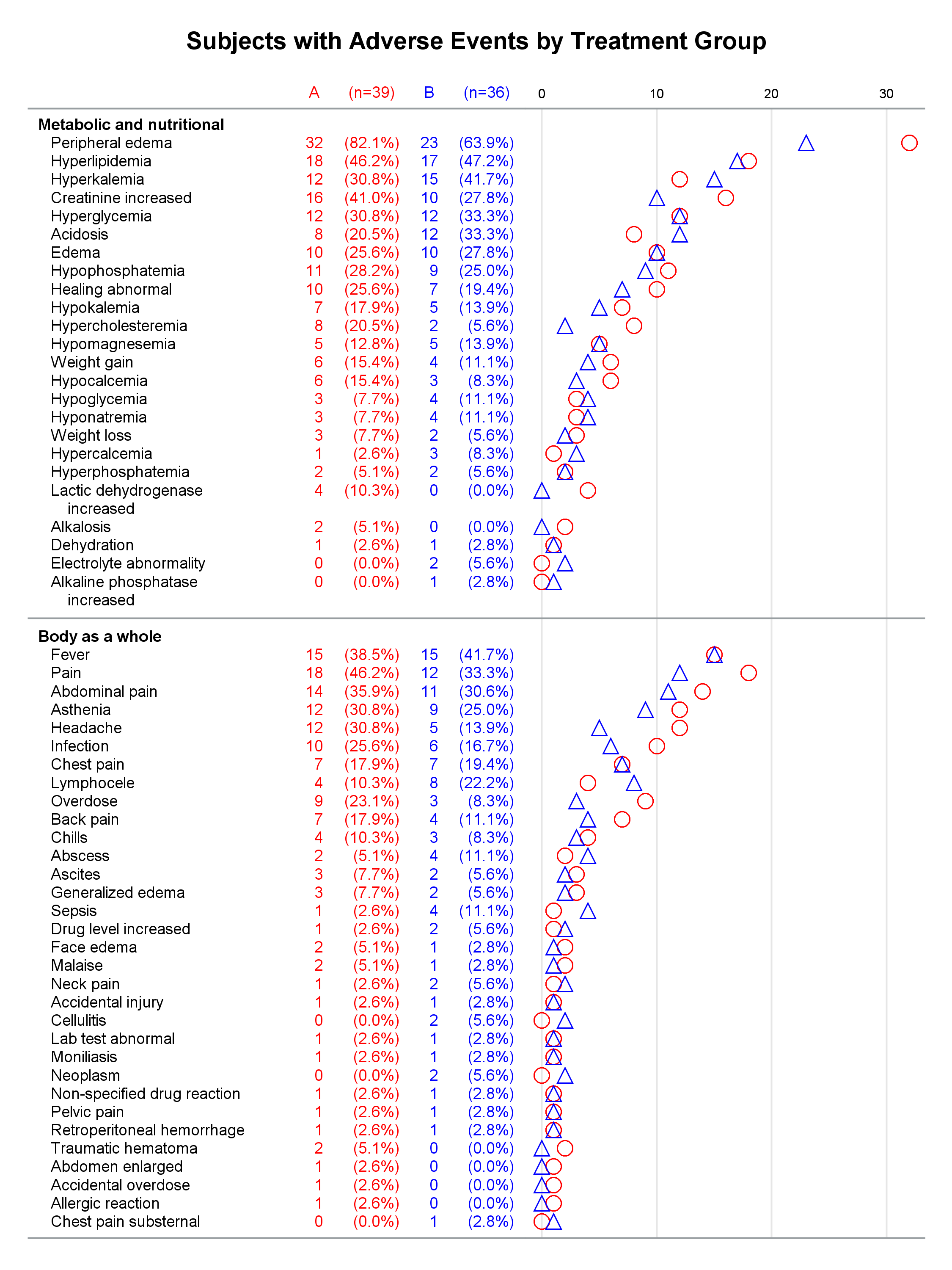

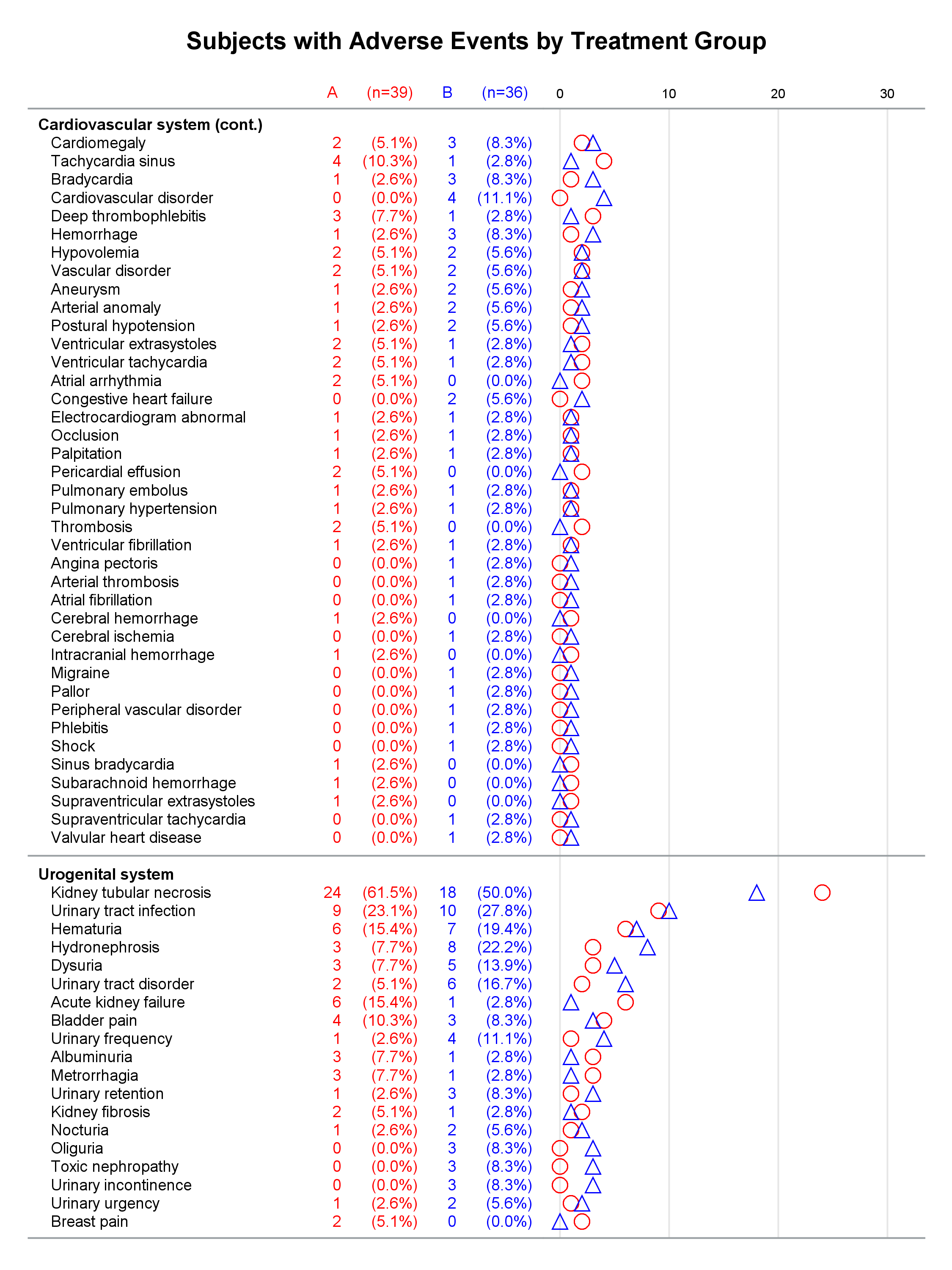
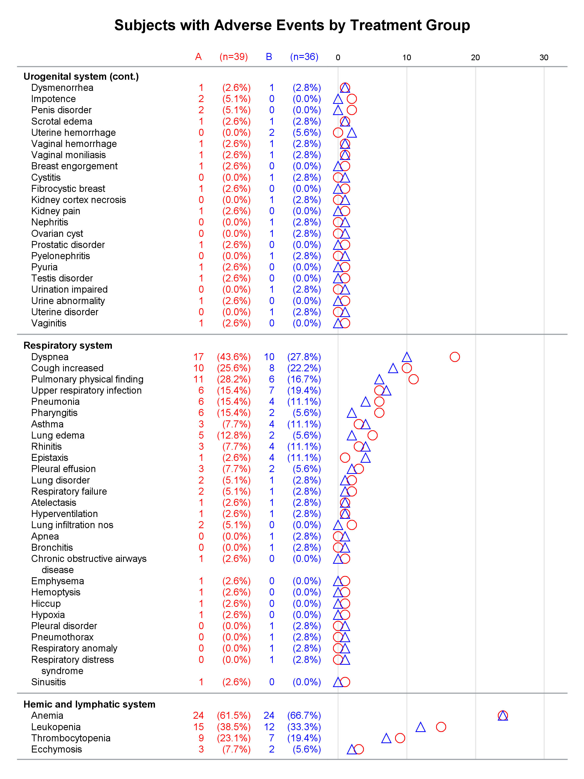

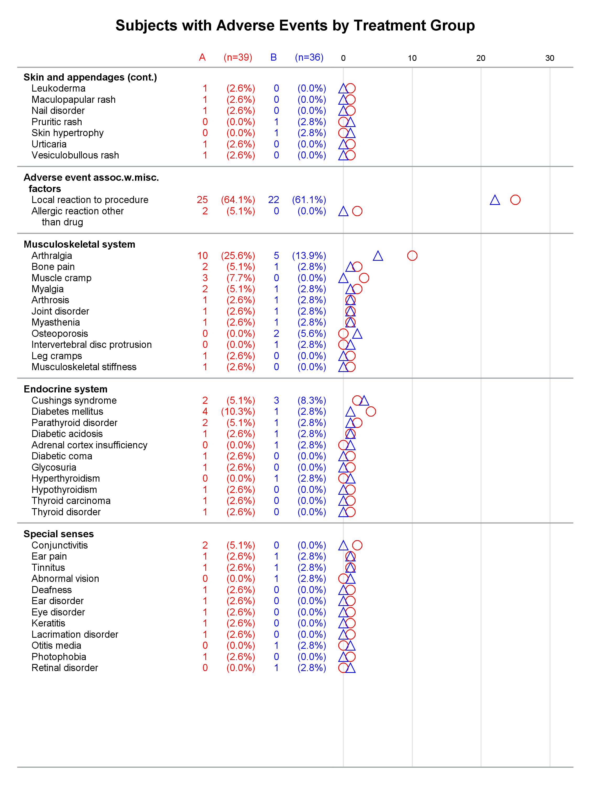
Graphs without reference lines:


1 Comment
Pingback: Basic ODS Graphics: Axis Options - Graphically Speaking