In the previous two articles we discussed Discrete Attribute Maps, and how these can be used to ensure that group attributes like color are consistently mapped to group values regardless of their position in the data.
Now, let us take a look at the attributes map that allows you to do something similar with numeric ranges, the Range Attributes Map.
Normally, when you assign a color to a numeric value for a heat map or contour plot, the default three color model from the active style is used to map the colors to the values. The lowest numeric value of the variable is always mapped to the StartColor and the highest numeric value is always mapped to the EndColor. The mean value is mapped to the NeutralColor. For a range of values, here is what you will get:
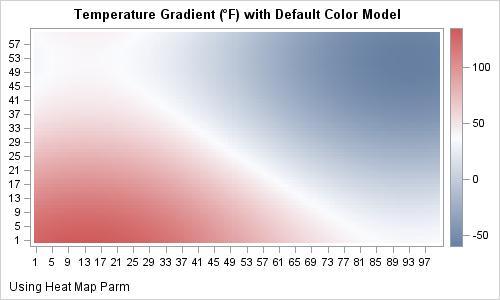
This graph uses the heat map parm statement in SAS 9.3 to draw the graph. The color response is assigned the temperature value resulting in this graph. Here, the smallest value in the data is mapped to a shade of blue and the highest to a shade of red. The color white represents the mean value, whatever that may be.
When you run this graph again with different data, the color mapping will change to map to the new data range of the value column. So, the question is:
- How can we ensure that the color mapping stays consistent across different data ranges?
- How can we ensure the value 32 is always discernible?
Here is where the Range Attribute Map comes in the picture. Similar to the Discrete Attributes Map, it allows you to map specific color (or range) to specific data value range. Using such a map for this data, here is what you will get:

Note the ranges of the response data are shown in the continuous color legend on the right. In the range definition, we have set the color for 32 to white. The adjascent ranges don't quite go all the way to white. This seems to provide just enough hint to the eye, and the white color stands out in the graph. In the legend it is labeled anyway.
Here is the GTL code snippet for the Range Attribute Map definition:
rangeattrmap name='map'; range -100 -< -60 / rangecolormodel=(purple purple); range -60 -< -32 / rangecolormodel=(purple blue); range -32 -< 0 / rangecolormodel=(blue lightblue); range 0 -< 32 / rangecolormodel=(lightblue cxf7f7f7); range 32 - 32/ rangecolor=white; range 32 -< 72 / rangecolormodel=(cxf7f7f7 gold); range 72 -< 100 / rangecolormodel=(gold red); range 100 -< 120 / rangecolormodel=(red darkred); range 120 -< 160 / rangecolormodel=(darkred darkred); endrangeattrmap; |
Note, the option on the right side can be a single color for the numeric range, or a color model that can have more than one color.
This same graph can also be made using the bubble plot.
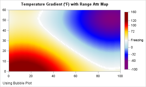
Some differences from the previous plot are:
- A format is used to display 32 as 'Freezing'.
- Note the difference in the axes and the markings on the continuous legend.
Discrete Attribute Maps can be used with SG Procedures using the DATTRMAP option. However, SG Procedures do not as yet provide a way to set range attribute maps. So, you have to use GTL for this feature. If you are a user of SG Procedures and need this feature added to the procedures, please chime in with your use cases.
Full SAS 9.3 Program: RangeAttrMap


1 Comment
Pingback: Advanced ODS Graphics: Range Attribute Maps - Graphically Speaking