Do you need to see how long patients have been treated for? Would you like to know if a patient’s dose has changed, or if the patient experienced any dose interruptions? If so, you can use a Napoleon plot, also known as a swimmer plot, in conjunction with your exposure data set to find your answers. We demonstrate how to find the answer in our recent book SAS® Graphics for Clinical Trials by Example (by Kriss Harris and me, Richann Watson).
You may be wondering what a Napoleon plot is? Have you ever heard of the map of Napoleon’s Russian campaign? It was a map that displayed six types of data, such as troop movement, temperature, latitude, and longitude on one graph (Wikipedia). In the clinical setting, we try to mimic this approach by displaying several different types of safety data on one graph: hence, the name “Napoleon plot.” The plot is also known as a swimmer plot because each patient has a row in which their data is displayed, which looks like swimming lanes.
Code
Now that you know what a Napoleon plot is, how do you produce it? In essence, you are merely writing GTL code to produce the graph you need. In order to generate a Napoleon plot, some key GTL statements that are used are DISCRETEATTRMAP, HIGHLOWPLOT, SCATTERPLOT and DISCRETELEGEND. Other plot statements are used, but the statements that were just mentioned are typically used for all Napoleon plot. In our recent book, one of the chapters carefully walks you through each step to show you how to produce the Napoleon plot. Program 1, below, gives a small teaser of some of the code used to produce the Napoleon Plot.
Program 1: Code for Napoleon Plot That Highlights Dose Interruptions
discreteattrmap name = "Dose_Group"; value "54" / fillattrs = (color = orange) lineattrs = (color = orange pattern = solid); value "81" / fillattrs = (color = red) lineattrs = (color = red pattern = solid); enddiscreteattrmap; discreteattrvar attrvar = id_dose_group var = exdose attrmap = "Dose_Group"; legenditem type = marker name = "54_marker" / markerattrs = (symbol = squarefilled color = orange) label = "Xan 54mg"; /* Other legenditem statements */ layout overlay / yaxisopts = (type = discrete display = (line label) label = "Patient") highlowplot y = number high = eval(aendy/30.4375) low = eval(astdy/30.4375) / group = id_dose_group type = bar lineattrs = graphoutlines barwidth = 0.2; scatterplot y = number x = eval((max_aendy + 10)/30.4375) / markerattrs = (symbol = completed size = 12px); discretelegend "54_marker" "81_marker" "completed_marker" / type = marker autoalign = (bottomright) across = 1 location = inside title = "Dose"; endlayout; |
Output
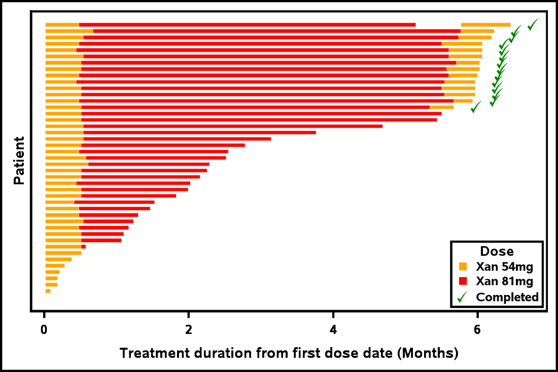
Without further ado, Output 1 shows you an example of a Napoleon plot. You can see that there are many patients, and so the patient labels have been suppressed. You also see that the patient who has been on the study the longest has a dose delay indicated by the white space between the red and orange bars. While this example illustrates a simple Napoleon plot with only two types, dose exposure and treatment, the book has more complex examples of swimmer plots.
Output 1: Napoleon Plot that Highlights Dose Interruptions

