 “Alexa, how many ounces are in a 750-ml bottle of wine?”
“Waze, how many miles between Cary and Kannapolis, NC?”
“Google, which NFL teams are favored to win this weekend?”
Every day many of us turn to some sort of search vehicle to help us solve a work issue or win a “discussion” with a friend. In fact, the word “Google” has now become a verb in our lexicon. Don’t know what PROC BCHOICE does? Google it!
Here at SAS, there are over 30,000 pages on the support.sas.com site, so we recognize how important an efficient search can be for our users. As part of our continuing effort to evolve the site and provide you with the best possible user experience, we’re pleased to announce that this week we launched a beta version of a new search engine. We believe the new search delivers an improved experience, but we’ll let you be the judge.
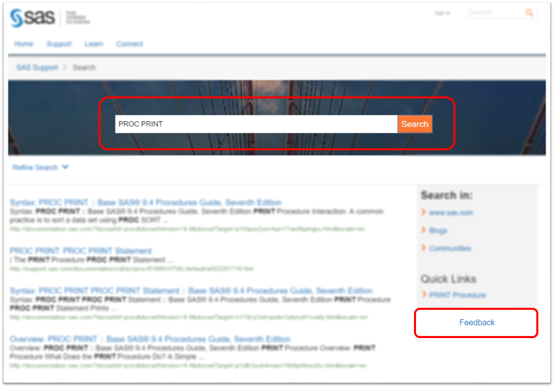
We want you to give the new search a try and provide your feedback. Type a few terms into the search box, click the “Feedback” link and let us know what you think. We want to know what works well for you and what doesn’t, and which filters you see yourself using and which you think aren’t as useful. Is there a feature you would like to see and don’t? Please use the search preview as often as you like, and feel free to give us feedback every time you do. But hurry, because the search preview will only run until the end of December.
We’ll use your feedback to put the finishing touches on our search functionality. Look for our first production release in early 2018! We want the support site search enhancements to be as important in helping you use SAS as Google is in helping you become the champion of your fantasy football team!
Thanks for your help and happy holidays!


1 Comment
Hi Judi,
I really like the fact that the search box is front and centre. When I visit support.sas.com it is mostly to search and the current front page has a small search box hidden away somewhat down the page and off to the right. It takes me a moment to find it. This new version is much more obvious and easier to find - will it appear like this on the support.sas.com home page too?
I also like how the search field gets the initial focus so you can just type away and hit enter - no need to click in the field. Could this be done on the support.sas.com home page too?
I noticed how the link you provided in the blog post pre-populates the field with "*:*". Is this a hint that you can type filter expressions in the field to refine the search without using the drop down menus? If so, is there any help on the syntax?
I wonder if the Refine Search feature at the top and the Search In feature on the right could be combined. The Search In box is more prominent and when I was wanting to filter my search results to just SAS notes I was looking in that area initially. It took a moment for me to notice the smaller Refine Search feature and click it to find SAS Notes under Site Area. Given both features provide a type of search refinement could they be combined into the one area to avoid confusion?
The SAS Support link at the top of the page is generating an error "Error reading 'siteArea' on type com.sas.aem.component.models.Metatag" - is this just because it is a preview page?
Cheers
Paul