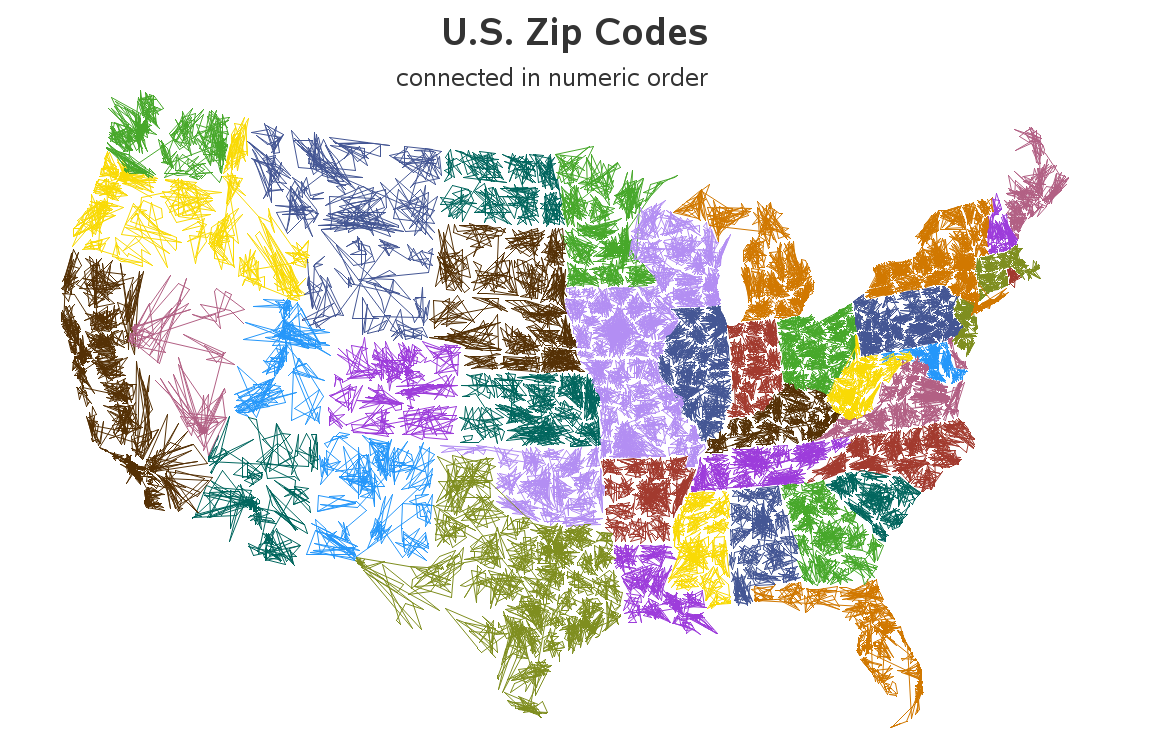
When I saw Robert Kosoro's cool ZIPScribble map, I knew I had to create a SAS version - and of course I had to add a few enhancements along the way....
I was perusing some of the examples on dadaviz.com, and Kosoro's ZIPScribble map caught my attention. It wasn't a particularly useful map, but it drew me in. Here's a screen-capture of the map:
I knew that I could easily create a similar map with SAS, using the zip code centroids from sashelp.zipcode, and plotting the latitude/longitude centroid values with Proc GPlot. But, even for a silly/fun example, I like to see if I can add a bit of analytic flair.
Therefore, rather than plotting the raw latitude/longitude centroids, I used Proc GProject to convert the coordinates into a more aesthetic map shape that we're accustomed to seeing (rather than all-flat along the northern border). And rather than making all the lines black, I let SAS randomly assign a color (based on the ODS style) by state, so you can more easily see the state groupings. And if you click the map below to look at the interactive version, you can see the html hover-text I added for each 'clump' of lines based on 3-digit zip codes (well, there's a bit of overlap, so this isn't perfect ... but it seems useful).


2 Comments
It would be interesting to pick 10 colors for 0xxxx - 9xxxx, or 100 colors for 00xxx - 99xxx, to show how the numbers are placed around the country. You could put a legend for the 10 primary Nxxxx colors, and light-to-dark shades for N0xxx - N9xxx. Don't forget Alaska and Hawaii.
Extra credit: do Canada. :-)
I think it would be very difficult to pick 10 colors that people could distinguish (especially when there are multiple shades of the colors in use). People have difficulty with colors (Google "blue dress"! LOL)