Get the right information, with visual impact, to the people who need it
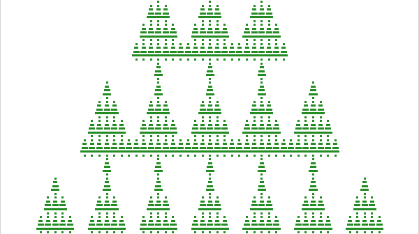
Happy holidays to all my readers! My greeting-card to you is an image of a self-similar Christmas tree. The image (click to enlarge) was created in SAS by using two features that I blog about regularly: matrix computations and ODS statistical graphics. Self-similarity in Kronecker products I have previously shown

