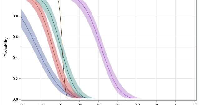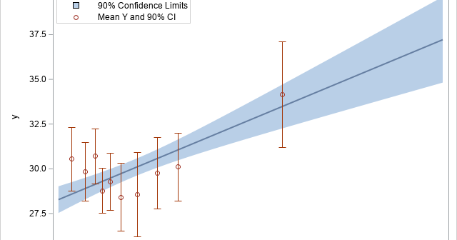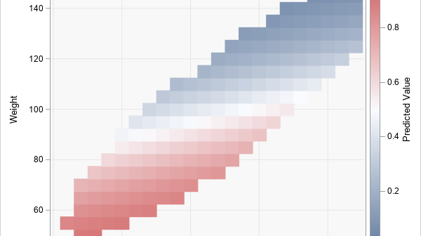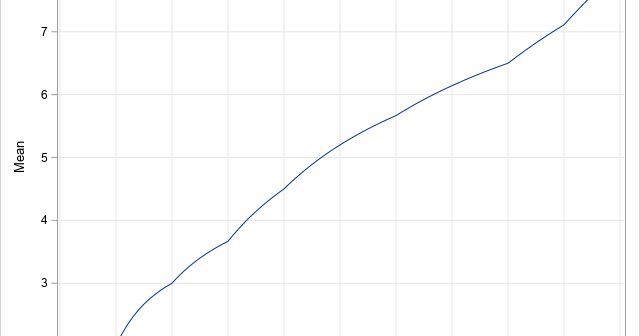
In a linear regression model, the predicted values are on the same scale as the response variable. You can plot the observed and predicted responses to visualize how well the model agrees with the data, However, for generalized linear models, there is a potential source of confusion. Recall that a
Tag: Data Analysis
Biplots are two-dimensional plots that help to visualize relationships in high dimensional data. A previous article discusses how to interpret biplots for continuous variables. The biplot projects observations and variables onto the span of the first two principal components. The observations are plotted as markers; the variables are plotted as
In grade school, students learn how to round numbers to the nearest integer. In later years, students learn variations, such as rounding up and rounding down by using the greatest integer function and least integer function, respectively. My sister, who is an engineer, learned a rounding method that rounds half-integers
Principal component analysis (PCA) is an important tool for understanding relationships in continuous multivariate data. When the first two principal components (PCs) explain a significant portion of the variance in the data, you can visualize the data by projecting the observations onto the span of the first two PCs. In
Understanding multivariate statistics requires mastery of high-dimensional geometry and concepts in linear algebra such as matrix factorizations, basis vectors, and linear subspaces. Graphs can help to summarize what a multivariate analysis is telling us about the data. This article looks at four graphs that are often part of a principal
Computing rates and proportions is a common task in data analysis. When you are computing several proportions, it is helpful to visualize how the rates vary among subgroups of the population. Examples of proportions that depend on subgroups include: Mortality rates for various types of cancers Incarceration rates by race
The EFFECT statement is supported by more than a dozen SAS/STAT regression procedures. Among other things, it enables you to generate spline effects that you can use to fit nonlinear relationships in data. Recently there was a discussion on the SAS Support Communities about how to interpret the parameter estimates
I recently wrote about how to use PROC TTEST in SAS/STAT software to compute the geometric mean and related statistics. This prompted a SAS programmer to ask a related question. Suppose you have dozens (or hundreds) of variables and you want to compute the geometric mean of each. What is
In a previous article, I mentioned that the VLINE statement in PROC SGPLOT is an easy way to graph the mean response at a set of discrete time points. I mentioned that you can choose three options for the length of the "error bars": the standard deviation of the data,
I frequently see questions on SAS discussion forums about how to compute the geometric mean and related quantities in SAS. Unfortunately, the answers to these questions are sometimes confusing or even wrong. In addition, some published papers and web sites that claim to show how to calculate the geometric mean