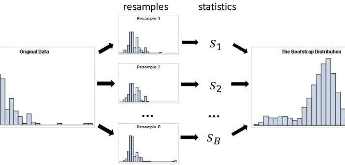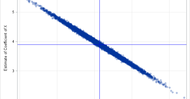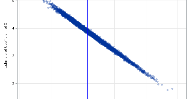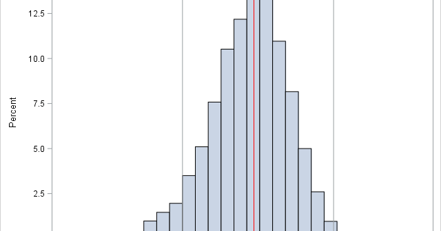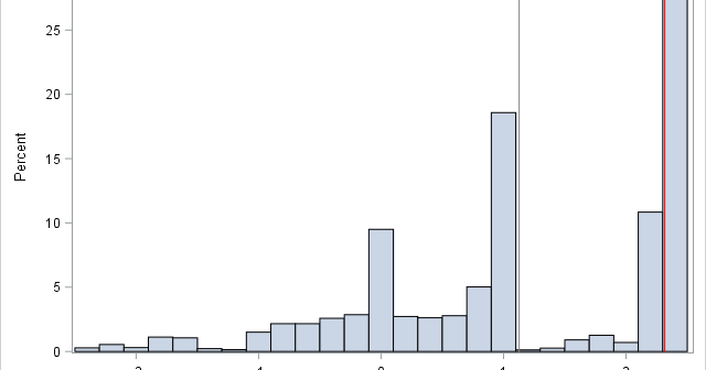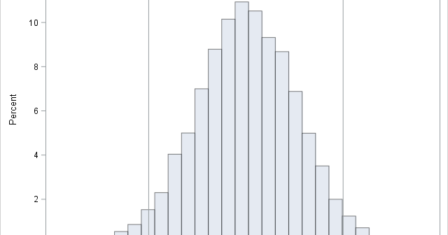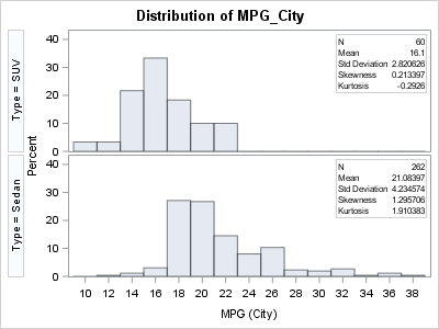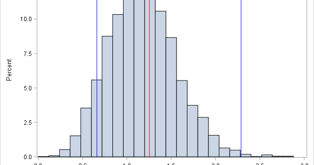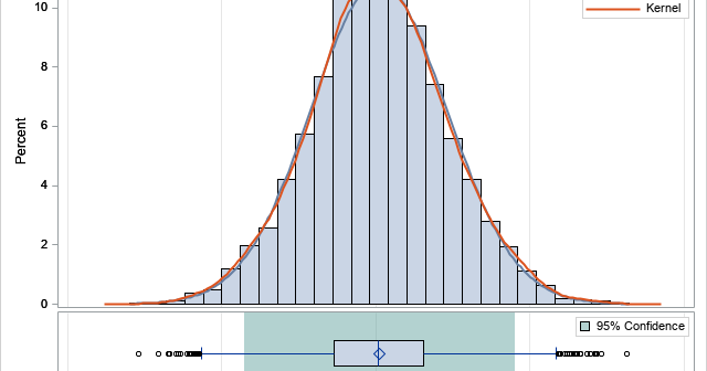
When I run a bootstrap analysis, I create graphs to visualize the distribution of the bootstrap statistics. For example, in my article about how to bootstrap the difference of means in a two-sample t test, I included a histogram of the bootstrap distribution and added reference lines to indicate a

