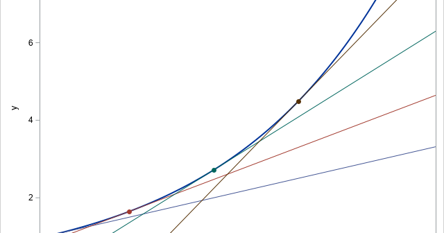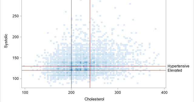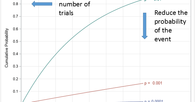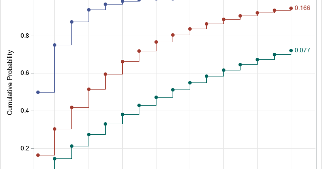
A 2-D "bin plot" counts the number of observations in each cell in a regular 2-D grid. The 2-D bin plot is essentially a 2-D version of a histogram: it provides an estimate for the density of a 2-D distribution. As I discuss in the article, "The essential guide to
Uncategorized

Rockin' around the Christmas tree At the Christmas party hop. – Brenda Lee Last Christmas, I saw a fun blog post that used optimization methods to de-noise an image of a Christmas tree. Although there are specialized algorithms that remove random noise from an image, I am not going to

Binary matrices are used for many purposes. I have previously written about how to use binary matrices to visualize missing values in a data matrix. They are also used to indicate the co-occurrence of two events. In ecology, binary matrices are used to indicate which species of an animal are

Recently I showed how to visualize and analyze longitudinal data in which subjects are measured at multiple time points. A very common situation is that the data are collected at two time points. For example, in medicine it is very common to measure some quantity (blood pressure, cholesterol, white-blood cell

This is a second article about analyzing longitudinal data, which features measurements that are repeatedly taken on subjects at several points in time. The previous article discusses a response-profile analysis, which uses an ANOVA method to determine differences between the means of an experimental group and a placebo group. The

Longitudinal data are used in many health-related studies in which individuals are measured at multiple points in time to monitor changes in a response variable, such as weight, cholesterol, or blood pressure. There are many excellent articles and books that describe the advantages of a mixed model for analyzing longitudinal

This article discusses how to restrict a multivariate function to a linear subspace. This is a useful technique in many situations, including visualizing an objective function that is constrained by linear equalities. For example, the graph to the right is from a previous article about how to evaluate quadratic polynomials.

What is an efficient way to evaluate a multivariate quadratic polynomial in p variables? The answer is to use matrix computations! A multivariate quadratic polynomial can be written as the sum of a purely quadratic term (degree 2), a purely linear term (degree 1), and a constant term (degree 0).

In a linear regression model, the predicted values are on the same scale as the response variable. You can plot the observed and predicted responses to visualize how well the model agrees with the data, However, for generalized linear models, there is a potential source of confusion. Recall that a

My colleague, Mike Drutar, recently showed how to create a "strip plot" that shows the distribution of temperatures for each calendar month at a particular location. Mike created the strip plot in SAS Visual Analytics by using a point-and-click interface. This article shows how to create a similar graph by