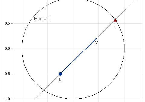
Recently, I needed to implement a line search algorithm in SAS. The line search is illustrated by the figure at the right. You start with a point, p, in d-dimensional space and a direction vector, v. (In the figure, d=2, but in general d > 1.) The goal is to

