A SAS statistical programmer recently asked a theoretical question about statistics. "I've read that 'p-values are uniformly distributed under the null hypothesis,'" he began, "but what does that mean in practice? Is it important?" I think data simulation is a great way to discuss the conditions for which p-values are
Author
At a recent conference in Las Vegas, a presenter simulated the sum of two dice and used it to simulate the game of craps. I write a lot of simulations, so I'd like to discuss two related topics: How to simulate the sum of two dice in SAS. This is
Years ago, I wrote an article that showed how to visualize patterns of missing data. During a recent data visualization talk, I discussed the program, which used a small number of SAS IML statements. An audience member asked whether it is possible to construct the same visualization by using only
A SAS programmer wanted to estimate a proportion and a confidence interval (CI), but didn't know which SAS procedure to call. He knows a formula for the CI from an elementary statistics textbook. If x is the observed count of events in a random sample of size n, then the
In a recent article, I graphed the PDF of a few Beta distributions that had a variety of skewness and kurtosis values. I thought that I had chosen the parameter values to represent a wide variety of Beta shapes. However, I was surprised to see that the distributions were all
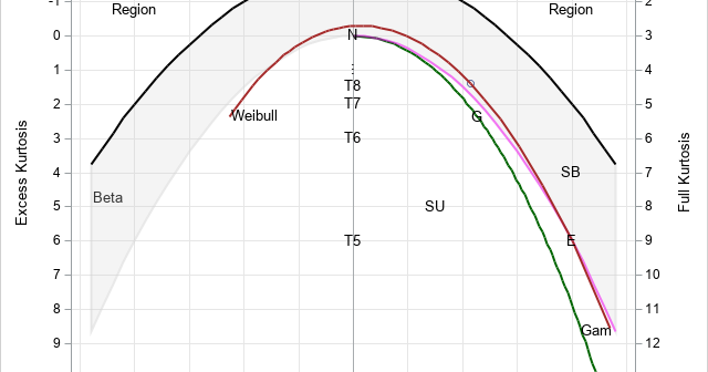
The moment-ratio diagram is a tool that is useful when choosing a distribution that models a sample of univariate data. As I show in my book (Simulating Data with SAS, Wicklin, 2013), you first plot the skewness and kurtosis of the sample on the moment-ratio diagram to see what common
A SAS programmer wanted to simulate samples from a family of Beta(a,b) distributions for a simulation study. (Recall that a Beta random variable is bounded with values in the range [0,1].) She wanted to choose the parameters such that the skewness and kurtosis of the distributions varied over range of
A dot plot is a standard statistical graphic that displays a statistic (often a mean) and the uncertainty of the statistic for one or more groups. Statisticians and data scientists use it in the analysis of group data. In late 2023, I started noticing headlines about "dot plots" in the
Recently, I saw a scatter plot that displayed the ticks, values, and labels for a vertical axis on the right side of a graph. In the SGPLOT procedure in SAS, you can use the Y2AXIS option to move an axis on the right side of a graph. Similarly, you can
A recent article describes how to estimate coefficients in a simple linear regression model by using maximum likelihood estimation (MLE). One of the nice properties of an MLE formulation is that you can compare a large model with a nested submodel in a natural way. For example, if you can