As mentioned in other PROC SGMAP blogs, several SAS/GRAPH procedures have been moved to 9.4M6 Base SAS to be used with PROC SGMAP. You can use these to create PROC SGMAP output even when using the free SAS University edition.
In this blog you will use the:
- IMPORT procedure for CSV files
- GINSIDE procedure
- GEODIST function
You will also combine datasets and use multiple PROC SGMAP statements to plot data onto background maps.
Here is the complete code for this example.
Importing CSV Data
SAS Institute has a training center located on 7th Avenue in New York, but lunch is not provided. Plot the free Wi-Fi hotspots and some sidewalk cafés near the training center so you can have lunch and browse the internet.
New York City provides many data sets on the NYC Open Data website. If you do a search for Wi-Fi Hotspot, a page for the NYC public WiFi hotspot locations is displayed and you export the data in CSV format.
Download the data and notice that first row of the data set are the column names, and the data starts on the second row. Use the PROC IMPORT DATAROW and GETNAMES statements to create a data set with well named variables.
proc import datafile="u:\hotspots\NYC_Free_Public_WiFi_03292017.csv" out=hotspots dbms=csv replace; datarow=2; /* start reading the data in the second row */ getnames=yes; /* generate SAS variable names from first row */ guessingrows=20; /* 20 is the default, it works fine for this data */ run; |
To see the hotspots, plot the data on an OpenStreetMap:
title1 'New York City Wi-Fi Hotspots'; proc sgmap plotdata=hotspots noautolegend; openstreetmap; scatter x=lon y=lat; run; |
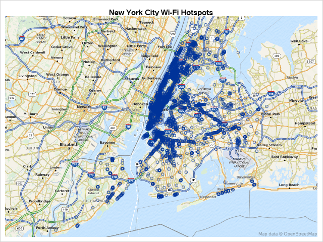
That is a lot of Wi-Fi hotspots.
PROC GINSIDE to Limit Data
SAS Institute has a training center located on 7th Avenue in New York County. Try limiting the data with PROC GINSIDE using a polygon provided by New York City.
You can use a CSV file for polygon data, but it is much easier to use a shapefile if it is available. Download the shapefile for the Neighborhood Tabulation Areas and use PROC GINSIDE. Note that PROC GINSIDE requires coordinates be named X and Y, so you will use a data step to rename these.
proc ginside data=hotspots_xy /* input dat set */ map=boros /* map polygon used to compare to input data */ out=hotspots_xy /* output data set */ insideonly; /* only points inside the map polygon are kept */ id boro_code; /* variable from map data set */ run; |
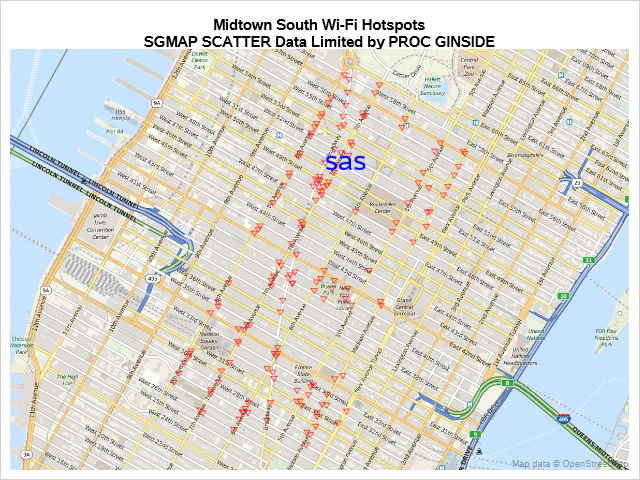
That helped, but there are still many hotspots displayed. You could get better results with a smaller polygon or by using the GEODIST function.
GEODIST Function to Limit Data
The GEODIST function allows you to set a distance variable in your data using the latitude and longitude of the SAS Training Center like this:
data hotspots (keep=lat lon provider distance); set hotspots; distance = geodist(lat, lon, 40.7618356, -73.98218050000002, 'DM'); run; |
The latitude and longitude variables, lat and lon, from the input data set are compared to the SAS latitude and longitude to create the distance variable. The DM option specifies that the input values are in degrees and the output value is in miles.
Add the SAS location using a data step, and limit the data to a quarter mile using the distance from the SAS Training Center:
data both; set both; where distance le 0.25; /* miles */ run; |
Plot the data using PROC SGMAP:
/* This is the beginning of the Esri URL */ %let url = http://services.arcgisonline.com/arcgis/rest/services; proc sgmap plotdata=both noautolegend; esrimap url=”&url/World_Topo_Map”; /* this plots the locations of the hotspots */ scatter x=lon y=lat / group=provider nomissinggroup markerattrs=(symbol=triangledown size=10 color=red); /* this is to indicate the location of SAS */ text x=lon y=lat text=saslabel / textattrs=(color=blue size=20); run; |
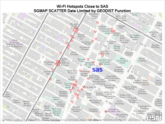
Now you know where the free Wi-Fi hotspots are located close to the SAS Training Center.
Next, add some sidewalk cafés locations so you can use the free Wi-Fi while having lunch. New York City also provides data for sidewalk café licenses.
See the SAS program for importing the café CSV data and add the distance from the SAS Training Center as you did before.
When you combine the datasets, different variables are created for each item plotted in PROC SGMAP. In the dataset below, PROVIDER is for the hotspot locations, sas is for the SAS Training Center, and BUSINESS_NAME2 is for the sidewalk cafés.
You can use the missing values to help plot locations. Here is a snapshot of the data:
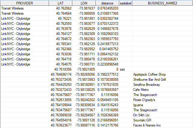
Use multiple statements to plot the data in PROC SGMAP, using GROUP with NOMISSINGGROUP in the SCATTER statements to keep missing data from being plotted.
proc sgmap plotdata=both; esrimap url="&url/World_Topo_Map"; /* this plots the locations of the hotspots */ scatter x=lon y=lat / group=provider nomissinggroup markerattrs=(symbol=triangledown size=10 color=red); /* this plots the locations of the cafes */ scatter x=lon y=lat / name='cafes' group=business_name2 nomissinggroup markerattrs=(symbol=starfilled size=20); /* this is to indicate the location of SAS */ text x=lon y=lat text=saslabel / textattrs=(color=blue size=20); /* only include cafes in the legend */ keylegend 'cafes' / title='Sidewalk Cafes'; run; |
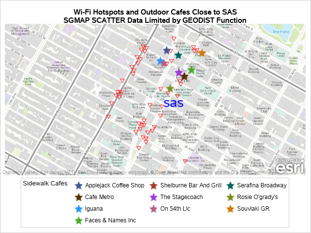
Now you know where to go eat lunch and get free Wi-Fi, but the map is not centered where the sidewalk cafés are located.
Use the coordinates to better zoom into the sidewalk cafés and run PROC SGMAP again:
data both; set both; if lat ge 40.7618356 and lon ge -73.983654 then output; run; |
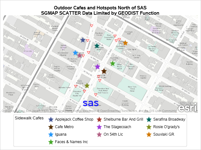
From this example, you can see that the GEODIST function is a powerful tool for limiting what you plot on maps.
A future blog will include an example of PROC GREDUCE to limit data plotted by PROC SGMAP.

1 Comment
Excellent post, thank you!