In the previous article on managing legends, I described the way to include items in a legend that may not exist in the data. This is done by defining a Discrete Attribute Map, and then requesting that all the values defined in the map should be displayed in the legend.
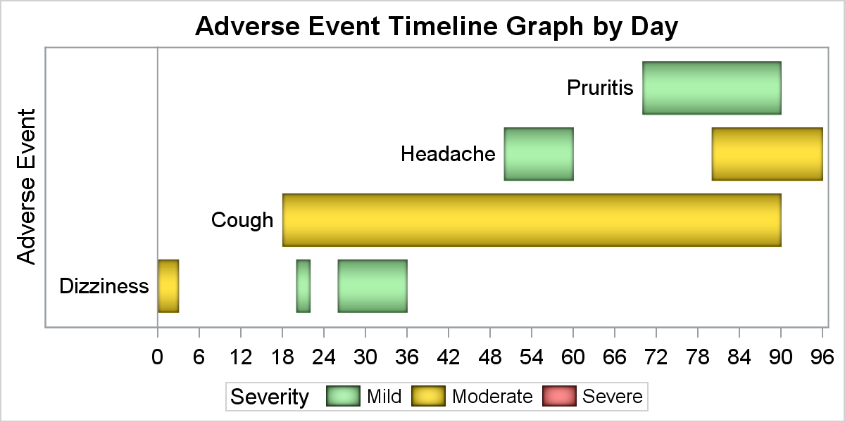 In the graph on the right, the data contains only Severity values of "Mild" and "Moderate". However, since three values are defined in the attribute map, and "Show" column is set to "Attrmap", all values for the group are displayed. That causes the value "Severe" to be displayed in the legend, even though there is no observation in the data with this severity.
Another useful (and intentional) result is the legend items are displayed in the order they are defined in the discrete attribute map as it allows you to control the order of the items in the legend. This feature is also useful to addresses an issue that a user was grappling with recently as described below.
The order of the items in the legend is based on the order the group values are encountered in the data. Legend values can be sorted in alphabetical order, but if you want a custom order, you can use the attribute map as discussed below.
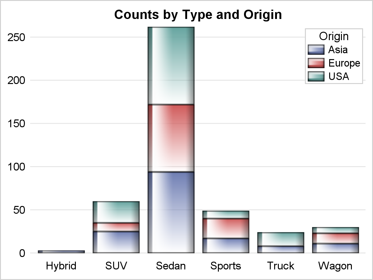 The graph on the right shows the stacked cumulative counts for the cars by Type and Origin. The legend inside is intentionally set with one column to make it easier to associate the colors with the stacking order. However, the order in the legend is the reverse of the order in the graph.
I can change the stacking order by setting the GROUPORDER option to "ReverseData". However, the order in the legend also reverses, thus keeping the legend order out of sync with the bar order.
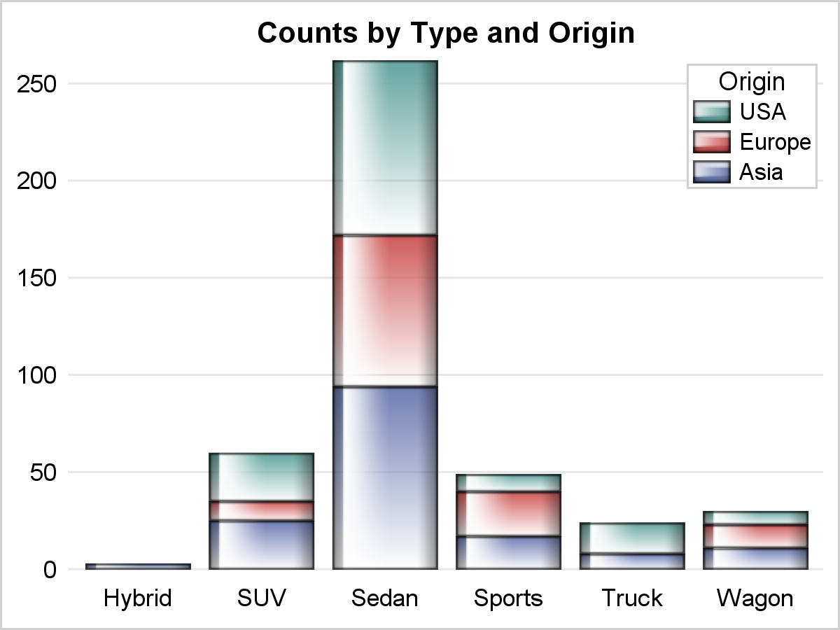 The way to address this is to use the Discrete Attr Map, and provide the group values and the corresponding colors in the order you want. Now, the legend item values will be displayed in the order of the values defined in the attr map. Note the items in the legend in the graph now are in the same order as the bar segments.
Note also in the Attr Map, we have not used actual fill color, like in the first case, but instead we have used the style elements. This can be done by using the FillStyleElement column name instead of the FillColor column name.
 The view of the Attribute Map for the the graph above is shown on the right. The code for the attr map and the graph is shown below.
data CarsShowAll;
retain Id 'Origin' Show 'Attrmap';
length Value $10 FillStyleElement $15;
input value $ FillStyleElement $;
datalines;
USA graphdata3
Europe graphdata2
Asia graphdata1
;
run;
title "Counts by Type and Origin";
proc sgplot data=sashelp.cars dattrmap=carsShowAll nowall noborder;
vbar type / group=origin dataskin=gloss filltype=gradient
baselineattrs=(thickness=0) attrid=Origin;;
keylegend / location=inside across=1 position=topright opaque
fillheight=12px fillaspect=golden;
xaxis display=(noline noticks nolabel);
yaxis display=(noline nolabel noticks) grid;
run;
Full SAS 9.4 Code: Legend_Order


2 Comments
Pingback: Infographics Bar Chart - Graphically Speaking
Requires 9.4 TS1M3, right?
TS1M2 does accept dattrmap-syntax,
but doesn't produce the wished for effect.