How different is different?
Descriptive analytics is powerful. You get to see your data and seeing is believing as they say. But blindly believing what you see is not always the best strategy. Asking someone else if they see what you see helps but is still subjective. Objectivity starts with formulating a hypothesis and having a quantitative measure by which you can measure the difference between what you think and reality.
I’d like to talk about how you can apply this approach to figuring out how different two segments are from each other. The obvious approach is to look at a bunch of profile plots of the two segments side by side. Then look for differences between the two.
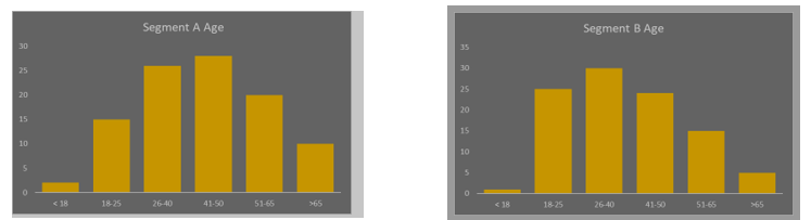
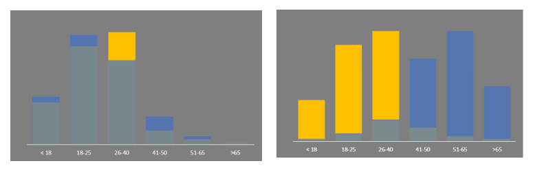
Above are two histograms showing the age distribution of members of two different segments A and B. As a marketer, how different do they look to you? Do these differences suggest a different approach to messaging members of these segments? How about the following pair of segments?
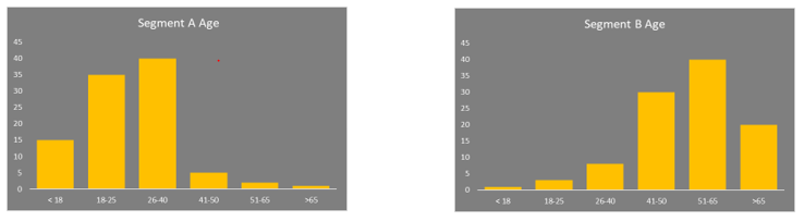
In this second case it is clear – the people in the two segments are very different from each other and these differences can be exploited by the marketer.
Of course, you look at more than one attribute (age in this case) when comparing two segments and it soon becomes hard for the human brain to hold on to all the different profile comparisons and make an objective call on whether the segments are different. Imagine instead you have an automated way of determining a) if two segments are different in a meaningful way, b) by how much, and c) what descriptive attributes best characterize this difference.
Segment profiling in SAS Customer Intelligence 360
This was exactly the business problem we had in mind when creating our segment profiler within SAS Customer Intelligence 360. The segment profiler provides an immediate qualitative assessment as to whether two segments were significantly different. It also provides quantitative measures that show the degree of difference and what drives this difference. The screenshot below shows segment profiler in action.
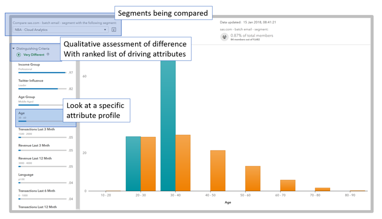
The two segments are compared to each other and, in this case, they are judged as being significantly different from each other. This assessment is based on an automatic measurement across all distinguishing criteria. A marketer can select any one of the distinguishing criteria (age in this example) and immediately see the comparison (the orange and blue bars representing the two segments).
Example insights
Profile comparisons like the one above are interesting but ultimately need to drive some action to be useful. Actionability comes from two areas. The first is whether the attributes being used for the comparison lend themselves to action. The second is whether the segments themselves represent behaviours with different value to the organization.
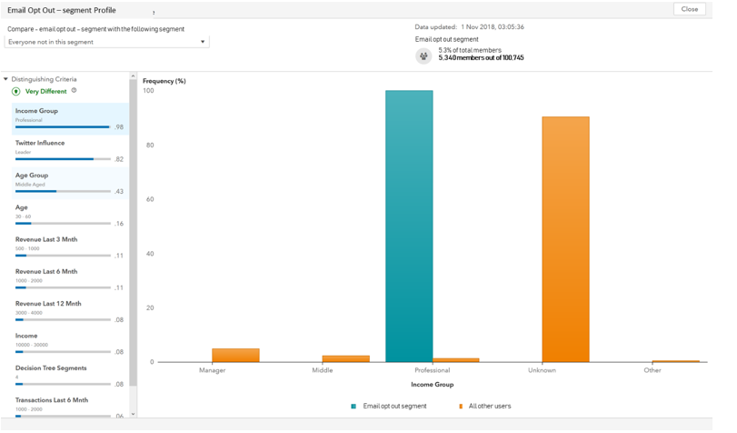
An example is a segment representing customers who have opted out of email communication. Another is a segment of people who have abandoned their shopping cart. Both these behaviours impact an organization’s bottom line, so understanding how these customers are different from others leads to corrective insight.
The following profiles show the most distinguishing features of customers who opt out of email communication. They tend to be higher income, more influential social media users and middle aged. Not being able to communicate with customers with higher disposable income and digital awareness represents a challenge. Being aware of the differences, marketers can implement contact policy rules to minimize the risk of opting out or making certain that the content relevant.
How SAS creates profile comparisons
When we were developing this capability, the typical customer reaction was “we need this right now, or even yesterday.” This is surprising for such a mundane sounding capability, given the hype around other analytics methods and use cases (think AI, machine learning, etc.). But then again, perhaps it should not be surprising because this sort of exercise is repeated hundreds or thousands of times every day in marketing departments across the world.
SAS wanted to make profile comparisons that are easy to interpret and reflects what the user would see if they went through a profiling exercise across all possible distinguishing attributes.
Imagine we overlay the two pairs of segment profiles from earlier, the pair that is similar on the left and the pair that is different on the right. Segment A is depicted by the yellow histogram, segment B by the blue histogram and the overlay is the blue-grey-green colour. Now, imagine that you are asked to quantify the degree of difference in both cases in such a way that you can objectively say that the pair of profiles in the left-hand chart are x% more similar than the pair on the right. How would you calculate what x is?
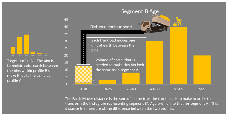
Moving dirt to determine degrees of difference
The ideal measure is one that is intuitive and related to the visual histograms. The earth mover’s distance (EMD) is just such a measure. If you’ve never come across this before, don’t worry, it’s easy to picture.
Imagine that the histograms above are piles of earth. Your job is to work on pile B and move the earth around until it looks just like pile A. The EMD represents how hard you had to work to do this – in other words how much dirt did you lift and how far did you have to carry it.
Of course, we can automate the process somewhat and employ a digger, so we end up with the following graphic explanation:
Naturally, we automate the calculation of this distance, so the marketer doesn’t need to do anything. For those who are interested, the precise nature of this calculation is the subject of my next post. I also use that post to talk about how we construct an equivalent calculation for categorical measures, and what we do to ensure that these distances can be compared and combined to provide an overall assessment of segment differences.
Take away
SAS has taken a seemingly mundane but difficult to quantify problem (segment comparison) and provided a quantitative method to help a marketer quickly evaluate how two (or more) segments differ from each other and what the differences are. This capability can yield actionable insights especially when the segments themselves represent customers with differing value to the organization, such as in the opt-out example. Finally, I’d like to encourage you to think about how, in your daily work, such simple but highly scalable comparisons could lead to greater business value.