For the first time in 4.5 years, we had a day with zero sunspots - I think this special occasion calls for some sunspot graphs!
But before we get started, here's one of the many pictures my friend Kirk took of the sun down in Marco Island, Florida. Spots or no spots, the sun always seems to look better when viewed from Kirk's boat! :)

A sunspot is a temporary cold spot on the sun - well, not exactly cold, but cooler than the surrounding areas. These areas look visibly darker, and appear as a dark spot. And for some reason we've had a fascination with these spots, and counted them ... for hundreds of years. The number of sunspots tends to go in cycles of about 11 years. But even these cycles fluctuate, with certain time periods having higher maximums and/or lower minimums than others. Some of the more extreme fluctuations in the cycles are referred to as the Maunder Minimum, the Dalton Minimum, and the Modern Maximum.
Almost any time you start researching about sunspots (such as the Wikipedia links above), you're likely to see this famous graph of the sunspot cycles:
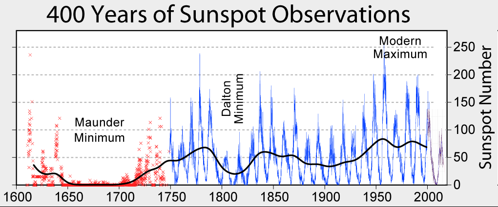
And, of course as with any famous and useful graph, I wanted to see if I could create something similar with SAS ...
Digging up the data was a little more difficult than I thought. The older (red marker) data was available on the web for a while, but then disappeared (I was able to request a copy via email). The data for the blue line was a bit easier to find, but over time the data location kept moving around. Also, I used to be able to get data that ~exactly matched the values of the blue line in the original graph, but then that source stopped being updated ... and the new source I recently found had values that were a good bit higher (probably due to this update in counting methodology).
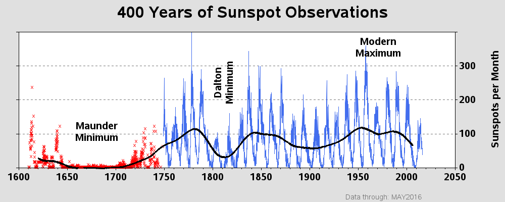
Here's the graph I came up with. It looks a lot like the original ... but with slightly different (presumably better?) data values for the blue line. For a few tiny additions, I added minor tick marks at each 10 years, and I added a footnote to indicate which was the most recent month in the data. I guess we can chalk another one up for "SAS can create just about any kind of graph!" Here's the code if you'd like to see it.
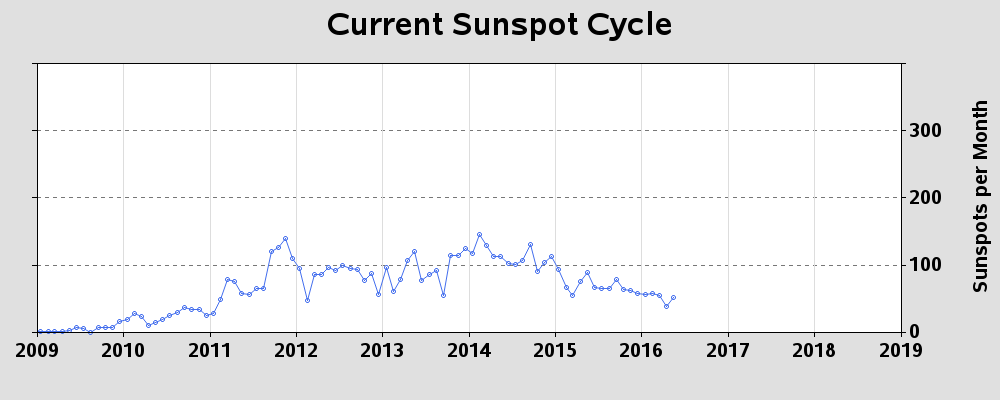
And, while I was at it, I thought it would be interesting to zoom-in on the latest cycle, so I also created the following graph:
What's your favorite sun-related thing? Sunspots, solar flares, solar eclipse, lunar eclipse, or solstice/equinox? Got any cool stories about the sun you can share?400 years of sunspot data #dataviz Share on X

2 Comments
Despite cloudy weather, we got to see part of the lunar eclipse last year! And I've viewed some solar eclipses with homemade pinhole projectors.
Those pinhole projectors are a pretty neat way to view a solar eclipse!