SAS Global Forum 2017 is around the corner and SAS users are gearing up to travel to Orlando for a blockbuster conference. ODS Graphics is now a well known component of Base SAS and many readers of this blog who are proficient users of SG Procedures and GTL can look forward to some cool presentations.
This year there are many papers and talks on using ODS Graphics for creating graphs, from the analytical to the decorative. Here is a brief summary of the presentations by SAS presenters at SGF this year. I hope you will have the opportunity to attend and further enhance your skills and contribute to the conversation.
Papers:
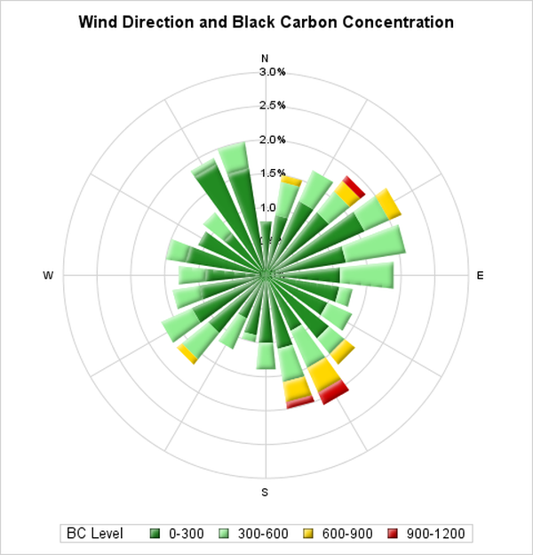
#520: Easy Polar Graphs - Prashant Hebbar. Abstract: Some data is best visualized in a polar orientation, particularly when the data is directional or cyclical. Although the SG procedures and Graph Template Language (GTL) do not directly support polar coordinates, they are quite capable of drawing such graphs with a little bit of data processing. We demonstrate how to convert your data from polar coordinates to Cartesian coordinates and use the power of SG procedures to create graphs that retain the polar nature of your data. Stop going around in circles: let us show you the way out with SG procedures!
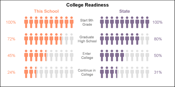
#315: Decorative Infographs using SAS - Sanjay Matange.
Abstract: The SAS® 9.4 SGPLOT procedure is a great tool for creating all types of graphs, from business graphs to complex clinical graphs. The goal for such graphs is to convey the data in a simple and direct manner with minimal distractions. But often, you need to grab the attention of a reader in the midst of a sea of data and graphs. For such cases, you need a visual that can stand out above the rest of the noise. Such visuals insert a decorative flavor into the graph to attract the eye of the reader and to encourage them to spend more time studying the visual. This presentation discusses how you can create such attention-grabbing visuals using the SGPLOT procedure.
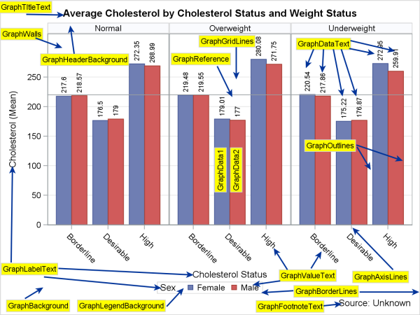
#675: Diving Deep into ODS Graphics Styles - Dan Heath.
Abstract: Creating an effective style for your graphics can make the difference between clearly conveying your message to your audience and hiding your message in a sea of lines, markers, and text. A number of books explain the concepts of effective graphics, but you need an understanding of how styles work in your environment to correctly apply those principles. The goal of this paper is to give you an in-depth discussion of how styles are applied to Output Delivery System (ODS) graphics, from the ODS style level all the way down to the graph syntax. This discussion includes information about differences in grouped versus non-grouped plots, precedence order of style application, using style references, and much more. Don't forget your scuba gear!
#312: Heat Maps: Graphical Displays for Big Data and Small Tables - Warren Kuhfeld.
Abstract: Heat maps use colors to communicate numeric data by varying the underlying values that represent red, green, and blue (RGB) as a linear function of the data. You can use heat maps to display spatial data, plot big data sets, and enhance tables. You can use colors on the spectrum from blue to red to show population density in a US map. In fields such as epidemiology and sociology, colors and maps are used to show spatial data, such as how rates of disease or crime vary with location. With big data sets, patterns that you would hope to see in scatter plots are hidden in dense clouds of points. In contrast, patterns in heat maps are clear, because colors are used to display the frequency of observations in each cell of the graph. Heat maps also make tables easier to interpret. For example, when displaying a correlation matrix, you can vary the background color from white to red to correspond to the absolute correlation range from 0 to 1. You can shade the cell behind a value, or you can replace the table with a shaded grid. This paper shows you how to make a variety of heat maps by using PROC SGPLOT, the Graph Template Language, and SG annotation.
Super Demos:
- Sunday - 5:30pm - Create Highly Customized Graphs Using ODS Graphics - Warren Kuhfeld
- Sunday - 5:30pm - What's New with ODS Graphics Procedures - Dan Heath
- Monday - 11:30am - What's New in GTL - Prashant Hebbar
- Monday - 1:30pm - ODS Graphics Designer - Scott Singer
- Monday - 2:30pm - Clinical Graphs using SAS - Sanjay Matange
- Monday - 2:30pm - Heat Maps: Graphically Displaying Big Data and Small Tables - Warren Kuhfeld
- Tuesday - 10:30am - Mapping - Jeff Phillips
- Tuesday - 12:00n - Change Titles in Graphs and Remove Subtitles in SAS® Output - Warren Kuhfeld
- Tuesday - 1:30pm - Clinical Graphs using SAS - Sanjay Matange
- Tuesday - 2:30pm - What's new in GTL - Prashant Hebbar
- Tuesday - 4:30pm - Decorative Infographs - Sanjay Matange.
In addition to these, there are a good set of papers on ODS Graphics presented by SAS users that will be of great interest. See y'all in Orlando next week.
