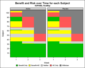
Let us continue our review of the Clinical Graphs included in the CTSPedia repository. Today, I noticed this Heatmap of Benefits and Risks over Time for Subjects in a study by Treatment, submitted by Max Cherny using "R" code. I thought it would be a good exercise to see how to build this graph using SAS. You may notice, I have already added the SAS version to the CTSPedia Heat Map page. This graph was intentionally created to mimic the graph by Max to avoid any variability.
 Here is the same graph created using SAS SGPANEL procedure. In this example I have softened the colors used by Max. The graph is pretty much the same. Click on graph for a higher resolution view.
The full code for generating the data and rendering the graph is linked below. You will see that most of the code is needed to generate the data set as I was unable to run Max's R code to do so.
The SGPANEL code necessary to create the graph itself is very concise, under 10 lines.
Here is the SGPANEL code:
proc sgpanel data=HeatMap ;
format value benefit.;
styleattrs datacolors=(cx3faf3f yellow lightgray lightred gray);
panelby trt / novarname spacing=10 headerbackcolor=lightgray;
heatmapparm x=week y=subject colorgroup=value / name='a';
colaxis integer offsetmin=0 offsetmax=0 display=(noline);
rowaxis values=(10 to 100 by 10) min=1 valueshint
offsetmin=0 offsetmax=0 display=(noline);
keylegend 'a' / valueattrs=(size=7) noborder;
run;
The full code for the graph is linked below. I have used some options to set the size of various fonts to mimic the "R" look for comparison.
Full SAS9.4 SGPANEL code: HeatMap2


