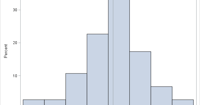
Last week I showed some features of SAS formats, including the fact that you can use formats to bin a continuous variable without creating a new variable in the DATA step. During the discussion I mentioned that it can be confusing to look at the output of a formatted variable
Tag: Data Analysis
In a scatter plot, the regions where observations are packed tightly are areas of high density. A contour plot or heat map of a bivariate kernel density estimate (KDE) is one way to visualize regions of high density. A SAS customer asked whether it is possible to use SAS to
When I read Robert Allison's article about the cost of a taxi ride in New York City, I was struck by the scatter plot (shown at right; click to enlarge) that plots the tip amount against the total bill for 12 million taxi rides. The graph clearly reveals diagonal and
You can visualize missing data. It sounds like an oxymoron, but it is true. How can you draw graphs of something that is missing? In a previous article, I showed how you can use PROC MI in SAS/STAT software to create a table that shows patterns of missing data in
Missing data can be informative. Sometimes missing values in one variable are related to missing values in another variable. Other times missing values in one variable are independent of missing values in other variables. As part of the exploratory phase of data analysis, you should investigate whether there are patterns
In SAS procedures, the WHERE clause is a useful way to filter observations so that the procedure receives only a subset of the data to analyze. The IML procedure supports the WHERE clause in two separate statements. On the USE statement, the WHERE clause acts as a global filter. The
Descriptive univariate statistics are the foundation of data analysis. Before you create a statistical model for new data, you should examine descriptive univariate statistics such as the mean, standard deviation, quantiles, and the number of nonmissing observations. In SAS, there is an easy way to create a data set that
Last weekend was the 2016 NCAA Division I wrestling tournament. In collegiate wrestling there are ten weight classes. The top eight wrestlers in each weight class are awarded the title "All-American" to acknowledge that they are the best wrestlers in the country. I saw a blog post on the InterMat
My previous blog post shows how to use PROC LOGISTIC and spline effects to predict the probability that an NBA player scores from various locations on a court. The LOGISTIC procedure fits parametric models, which means that the procedure estimates parameters for every explanatory effect in the model. Spline bases
Last week Robert Allison showed how to download NBA data into SAS and create graphs such as the location where Stephen Curry took shots in the 2015-16 season to date. The graph at left shows the kind of graphs that Robert created. I've reversed the colors from Robert's version, so