Tag: Data Analysis

Rick Wicklin 7
Create an ogive in SAS

My son is taking an AP Statistics course in high school this year. AP Statistics is one of the fastest-growing AP courses, so I welcome the chance to see topics and techniques in the course. Last week I was pleased to see that they teach data exploration techniques, such as

Rick Wicklin 0
The distribution of nearest neighbor distances

Last week I showed how to compute nearest-neighbor distances for a set of numerical observations. Nearest-neighbor distances are used in many statistical computations, including the analysis of spatial point patterns. This article describes how the distribution of nearest-neighbor distances can help you determine whether spatial data are uniformly distributed or

Advanced Analytics
Rick Wicklin 8
Compute nearest neighbors in SAS

Finding nearest neighbors is an important step in many statistical computations such as local regression, clustering, and the analysis of spatial point patterns. Several SAS procedures find nearest neighbors as part of an analysis, including PROC LOESS, PROC CLUSTER, PROC MODECLUS, and PROC SPP. This article shows how to find

Rick Wicklin 3
Graph a step function in SAS

Last week I wrote about how to compute sample quantiles and weighted quantiles in SAS. As part of that article, I needed to draw some step functions. Recall that a step function is a piecewise constant function that jumps by a certain amount at a finite number of points. Graph

Rick Wicklin 4
Weighted percentiles

Many univariate descriptive statistics are intuitive. However, weighted statistic are less intuitive. A weight variable changes the computation of a statistic by giving more weight to some observations than to others. This article shows how to compute and visualize weighted percentiles, also known as a weighted quantiles, as computed by

Rick Wicklin 5
Compute highest density regions in SAS

In a scatter plot, the regions where observations are packed tightly are areas of high density. A contour plot or heat map of a bivariate kernel density estimate (KDE) is one way to visualize regions of high density. A SAS customer asked whether it is possible to use SAS to

Rick Wicklin 11
How much do New Yorkers tip taxi drivers?

When I read Robert Allison's article about the cost of a taxi ride in New York City, I was struck by the scatter plot (shown at right; click to enlarge) that plots the tip amount against the total bill for 12 million taxi rides. The graph clearly reveals diagonal and

Rick Wicklin 7
Visualize missing data in SAS

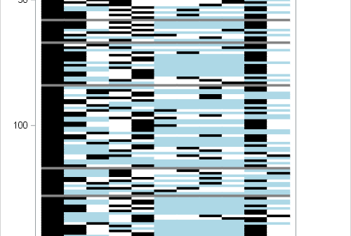
You can visualize missing data. It sounds like an oxymoron, but it is true. How can you draw graphs of something that is missing? In a previous article, I showed how you can use PROC MI in SAS/STAT software to create a table that shows patterns of missing data in

1 27 28 29 30 31 49